TEVA
TEVA Pharmaceuticals.
Before TEVA gave me the mandate to design packages for over 500 pharmaceutical products, the company had a conglomeration of boxes designed at random over the years which created confusion & mix-ups at the packing level as well as in storage and distribution logistics.
I consider the macro-function of graphic design as a device to establish order & hierarchy amid the complexities of visual communication; therefore, the necessity for a clearly-defined packaging identity system was obvious to me. To my favor, Mr. Eli Horowitz, the legendary founder and CEO of TEVA shared this opinion.
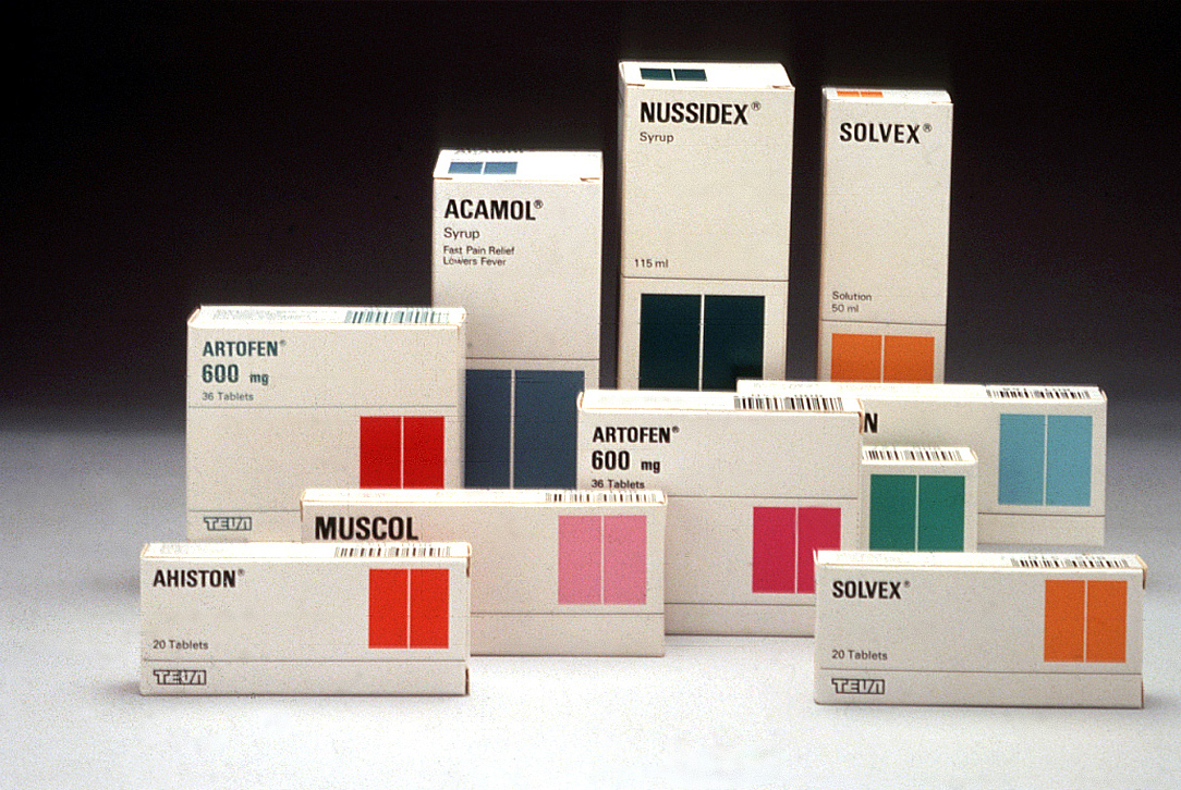
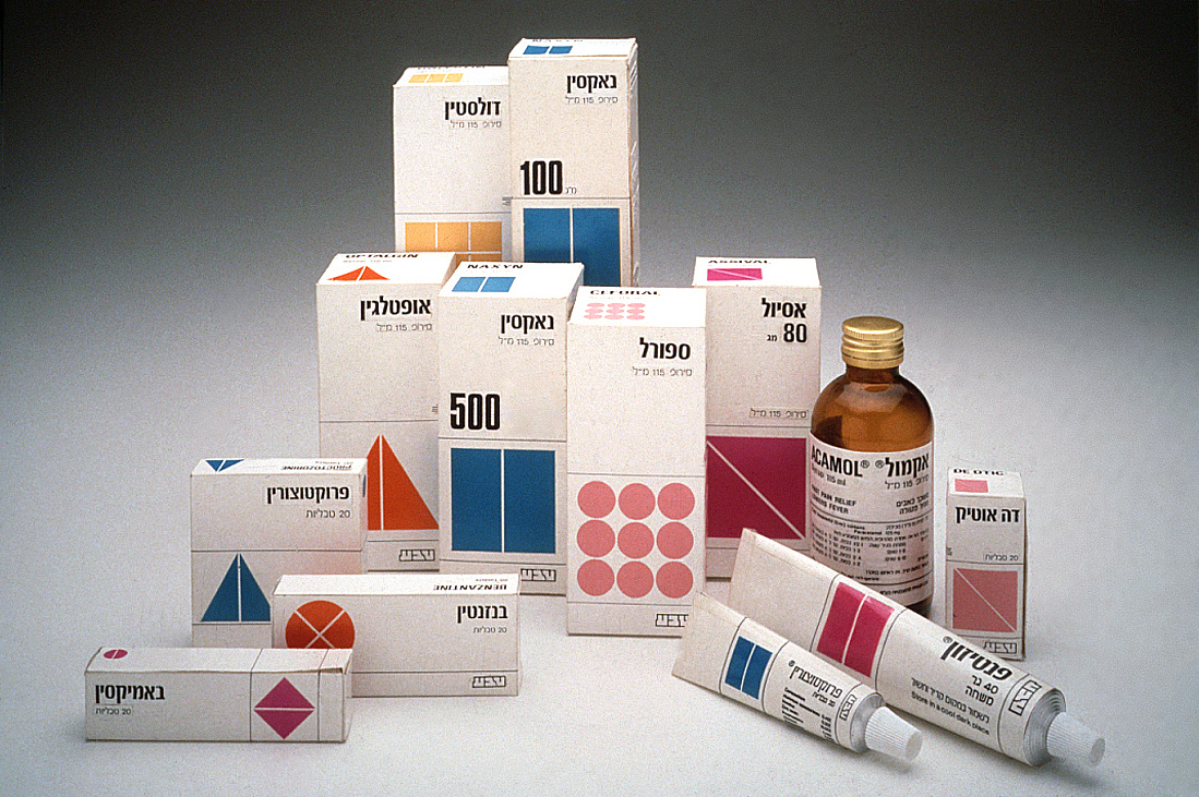
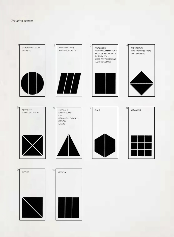
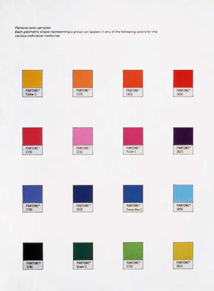
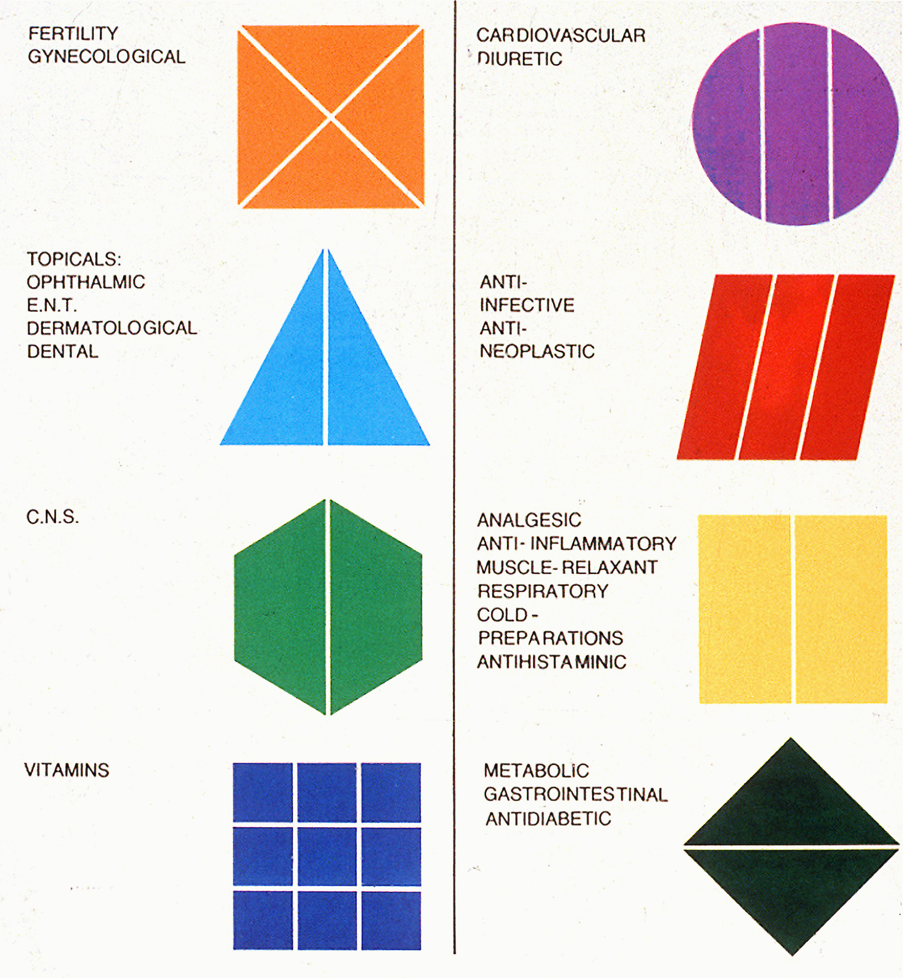
The design solution resulting from this purely analytical process was as much a mathematical formula – shape x color – as a ‘classic’ graphic design. Each pharmaceutical group is identified by pictogram which can be multiplied by any number of colors. Its aesthetic value is the ‘by-product’ of its logic. An aspect of a well-designed packaging helps avoiding sometimes dangerous mistakes, particularly in the pharmaceutical industry.
And as for the logo, my intention was to create a white logo, symbol of purity and sterility. I achieved it by the green outlines of the logo, which lent itself to the harmonious coordination of the Hebrew and Latin logotype.
With the introduction of the new logo and new image of the company, Dan Reisinger also redesigned the packaging system for over 600 products. The aim was to create a system that can grow with marketing and manufacturing needs. All products were divided into 10 pharmaceutical groups. For each group, a pictogram was designed, which can be multiplied by any number of colors.
I consider the macro-function of graphic design as a device to establish order & hierarchy amid the complexities of visual communication.
Before TEVA gave me the mandate to design packages for over 500 pharmaceutical products, the company had a conglomeration of boxes designed at random over the years which created confusion & mix-ups at the packing level as well as in distribution and storage logistics. The necessity for a clearly-defined packaging identity/system was obvious to me – and to the president of TEVA, Mr. Eli Horowitz.
The design solution resulting from this purely analytical process was as much a mathematical formula as a ‘classic’ graphic design. Its aesthetic value is the ‘by-product’ of its logic.
An aspect of this is well-designed packaging that helps avoid sometimes dangerous mistakes (in the process of packaging, storing, or distributing, as well as in identification of medication within the pharmacies)- and so, graphic design can save lives.
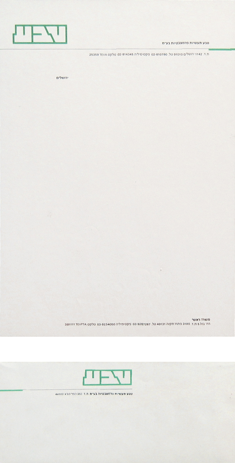
Stationary
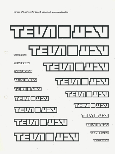
Page from Teva design manual
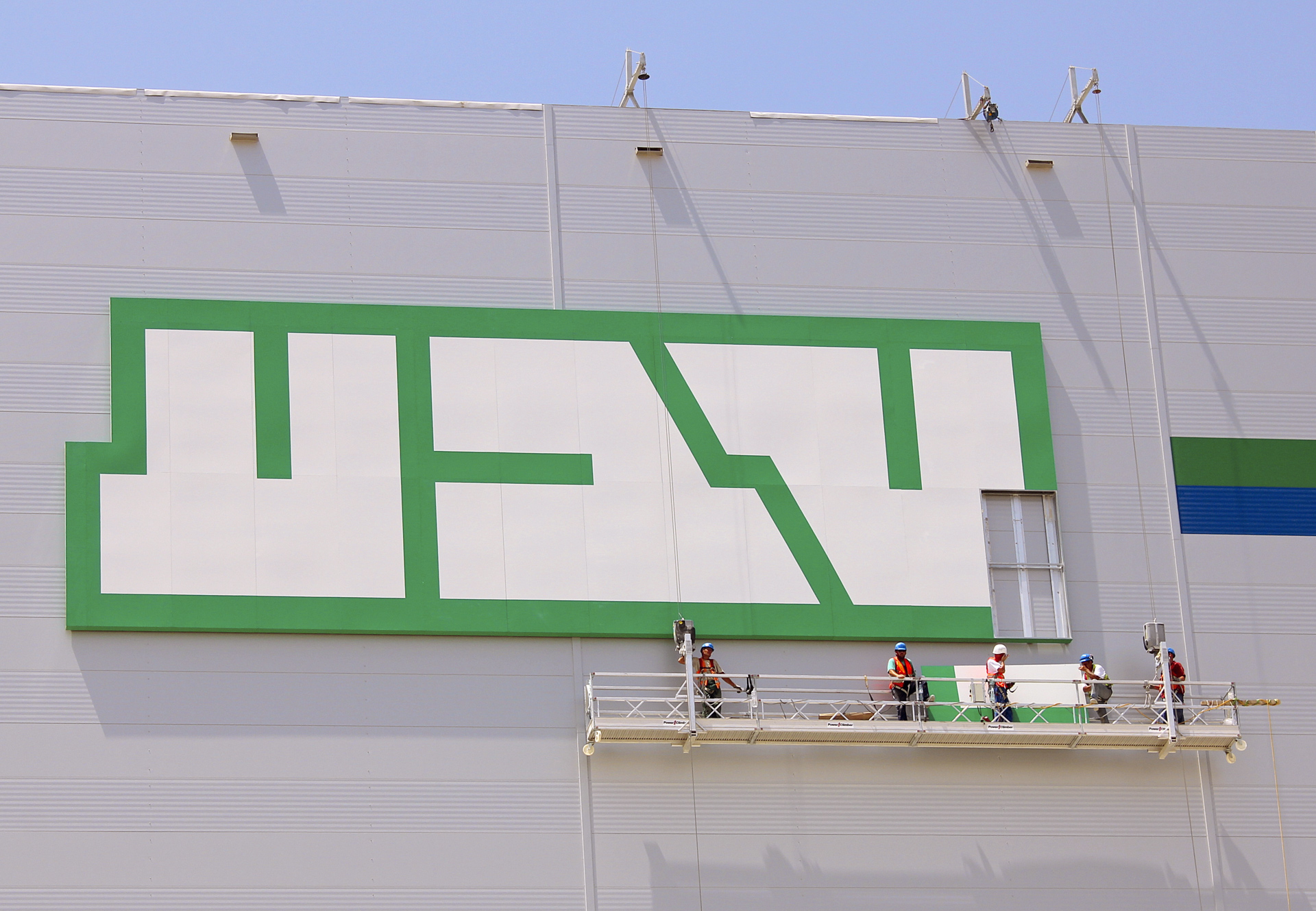
Logo on factory building
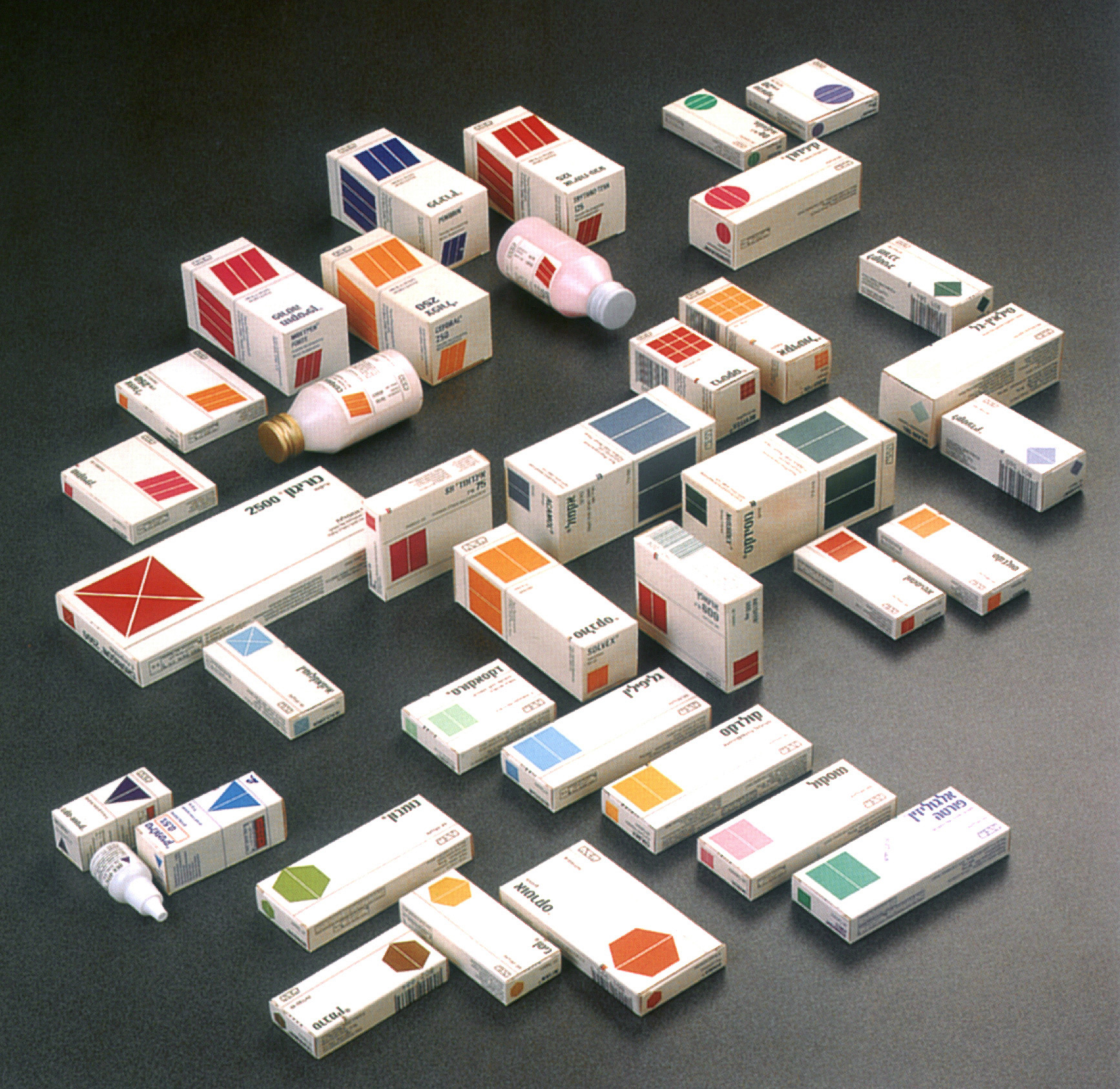
Teva packages, 1986–87
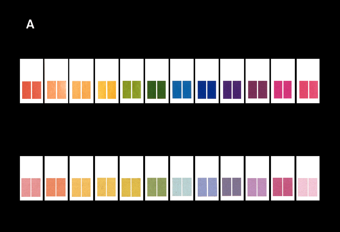
Color samples for package design, digital rendering
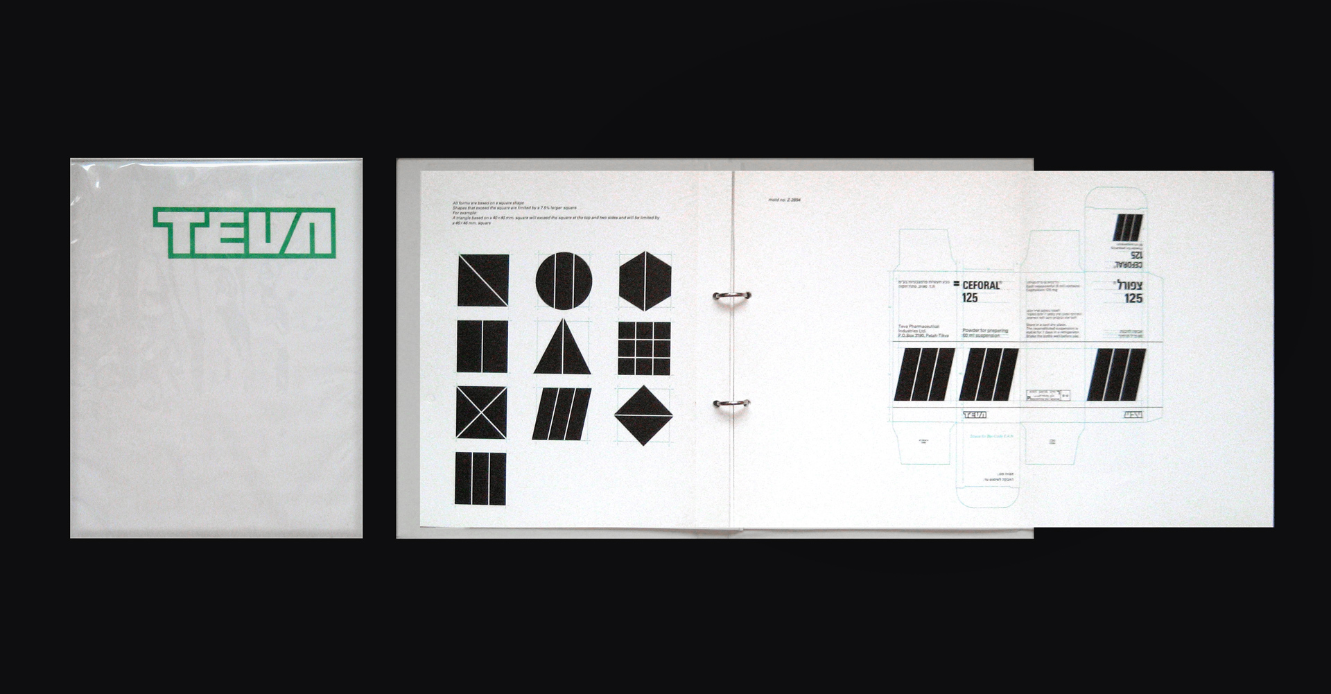
Design manual for Teva Pharmaceutical Industries, 1987
Pages from design manual of comprehensive design for Teva Pharmaceutical Industries, 1987
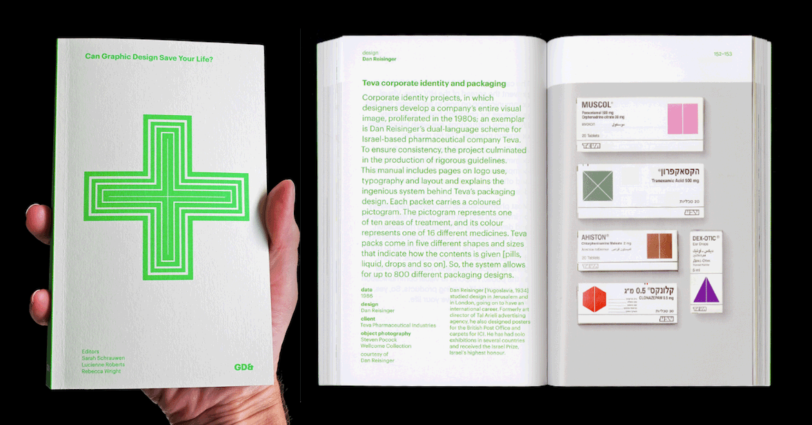
Can Graphic Design Save Your Life? exhibition at the Wellcome Collection, London. publication: GraphicDesign&