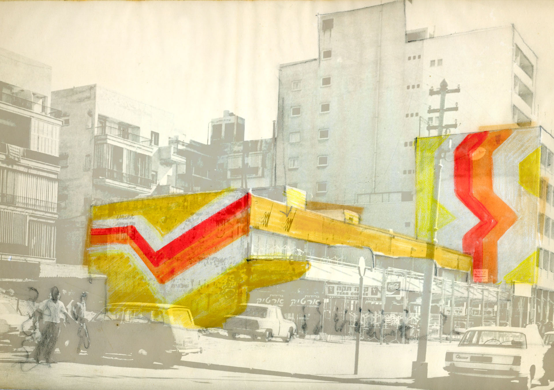
Supergraphics
TAYELET
TAYELET
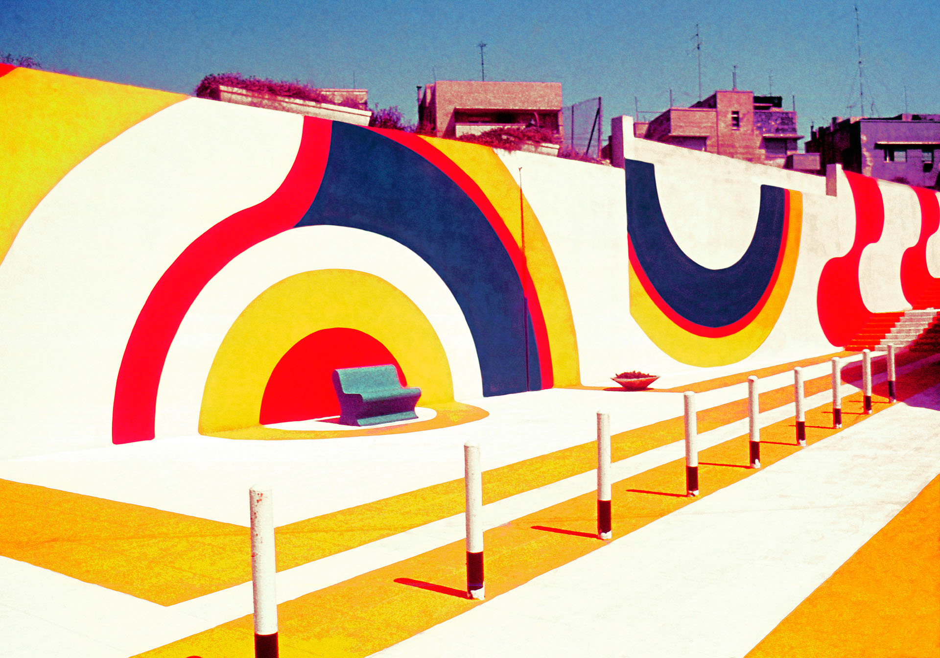
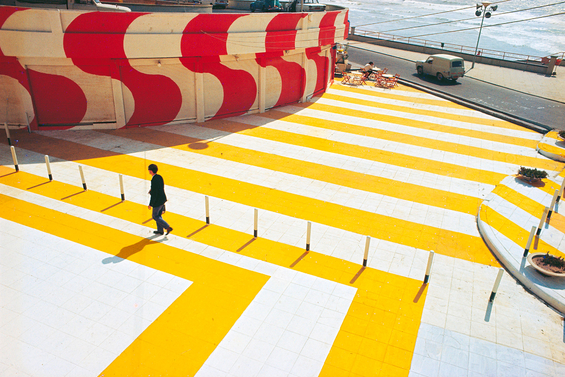
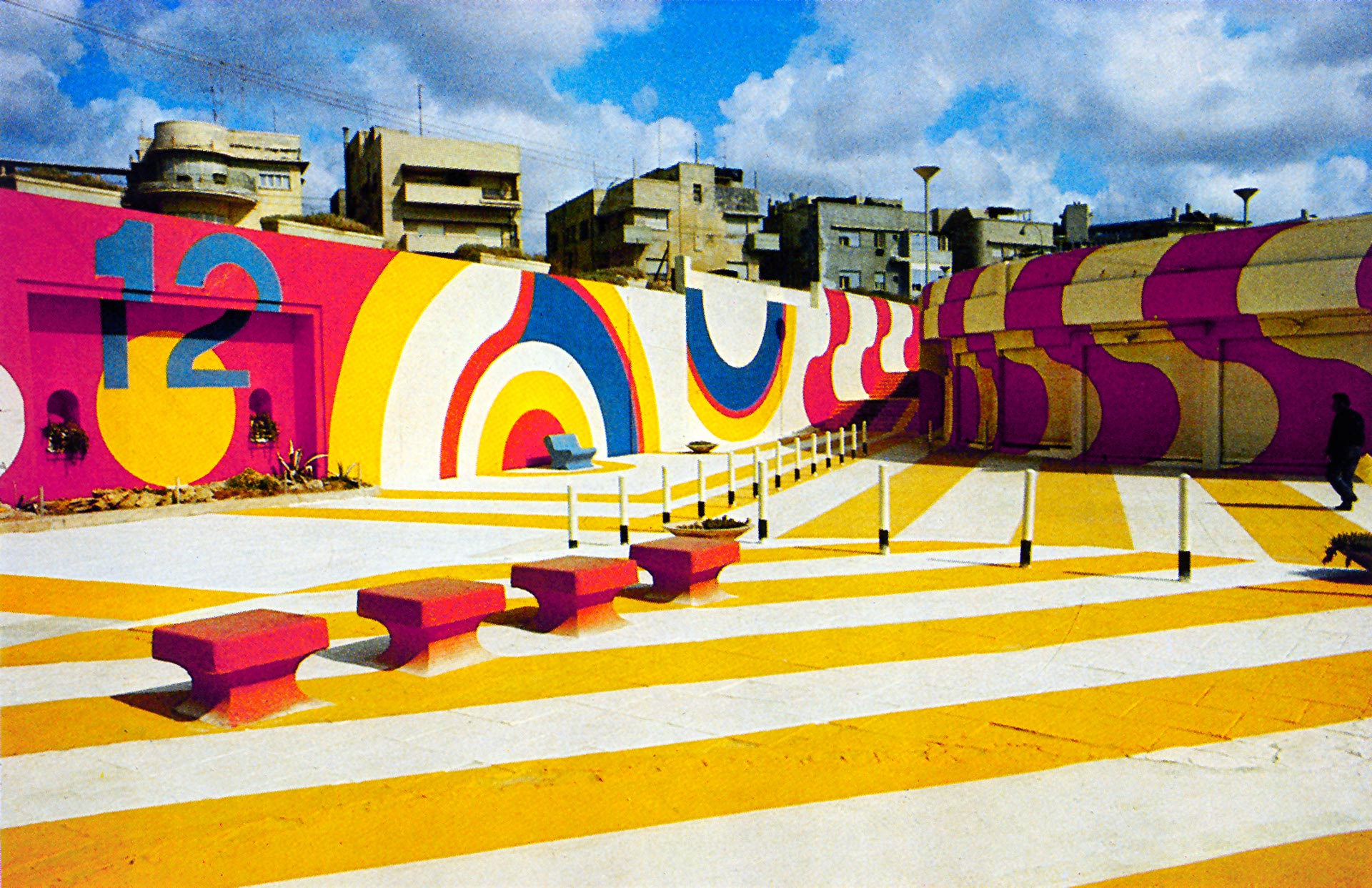
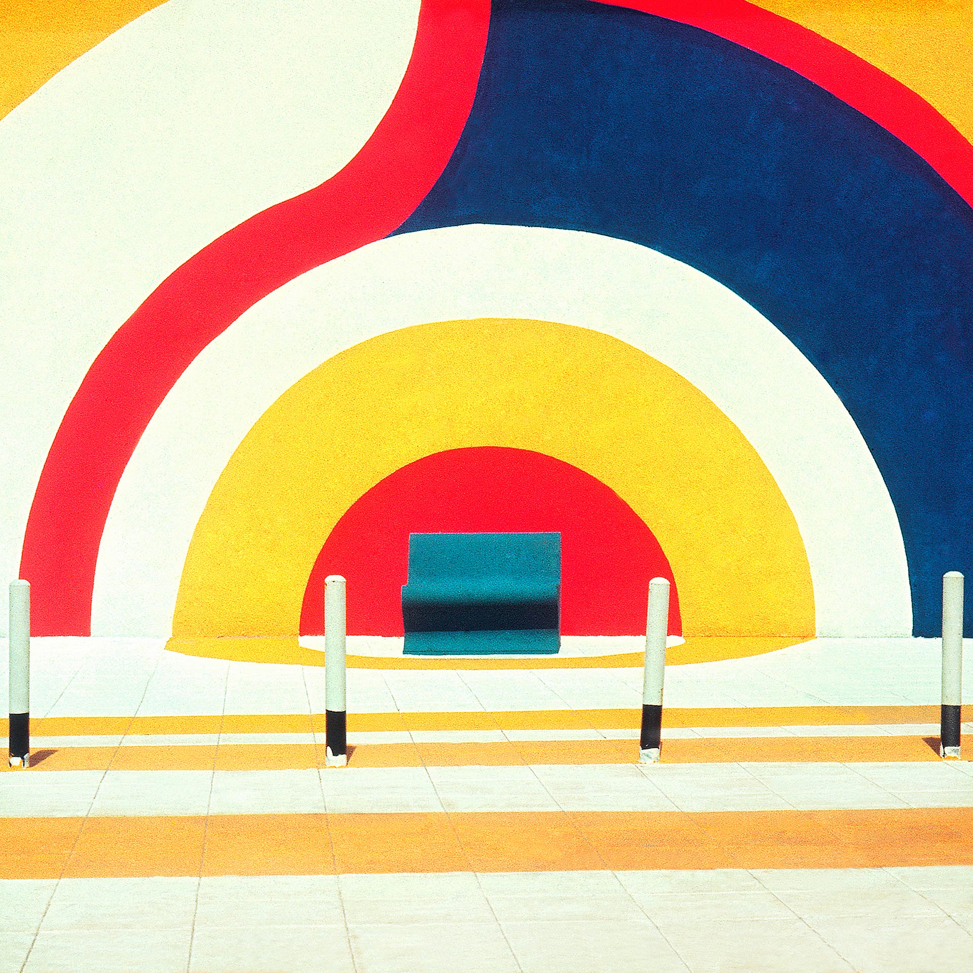
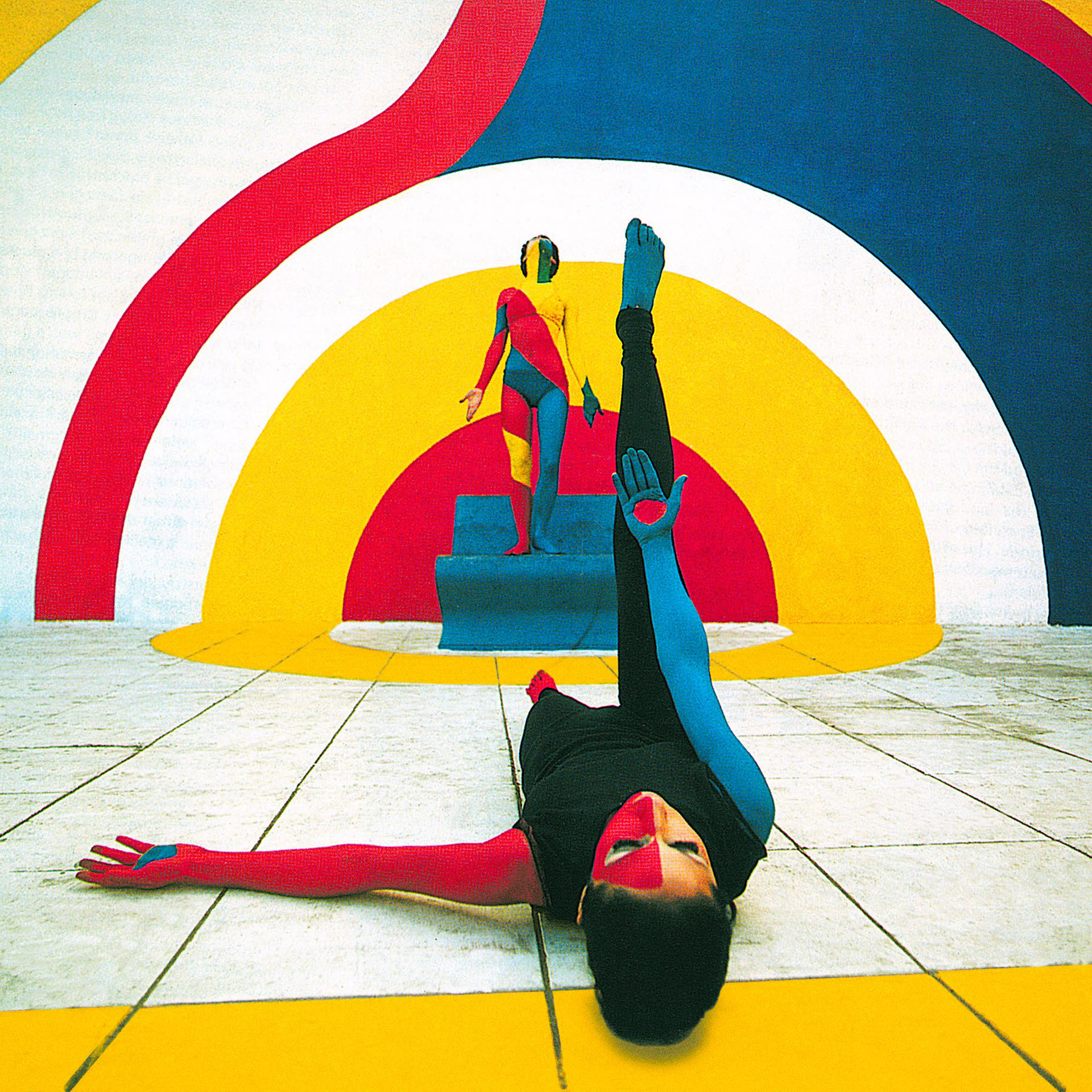
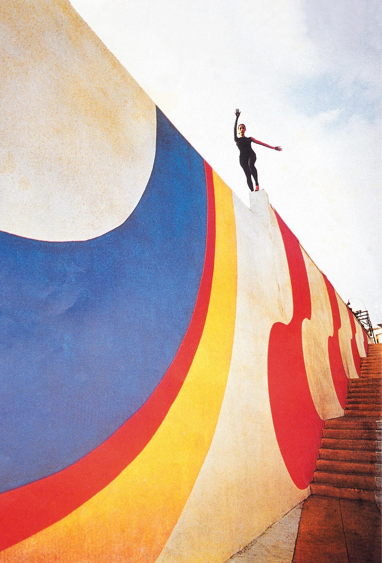
Supergraphic design of the Tel Aviv promenade, 1970.
The idea of using color-graphics on a large scale came to me – in a flash – in the early 60’s, while visiting a new settlement consisting of over a hundred identical small houses inhabited by immigrants from North Africa. I found the bleak monotony of this site in the Negev desert depressing. The inhabitants, accustomed to the colorful markets of Algiers and Marrakesh, must have felt the same. I suddenly imagined those houses painted in different colors – with basic geometric shapes – creating a vibrant colorful environment. I made a note of the concept in my diary, but did not act upon it until the right opportunity presented itself.
On my first visit to New York in 1967, I have seen some painted facades on buildings. The term ‘Supergraphics’ entered the general lexicon and reinforced the validity of my earlier idea of the ‘painted village’ in the Negev.
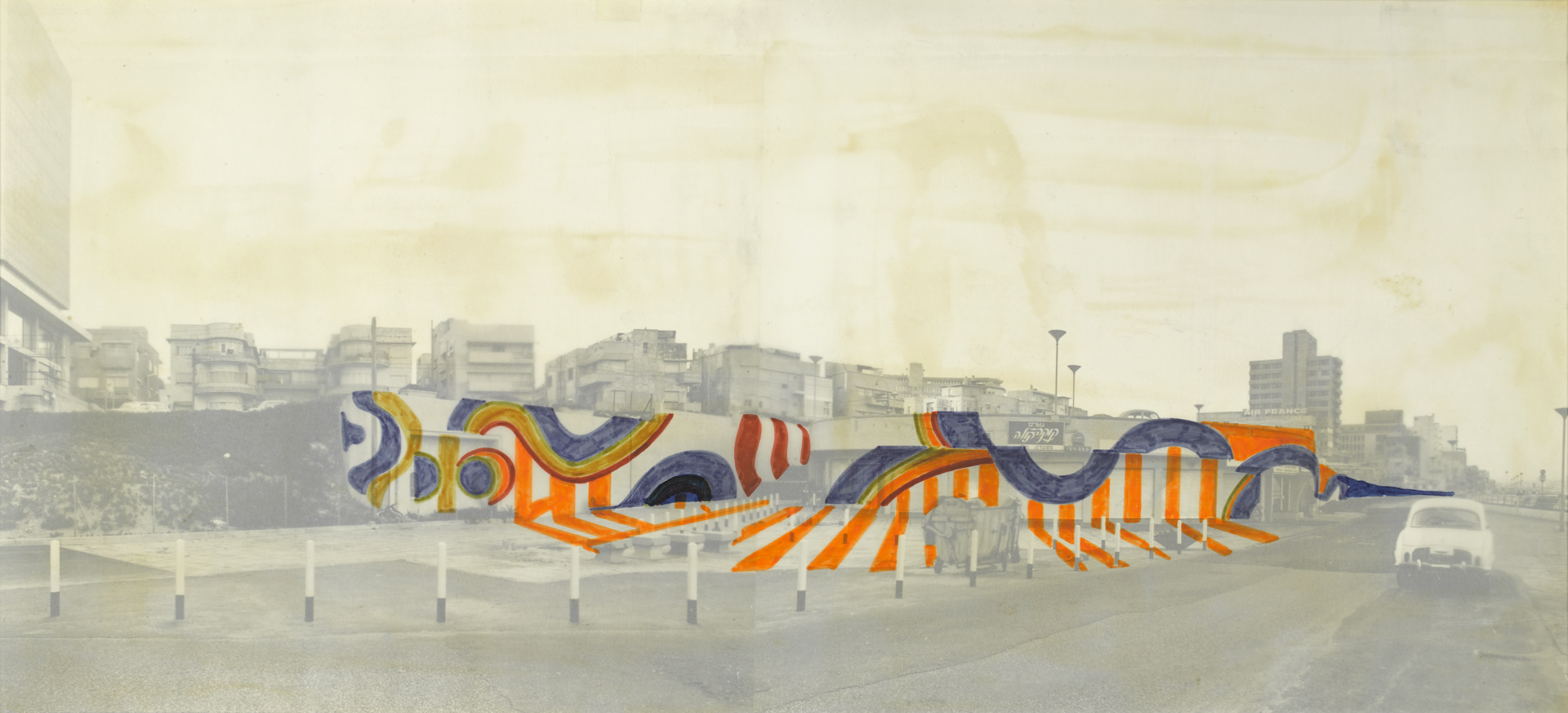
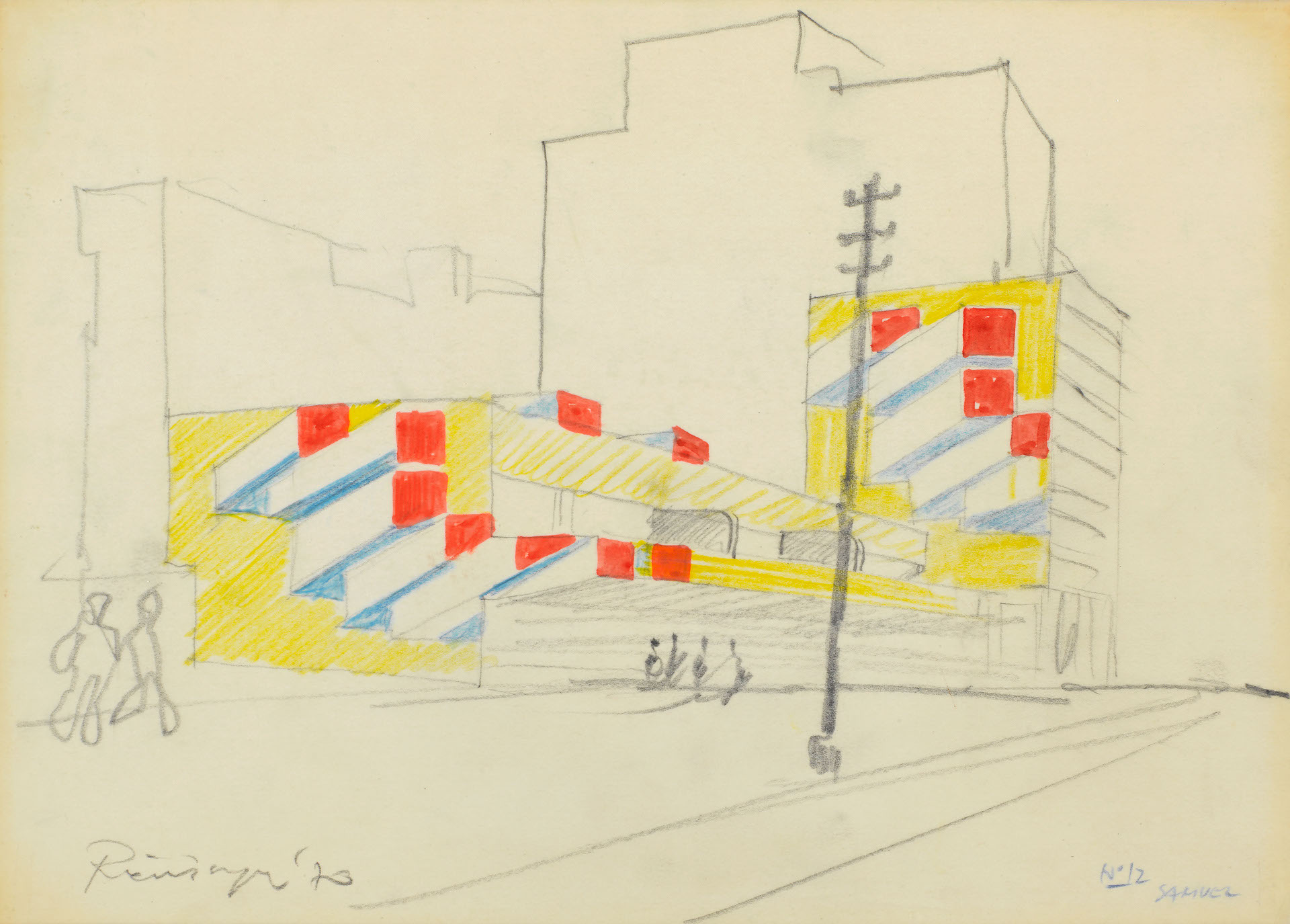
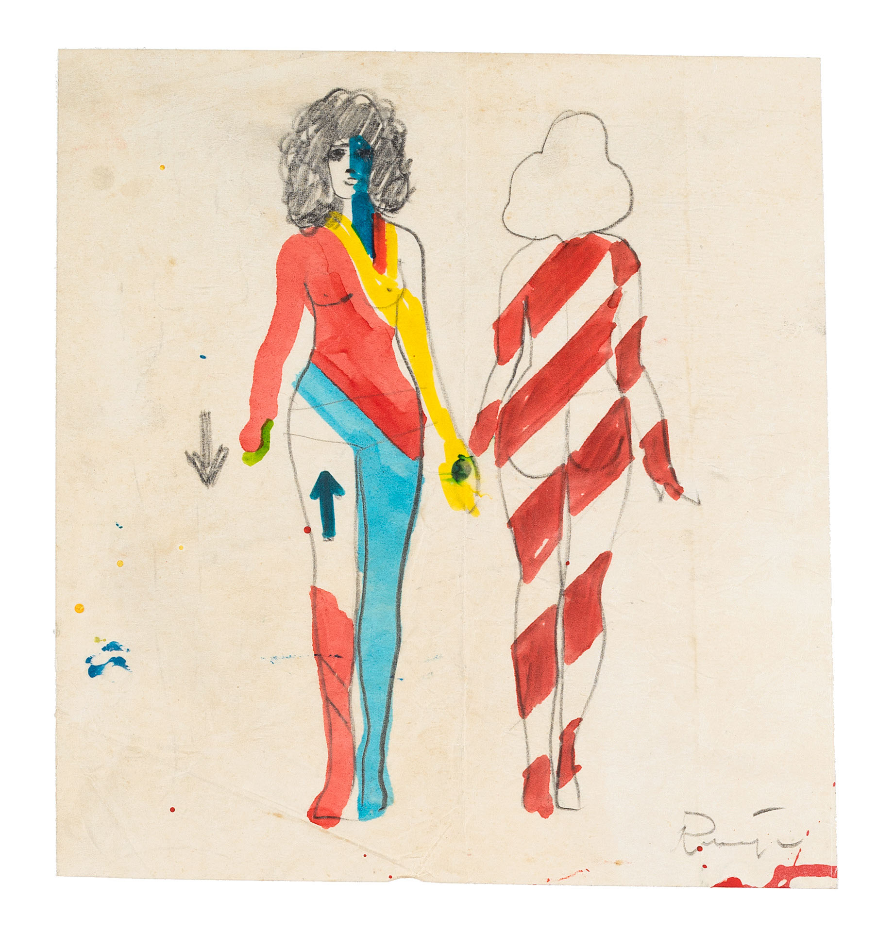
Sketch for Tel Aviv promenade supergraphic design, 1970
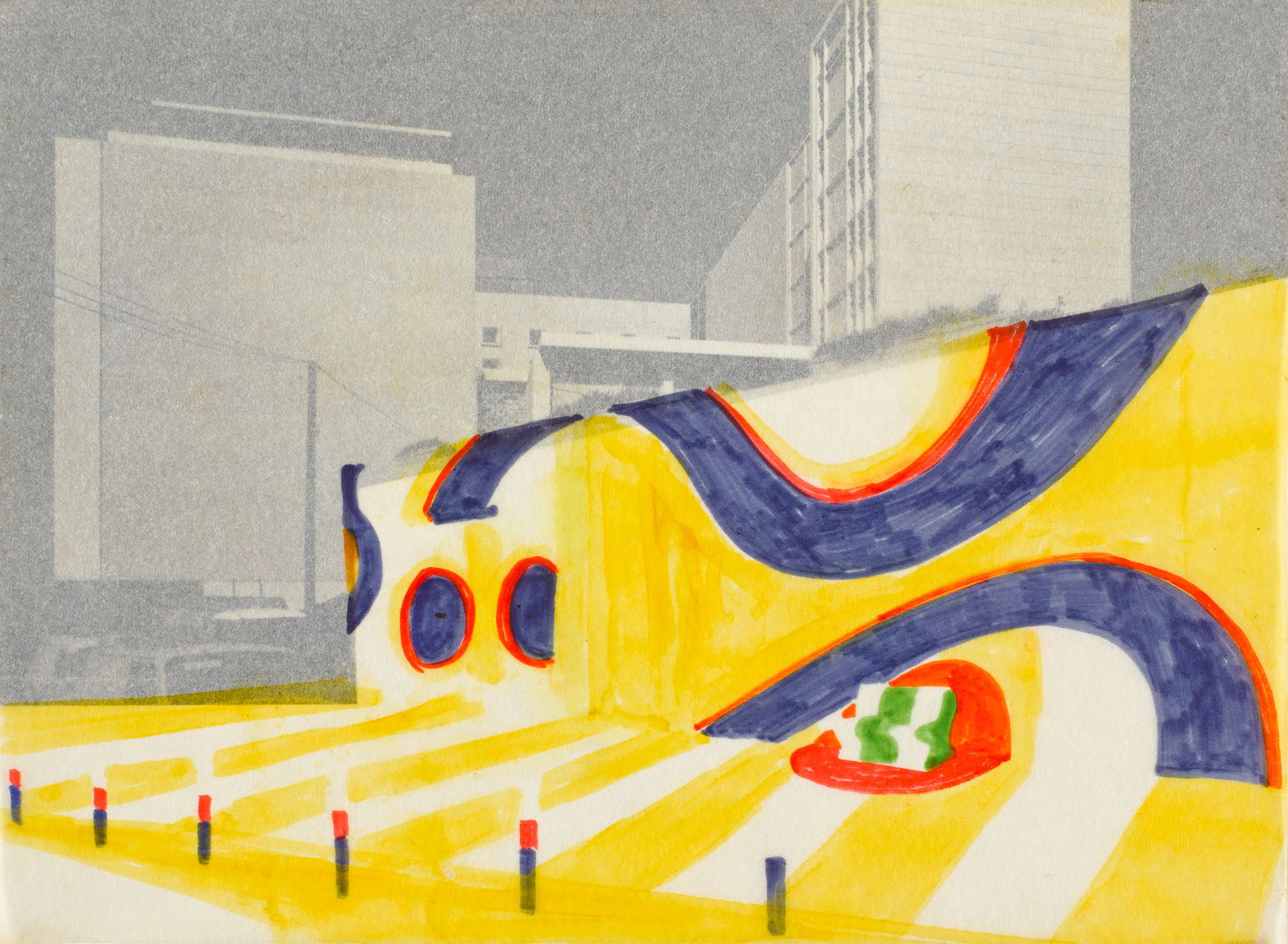
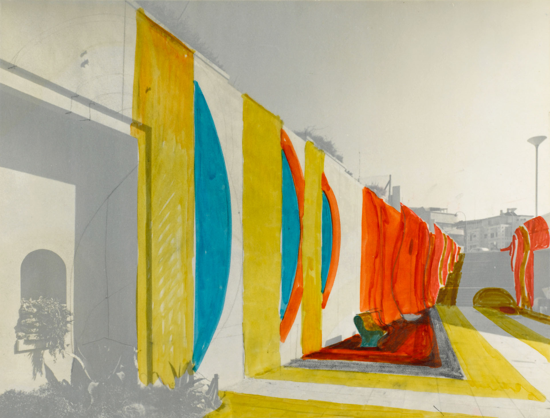
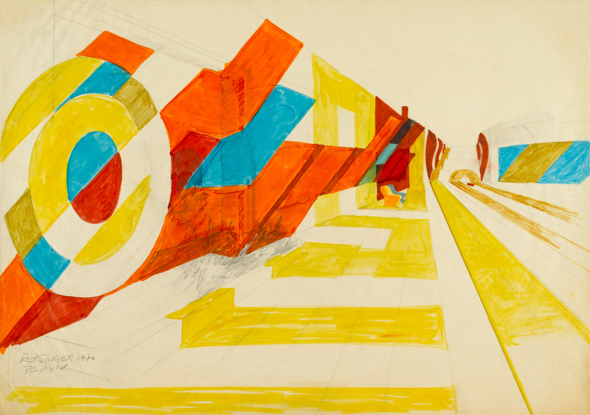
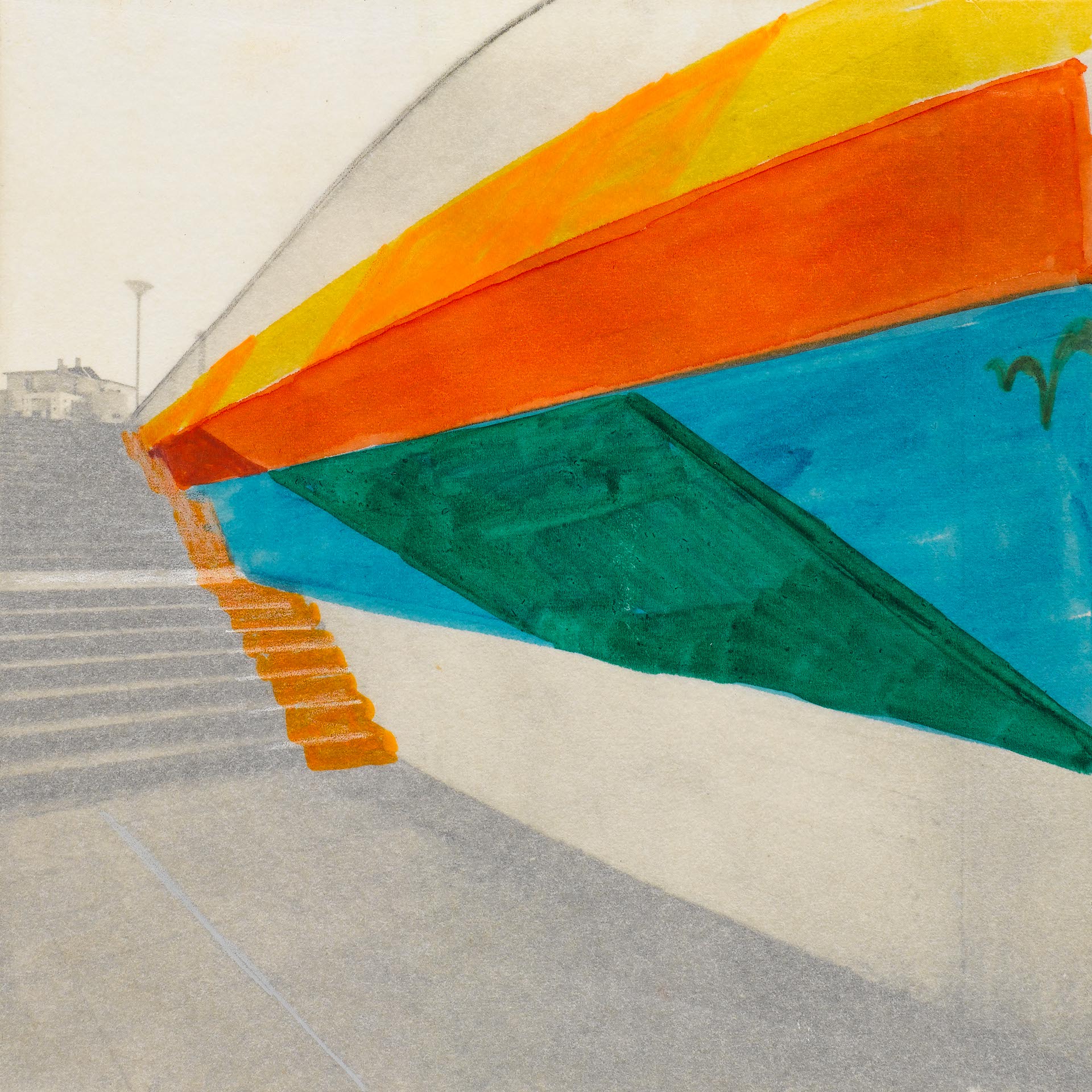
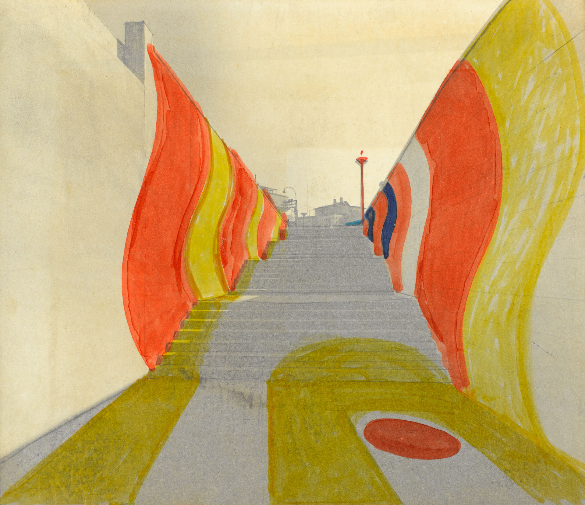
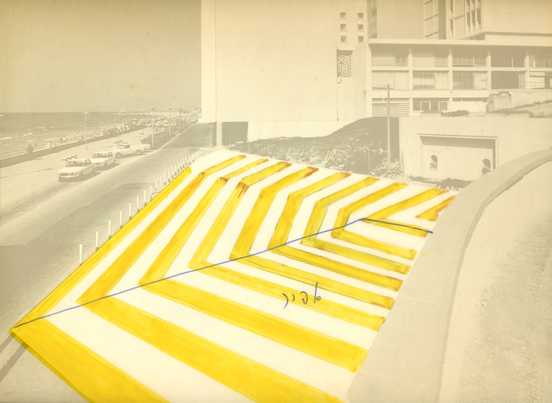
The Tel Aviv promanade and the aestheticized landscape.
– Adrian Shaughnessy –
Behind Dan Reisinger’s artistic rhetoric is an honest desire to create an aesthetic landscape from the chaos of urban clutter. And what better way to start than with the grandest and most cherished symbol of all.’
Reisinger’s use of colour is at the core of nearly all his work. It is his way of ‘enlarging the scope and adding volume’ to the interiors and exteriors of buildings; it is his way of unifying disparate architectural environments; and his way of adding a note of chromatic excitement to otherwise drab and quotidian locations. Reisinger’s philosophy can be seen to good effect in Maxima, the industrial plant in the Negev desert that he designed in 1977. Under his upbeat colour regime, the utilitarian silos, cooling towers, metal gantries and steel ducting that housed the machinery required to separate various gases from air for use in the aviation industry and in hospitals, were transformed into a joyous explosion of architectural delight.
Here, in the middle of the monotonous Negev desert, was proof that industrial architecture – normally bereft of colour – could be converted from the strictly functional to the emotionally engaging by the robust application of graphics and colour. Even Maxima’s hard-nosed French managers and engineers, when they visited the newly painted site for the first time, were enchanted by Reisinger’s daring makeover. And it’s not hard to see why: the vibrancy of his colour permutations had a boldness that turned the plant into a work of art.
So arresting and optimistic is Reisinger’s colour usage, that we are forced to contemplate where this predilection comes from. Reisinger maintains that his remarkable sense of colour is derived not from colour theory or from academic study, but comes instead from his genes: ‘My family were painters and decorators in Austria-Hungary and the Balkans.’ he states. ‘In the 1920s my grandfather painted stately homes and cinemas in Belgrade, in the old Yugoslavia. My father was a painter. This had a great influence on me.’.
Excerpt from: Dan Reisinger, Israel Museum, Jerusalem, 2016
Ed: Adi Engelman and Dan Handel
See original sketches at Centre Pompidou design and architecture collection
Supergraphic design of the Tel Aviv promenade, 1970

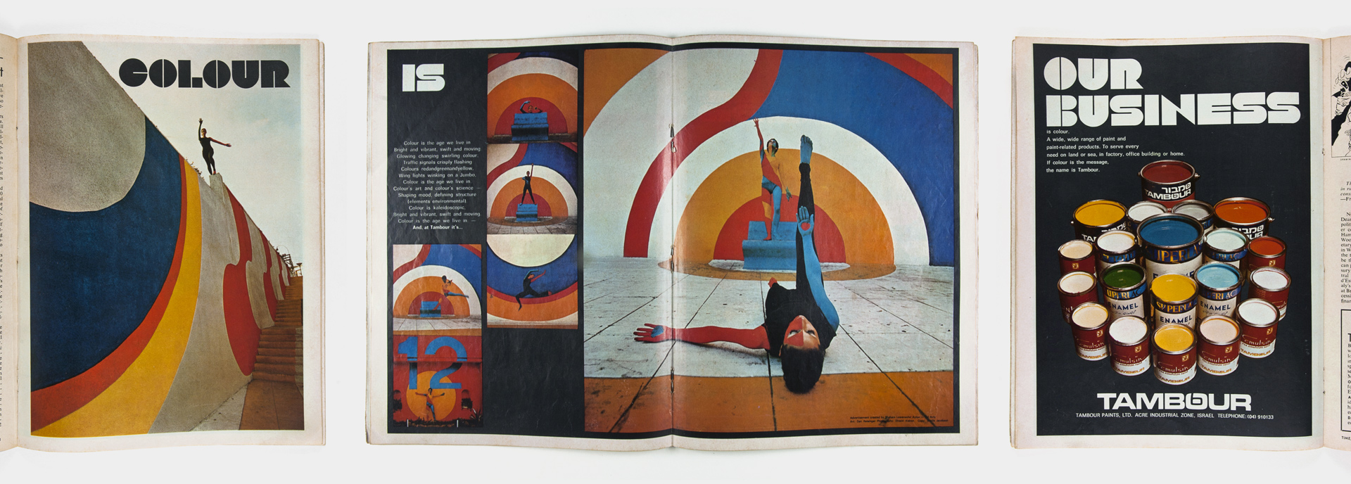
'Colour is Our Business', Ad for Tambour paint company, Time magazine, 1970