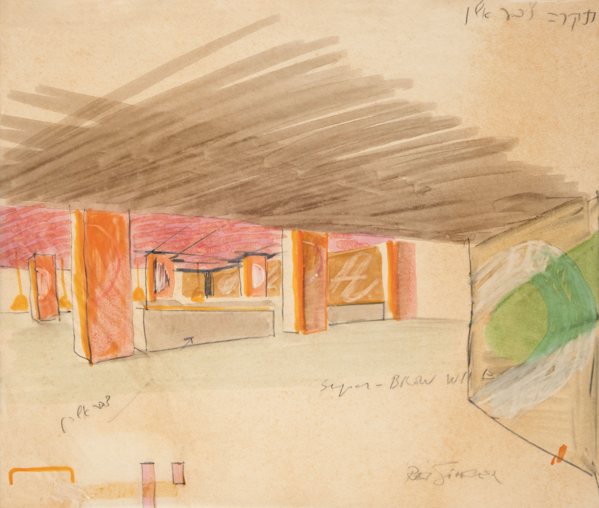
Supergraphics
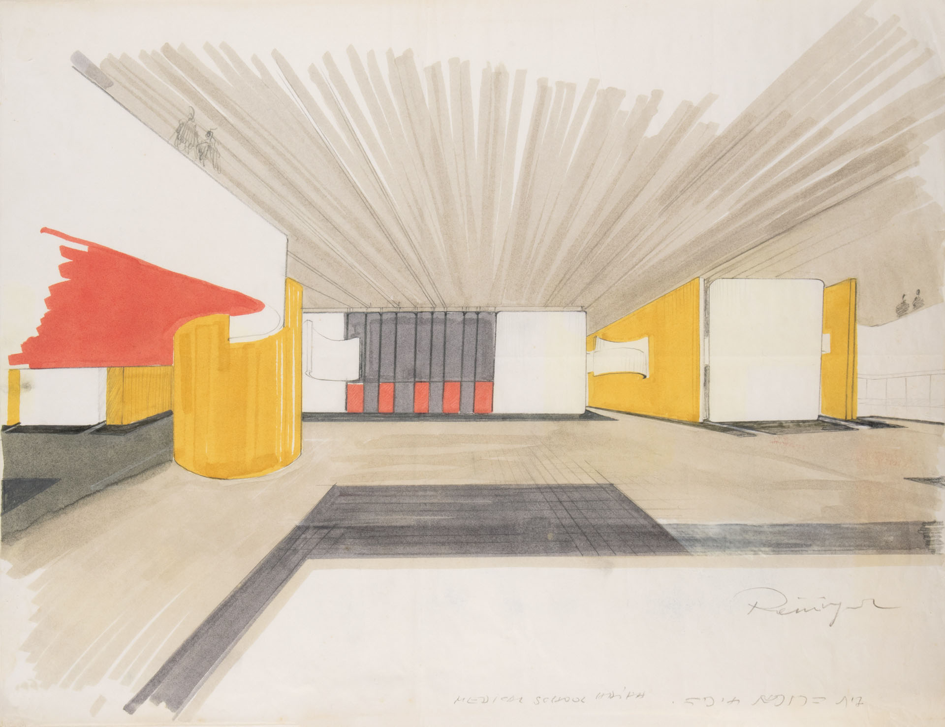
HAIFA MEDICAL SCHOOL
HAIFA MEDICAL SCHOOL
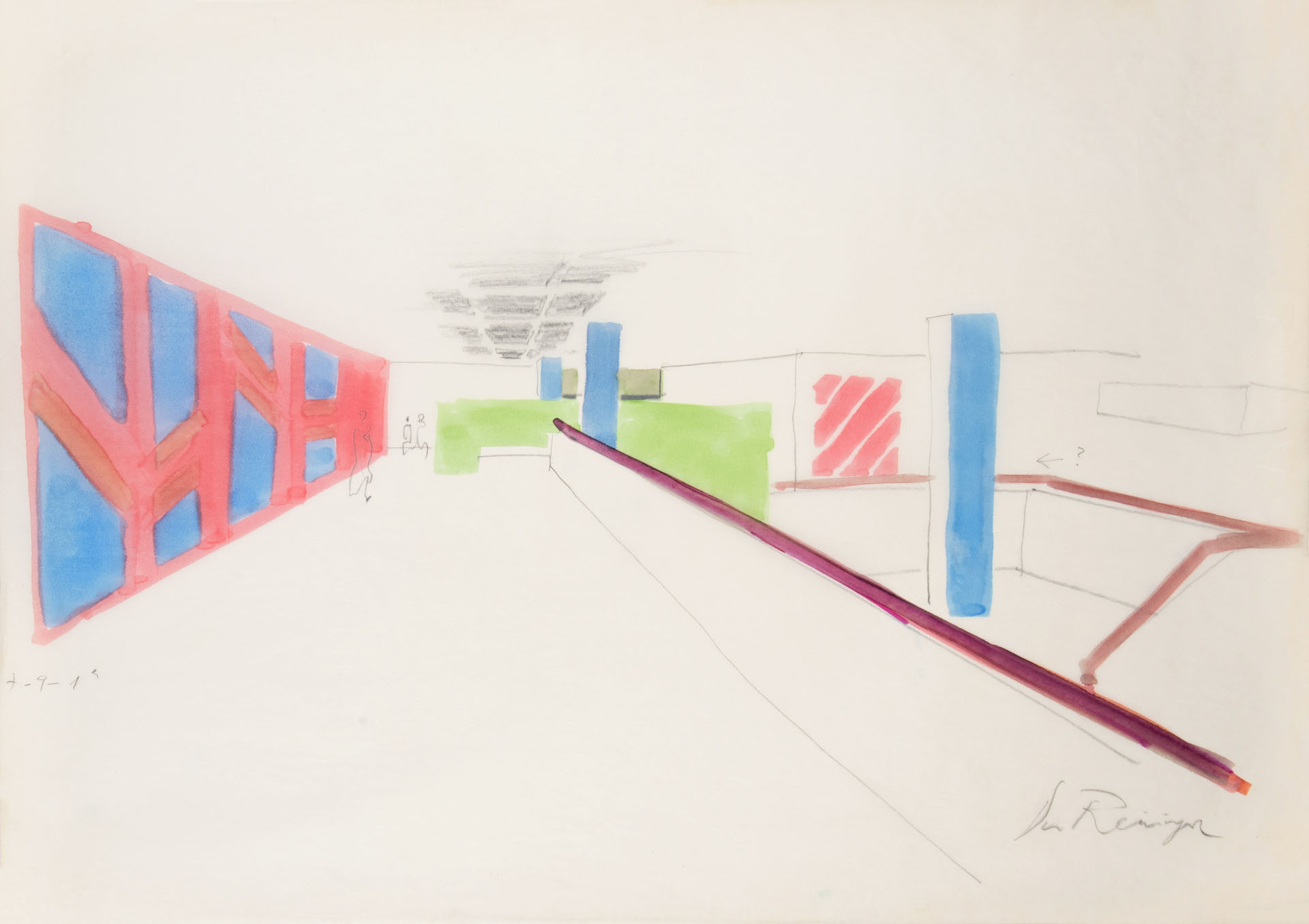
Haifa medical school environment and orientation design.
Arch. Arie Freiberger
The building is vertically designed and its orientation needs are determined accordingly.
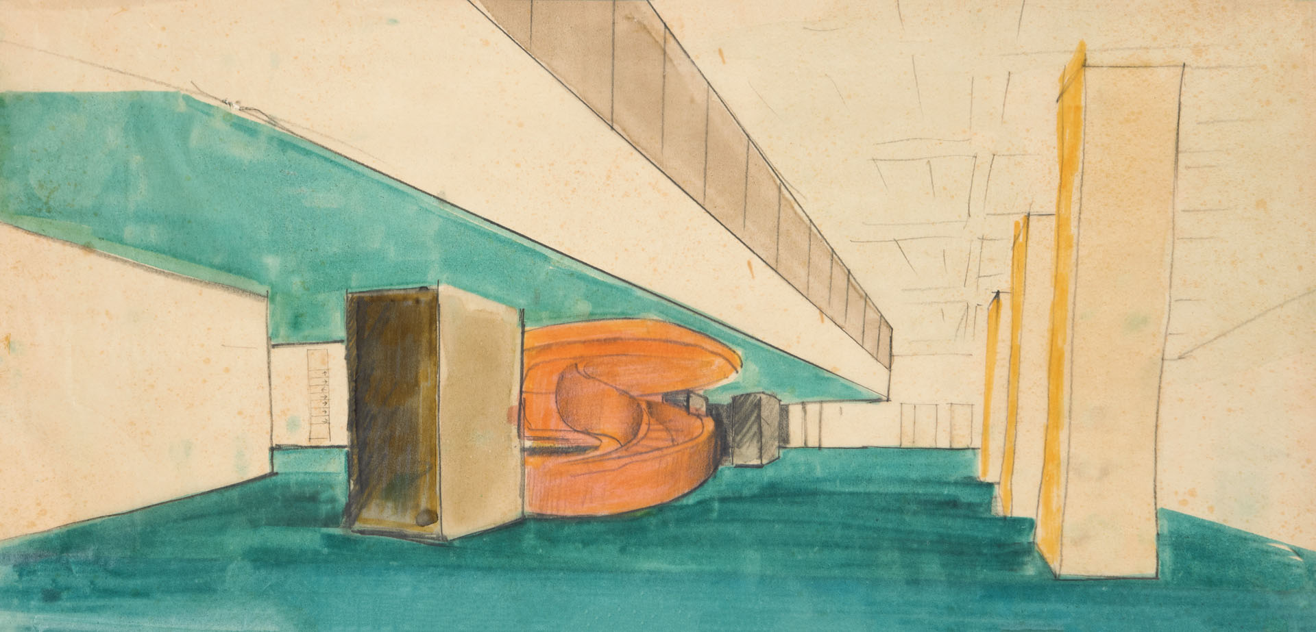
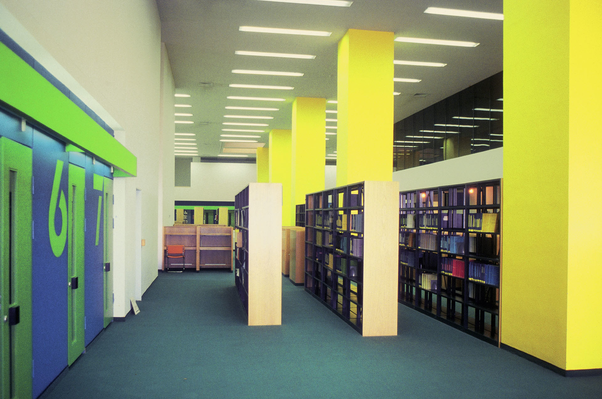
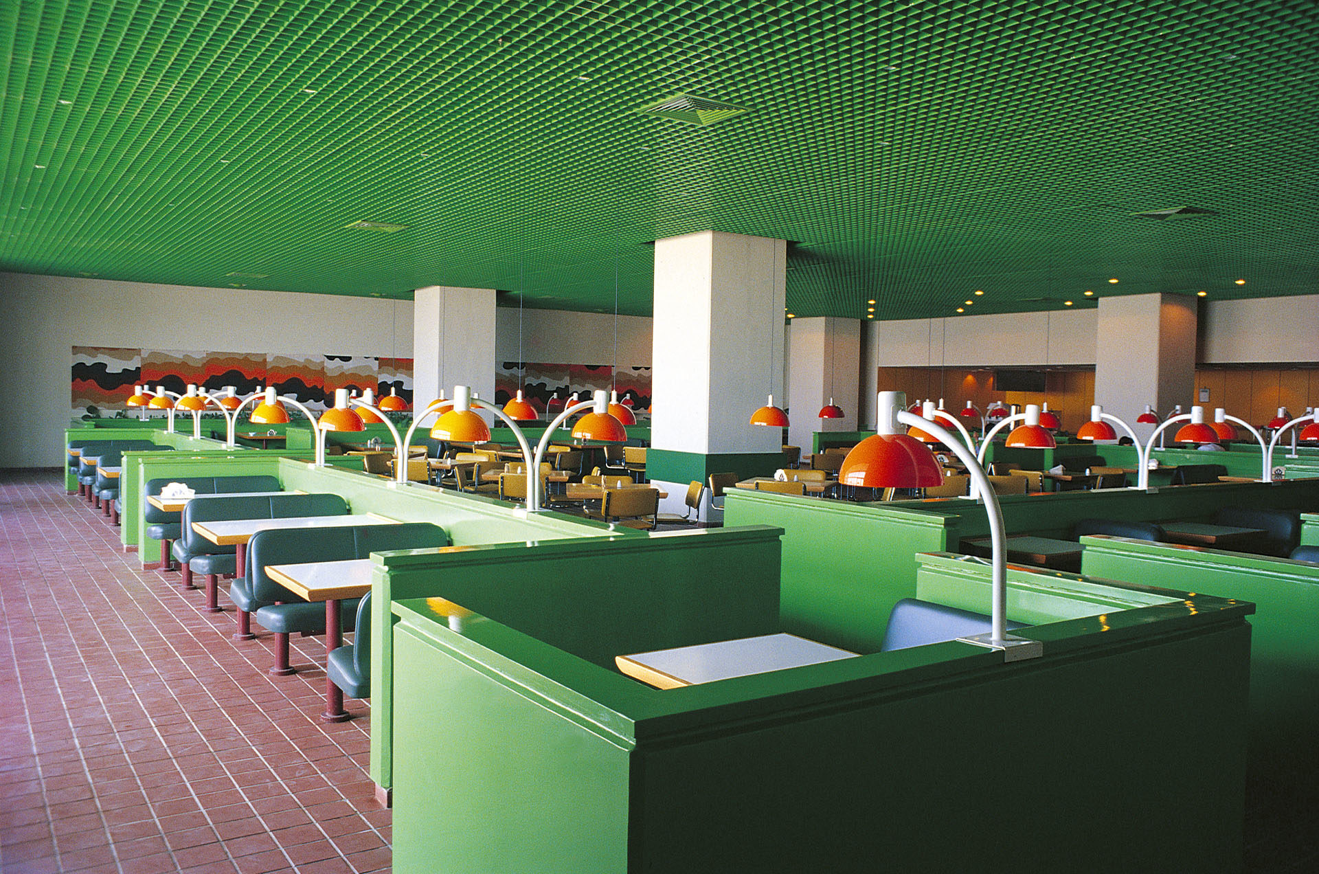
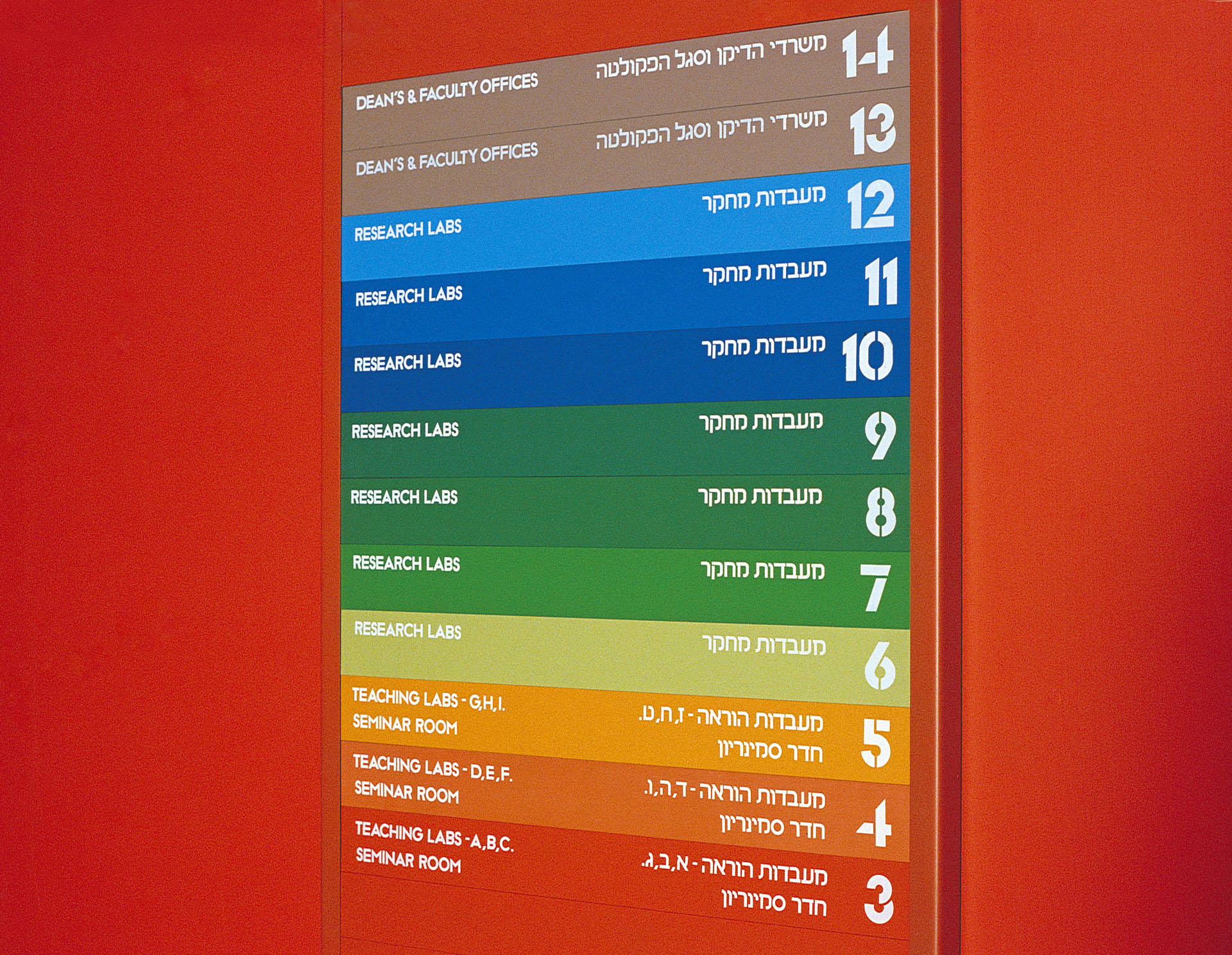
My concept was formed around the need to differentiate between each floor, basically divided into three groups: administration, laboratories and students, in addition to lecture halls, library and restaurant (the communal areas).
The extensive use of color rather than “materials” was not only a conceptual decision but financial as well – color treatment is less costly and in certain cases more effective.
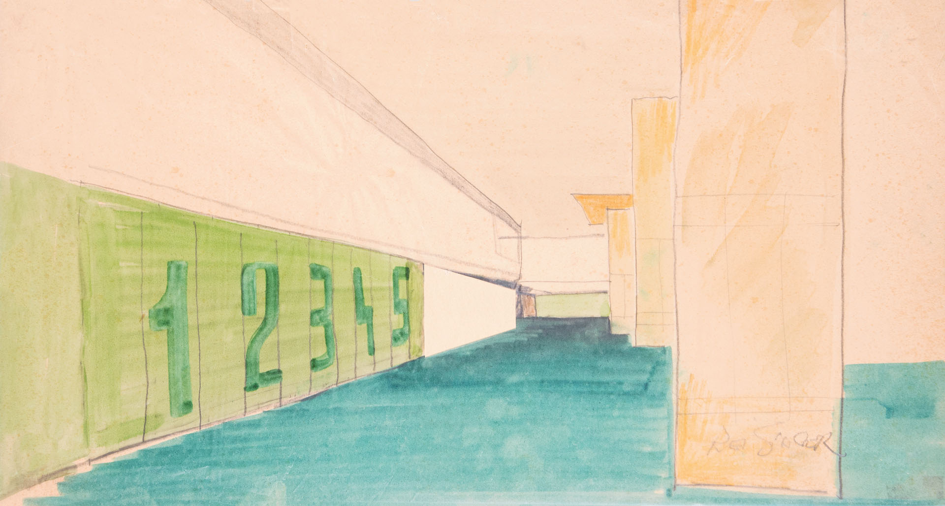
Once the environmental attitude was established, the orientation / sign system was a logical conclusion.
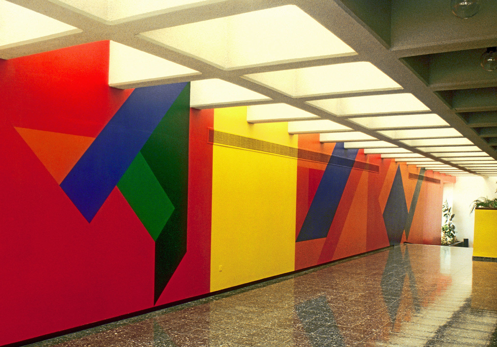
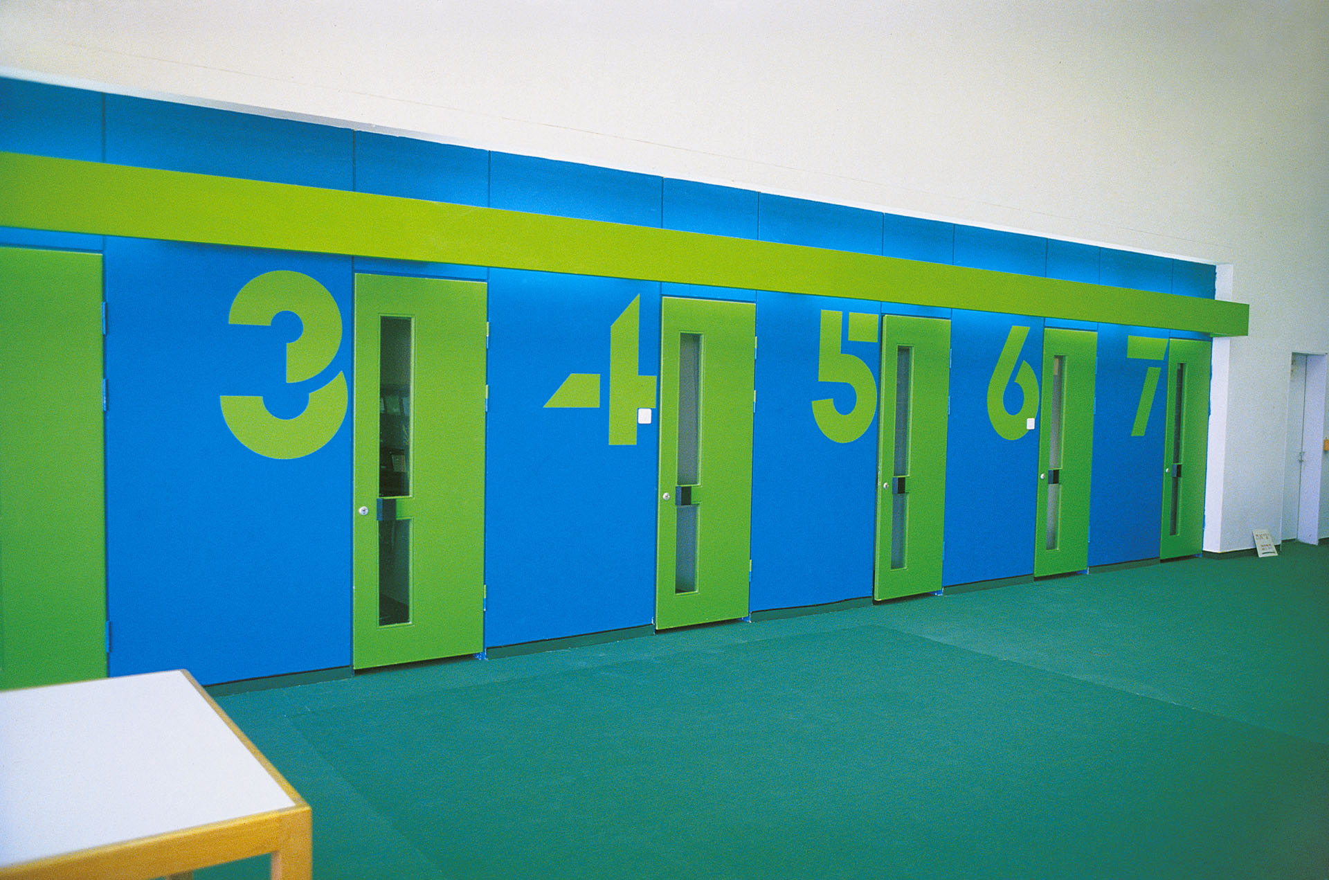
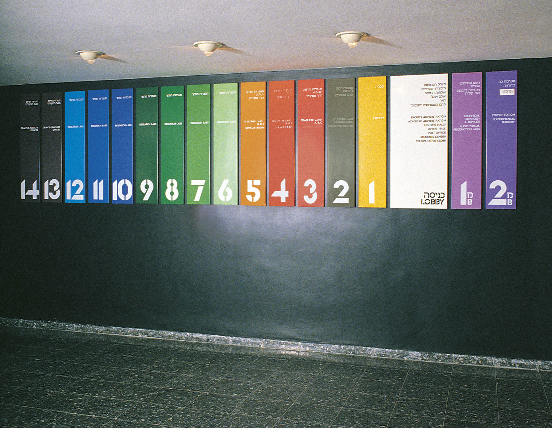
At the entrance to the lifts (the main communication in the building) a clear display of the functions on each floor is presented. On each floor, a vertical sign shows the functions available. At the given floor and general information about the rest of the floors, thus enabling us to relate to the content of the entire building from any given position.
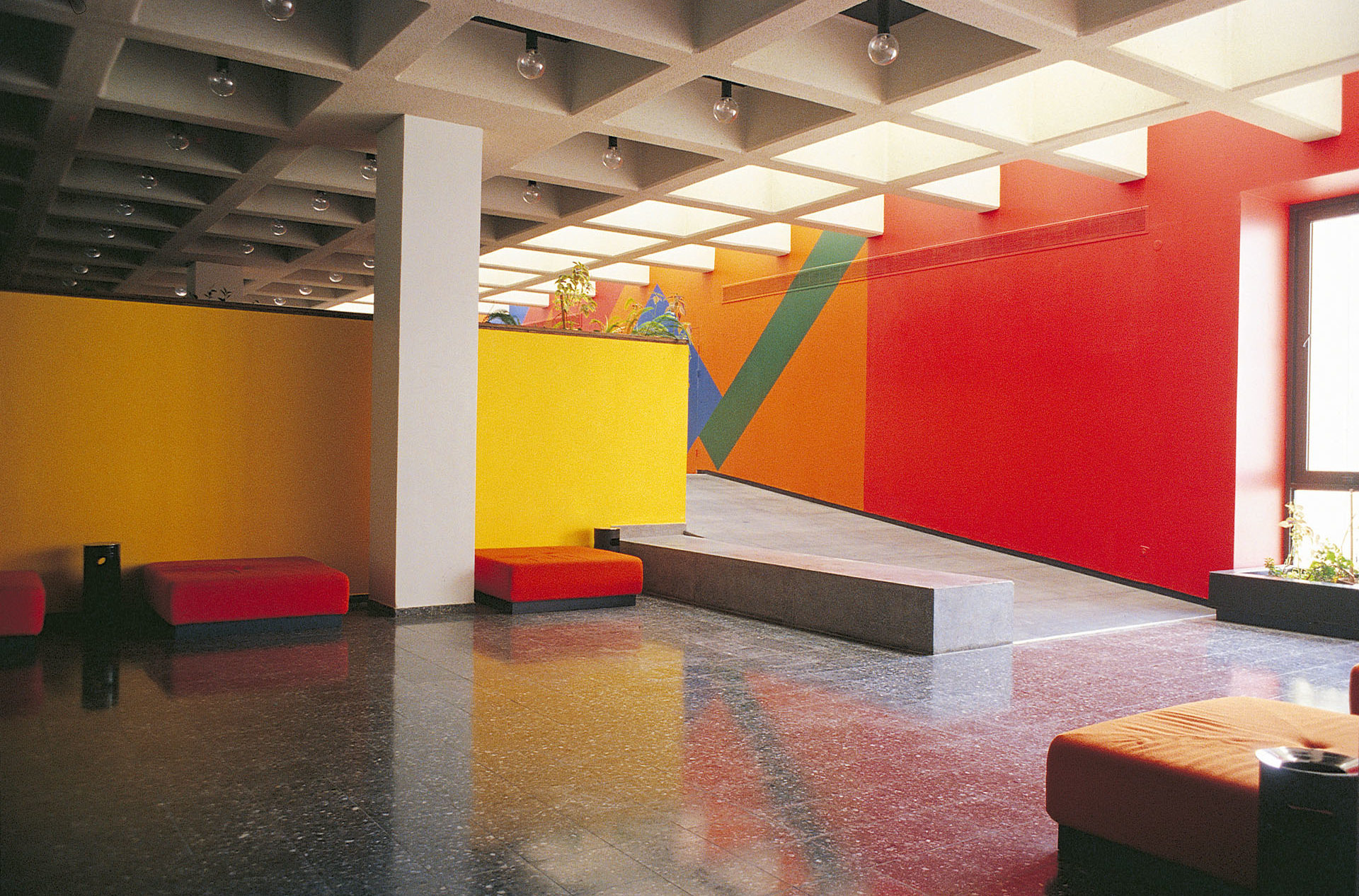
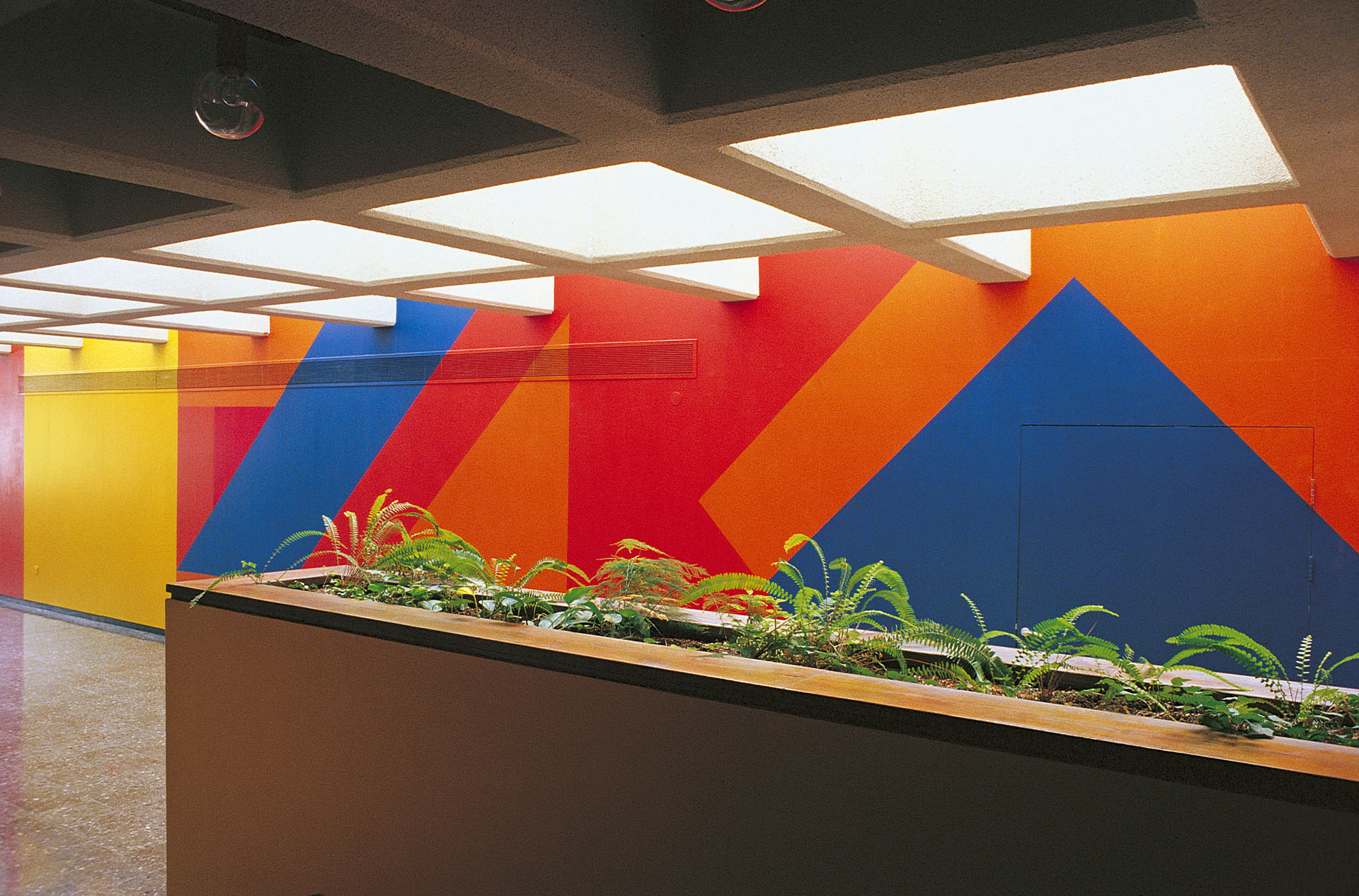
The color coding serves as an environmental statement in itself, while moving from functional to aesthetic presentations.
Public areas are not color – coded since color was used freely in carpets, textiles and wall – paint to create a vibrant atmosphere. (green was frequently introduced to remind us of nature). In the library, the heavy columns were painted yellow – a color that gives a non – volume effect – therefor easing on the visual impact of their massivity.
Finally, a new Hebrew typeface was designed for the sign texts throughout the building.
During the design and implementation process a close working procedure was maintained both with the architect Arie Freiberger and with representatives of the client. This, i am sure, contributed to the positive results we achieved.