TAMBOUR
Tambour paint company, 1991–95.
The design of Tambour’s new corporate identity was based on 3 factors which had to be addressed:
• The need to restructure categories of products into distinctive branches, i.e. paints, solvents etc.
• The introduction of additional services and products by the company.
• Architectural changes and enlargement of Tambour manufacturing facilities.
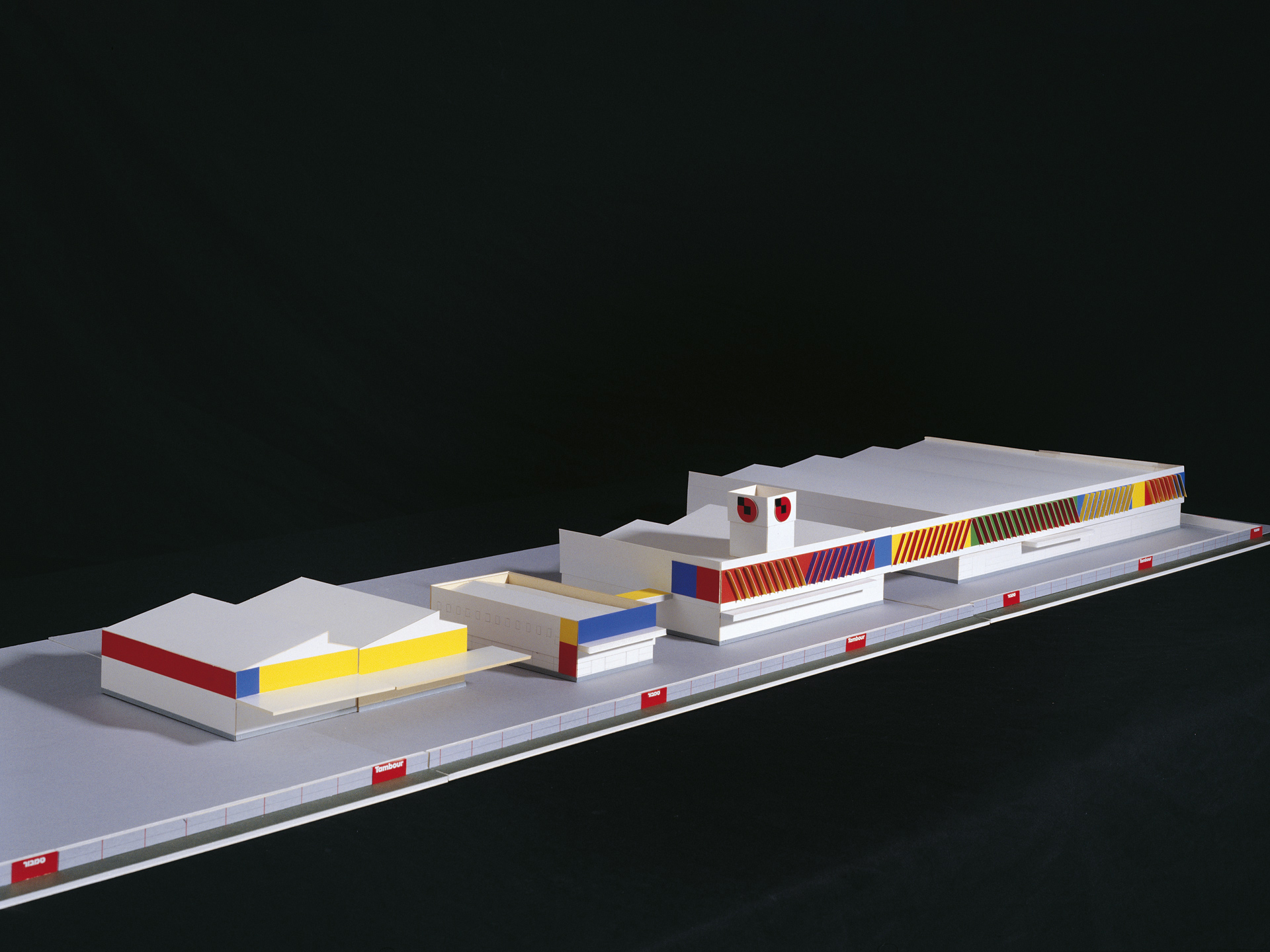
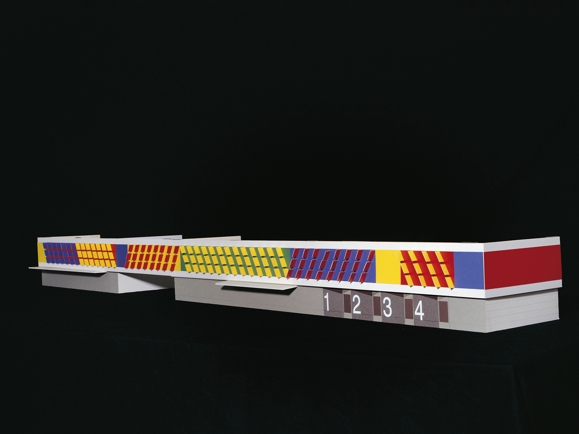
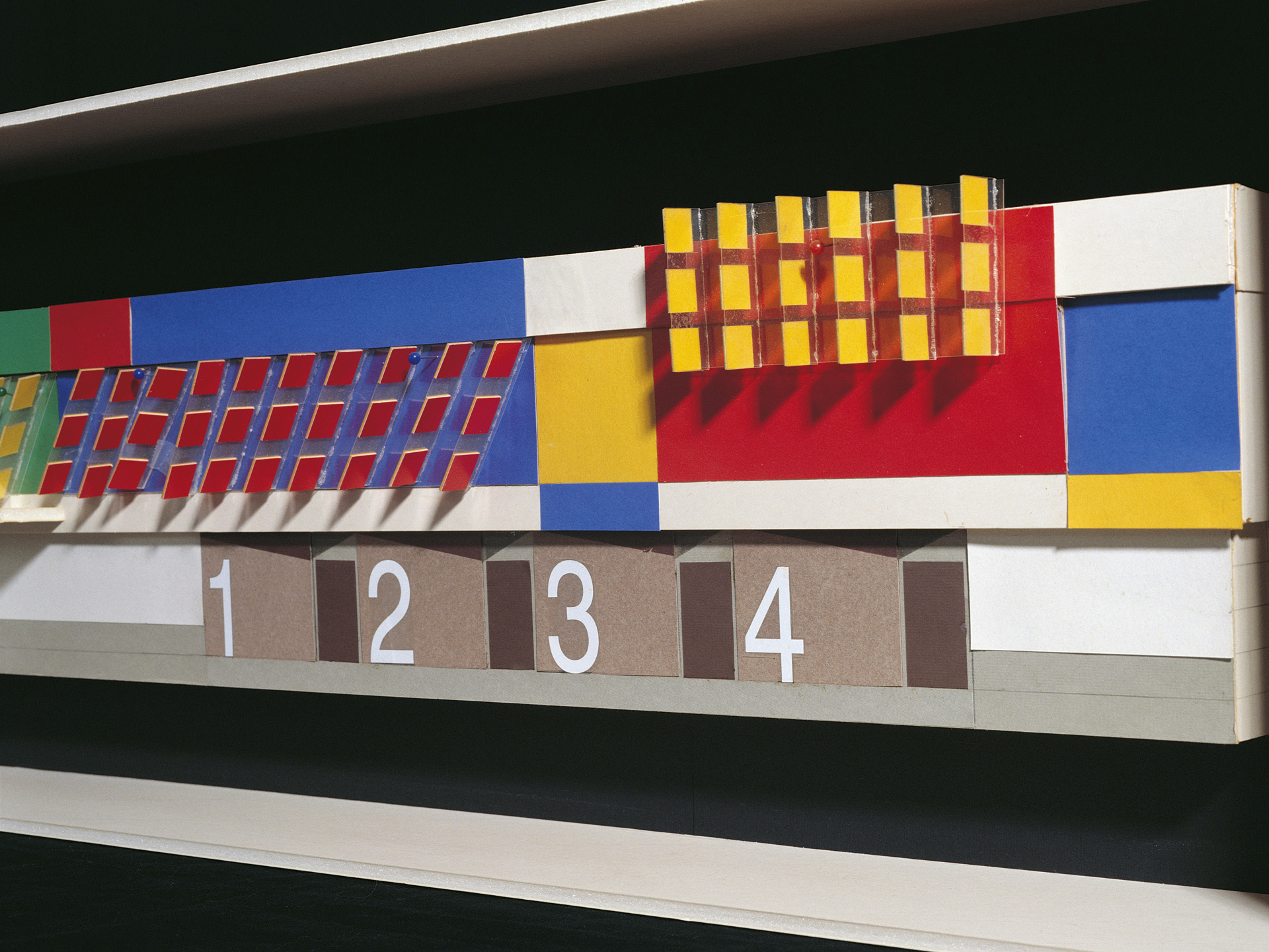
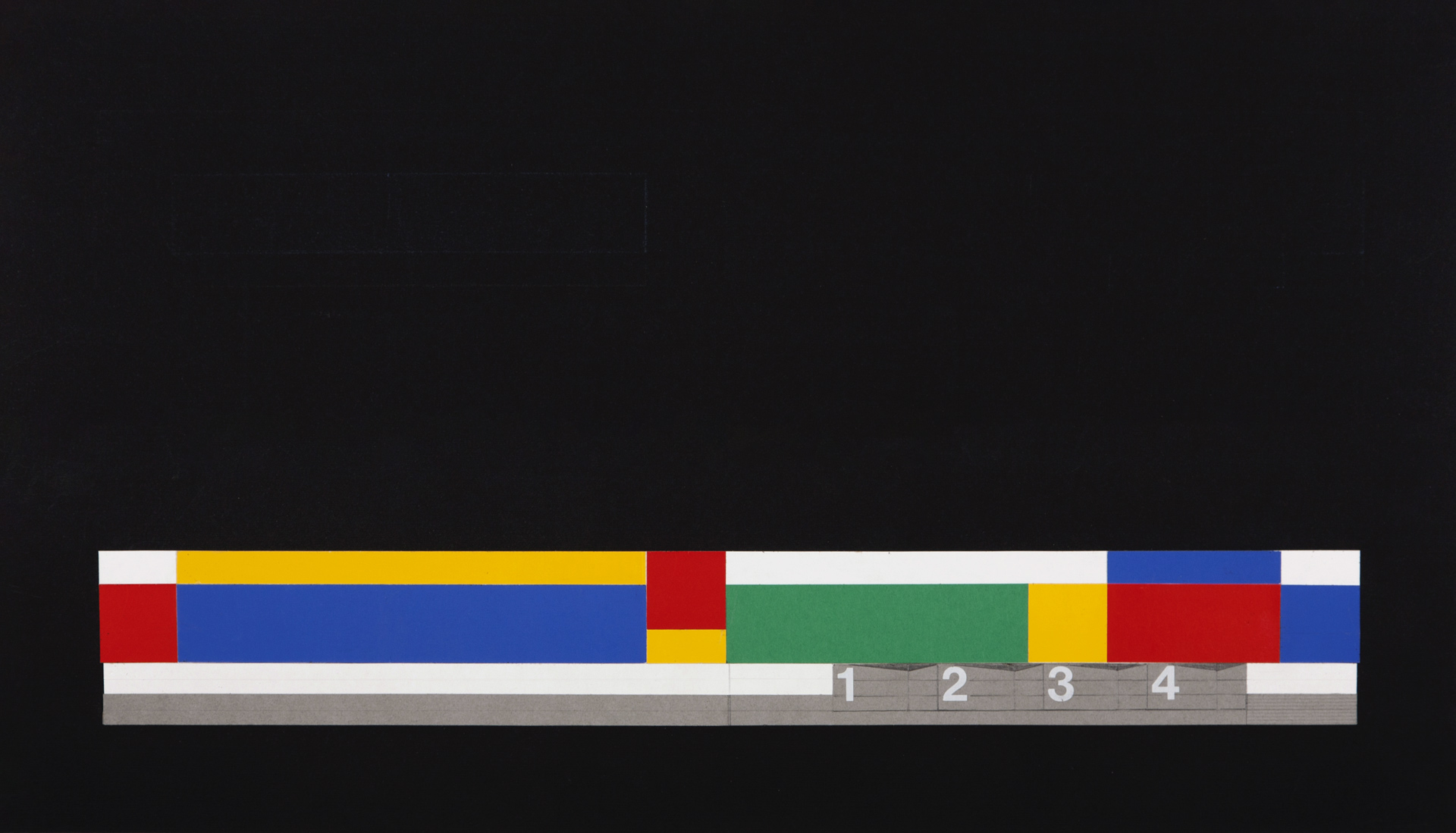
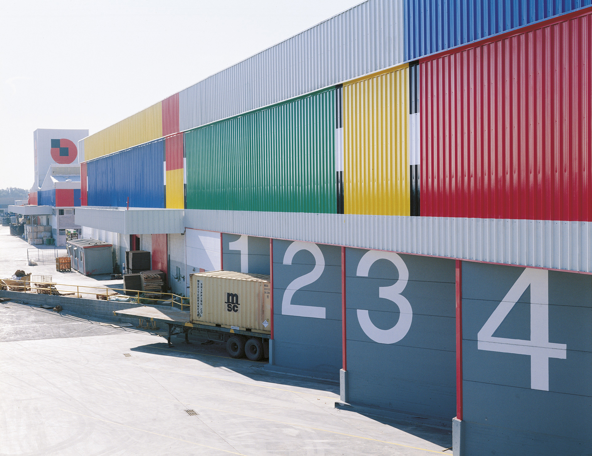
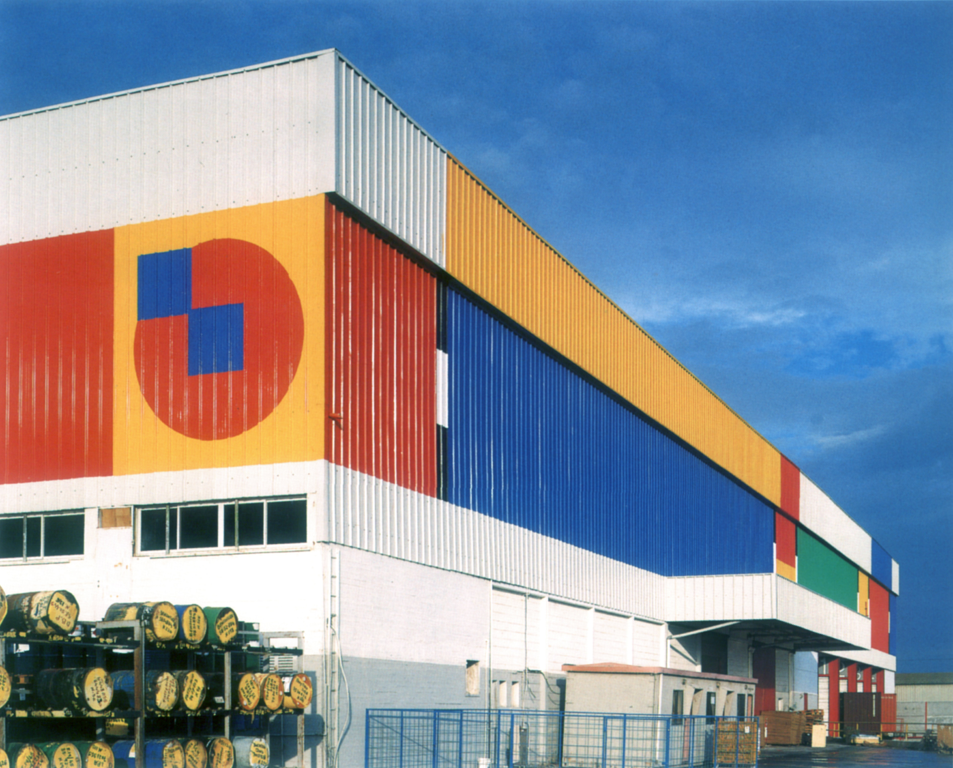
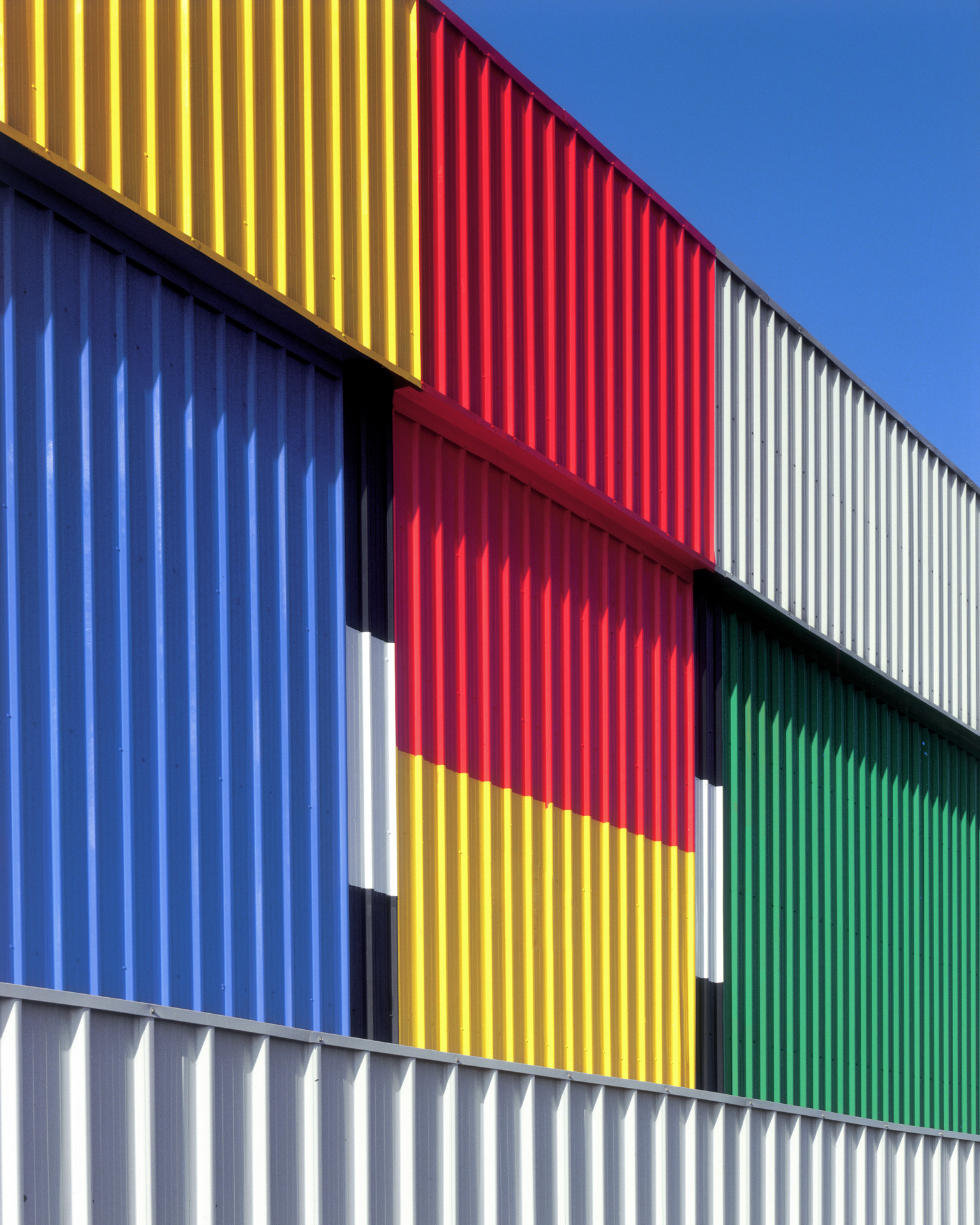
The new logotype, packaging system and environmental design – a 250 meter long façade, facing the main highway – were created to reflect the company’s predominance in the local market and to emphasize Tambour’s investment in better quality products and service to its local and international customers.
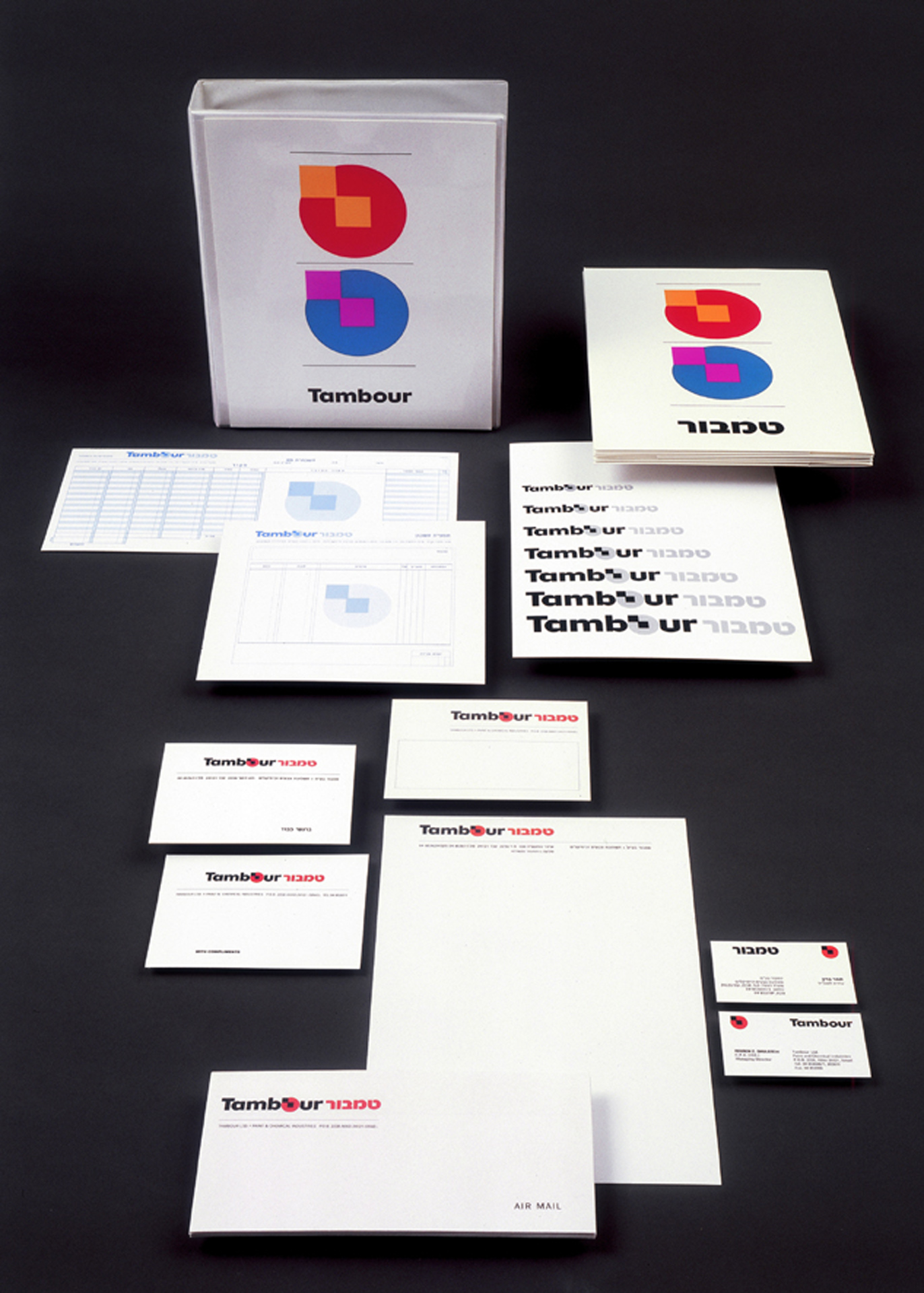
Paint can with stationary
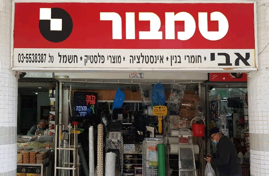
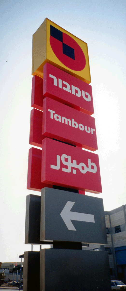
Tambout Signs are so prevelant, to the extent that the word Tambourya is synonim for hardwear store
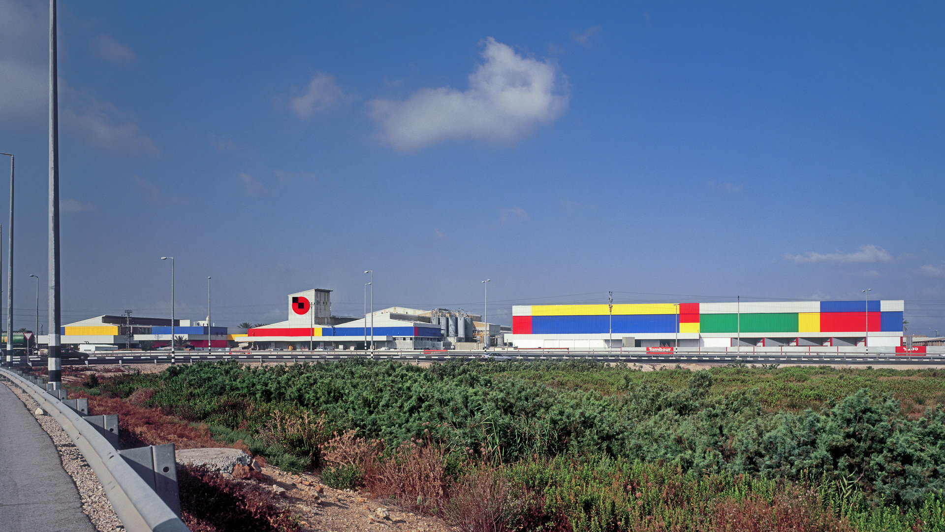
Supergraphic design of the factory building in Acre
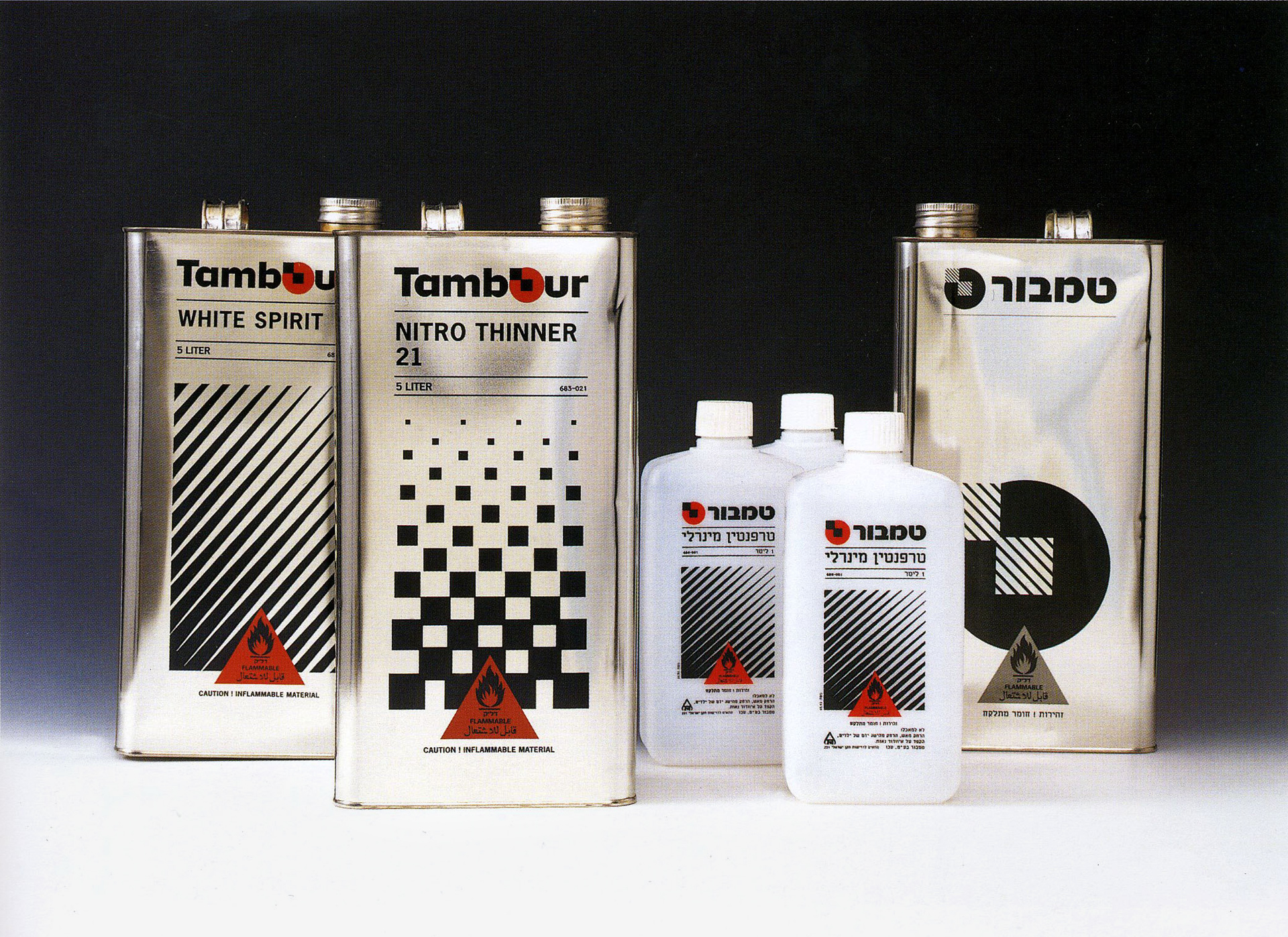
Brand diffretiation - solvants
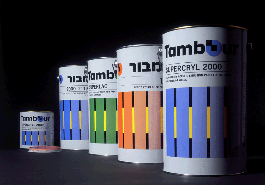
Premiom Paint
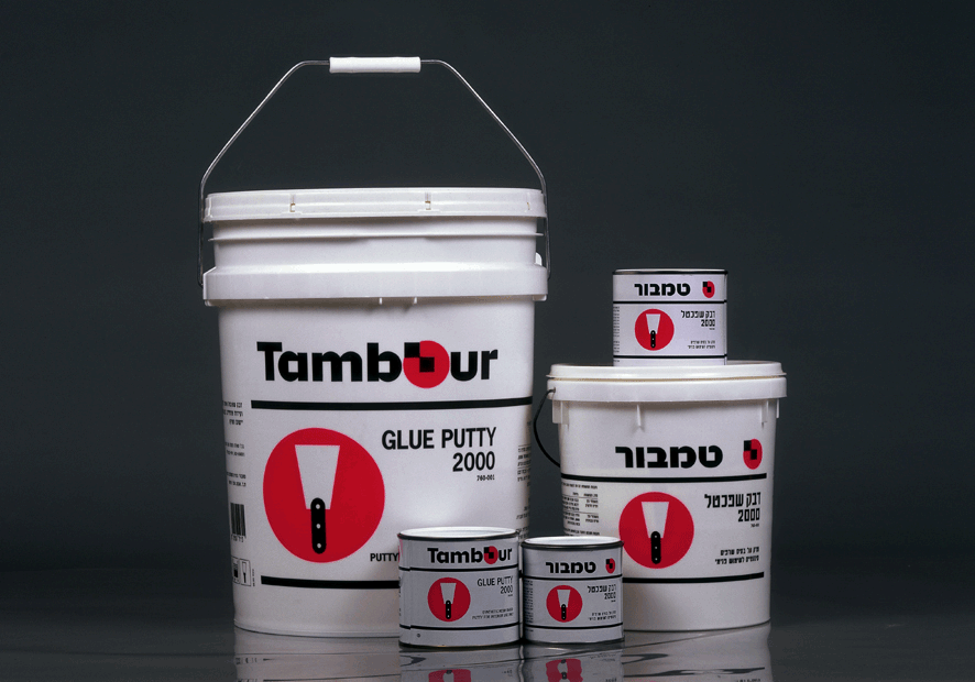
Glue Putty
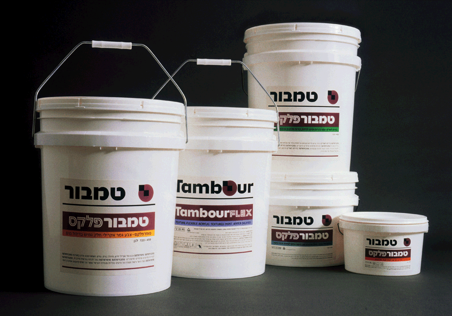
Tambourflex
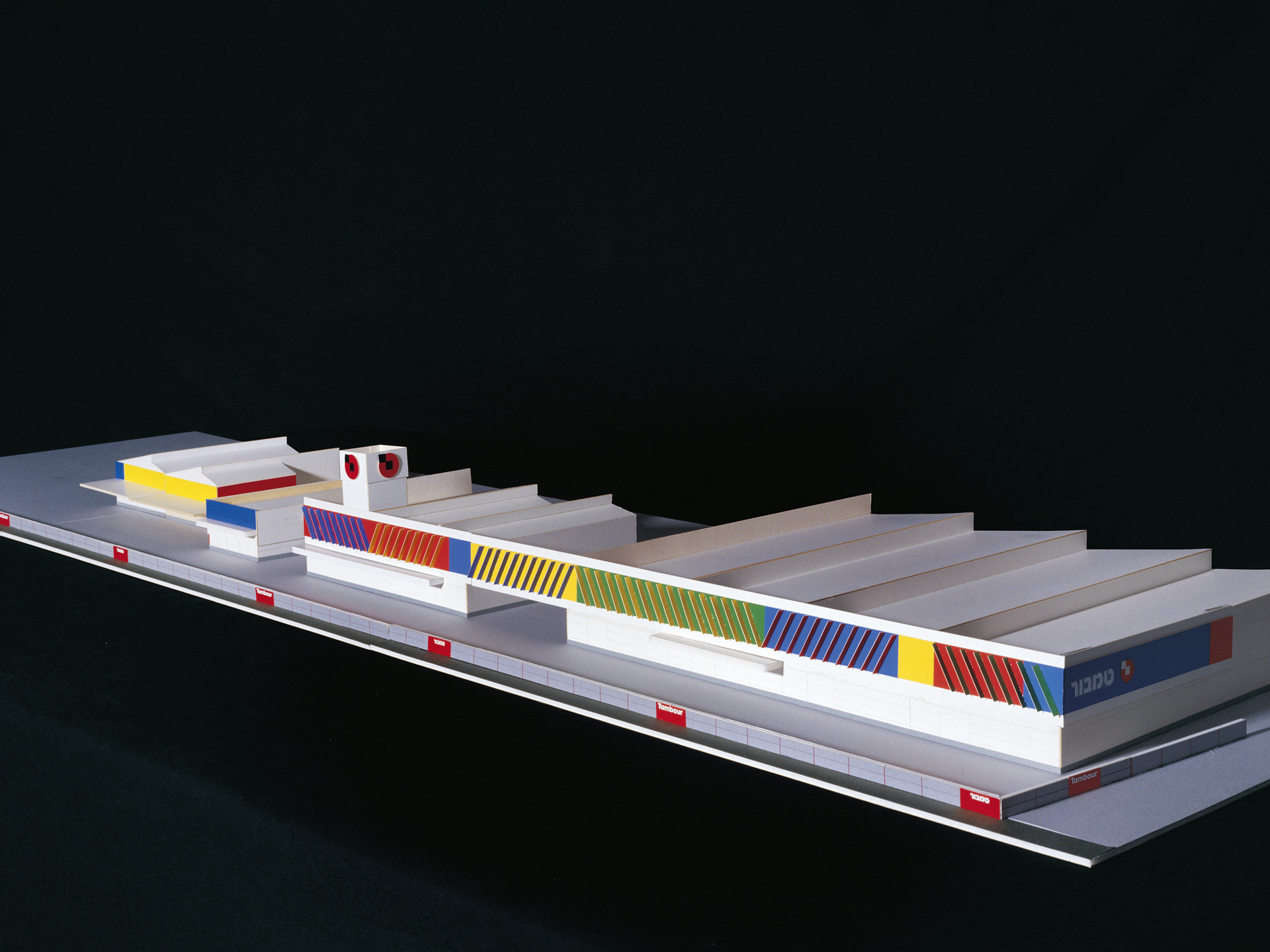
Model of factory building in Acre