EL AL

The creation of a corporate identity in response to a series of corporate needs arising within the various departments of a company over a period of years is a challenge which requires steadfastness of purpose and some optimism on the part of the designer. The new corporate identity developed for El Al, Israel’s national airline, was achieved in just such a manner – as a slowly evolving process in which each stage was viewed individually by each department head, rather than as part of a unified design intention. It was the responsibility of the designer to develop and maintain his design concept from project to project.
The concept we developed for El Al was based on the consideration that a corporate identity has to serve the company’s goals and reflect its potential and capability. Design can influence the development of a company, but the design is ultimately a mirror of the company’s excellence. The major design projects for El Al were carried out during its most vital and dynamic years. From the first we had a new totality in mind and were convinced of the need to create a new corporate identity based on the new logo – even if the company itself was not yet aware. The design projects that eventually evolved into a ten-year long design process were:
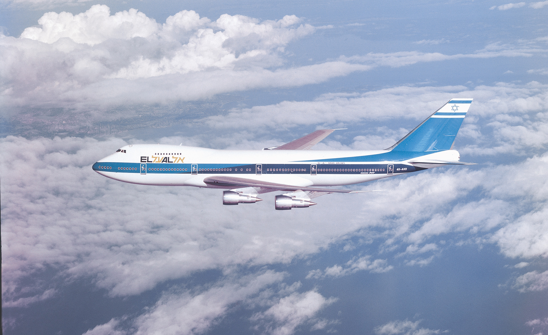
1. Creation of a unified Hebrew/Latin logo as part of the 747 livery design and environmental graphics for its interior
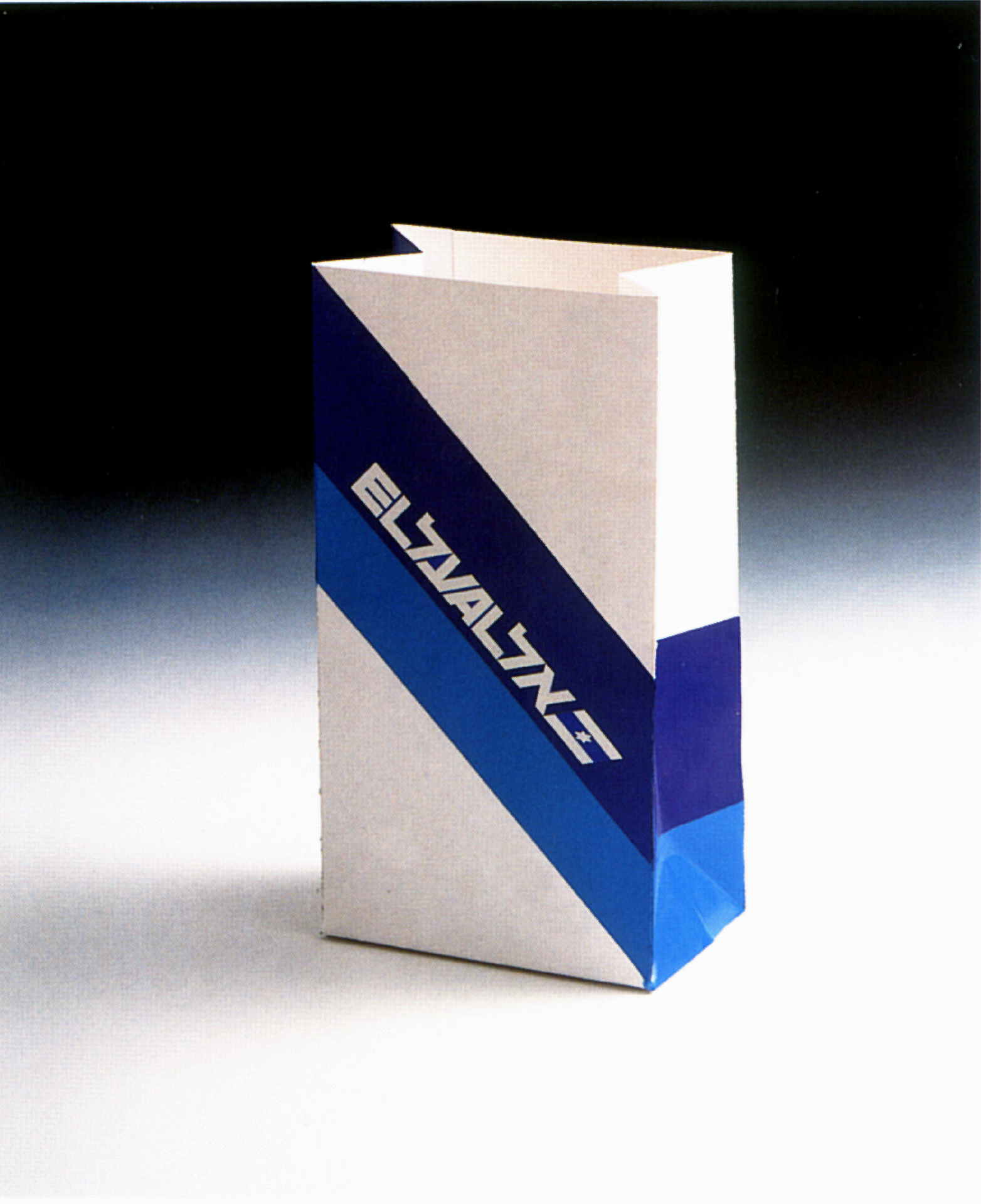
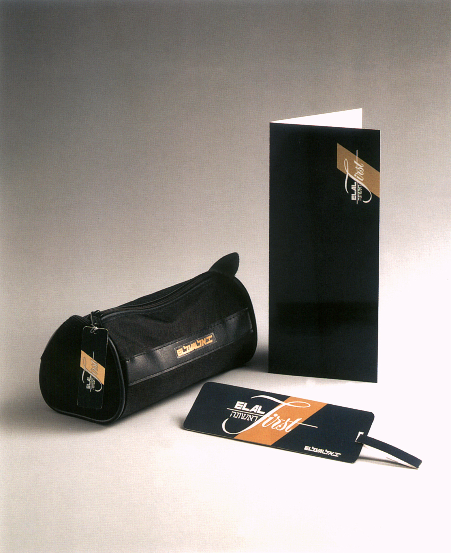
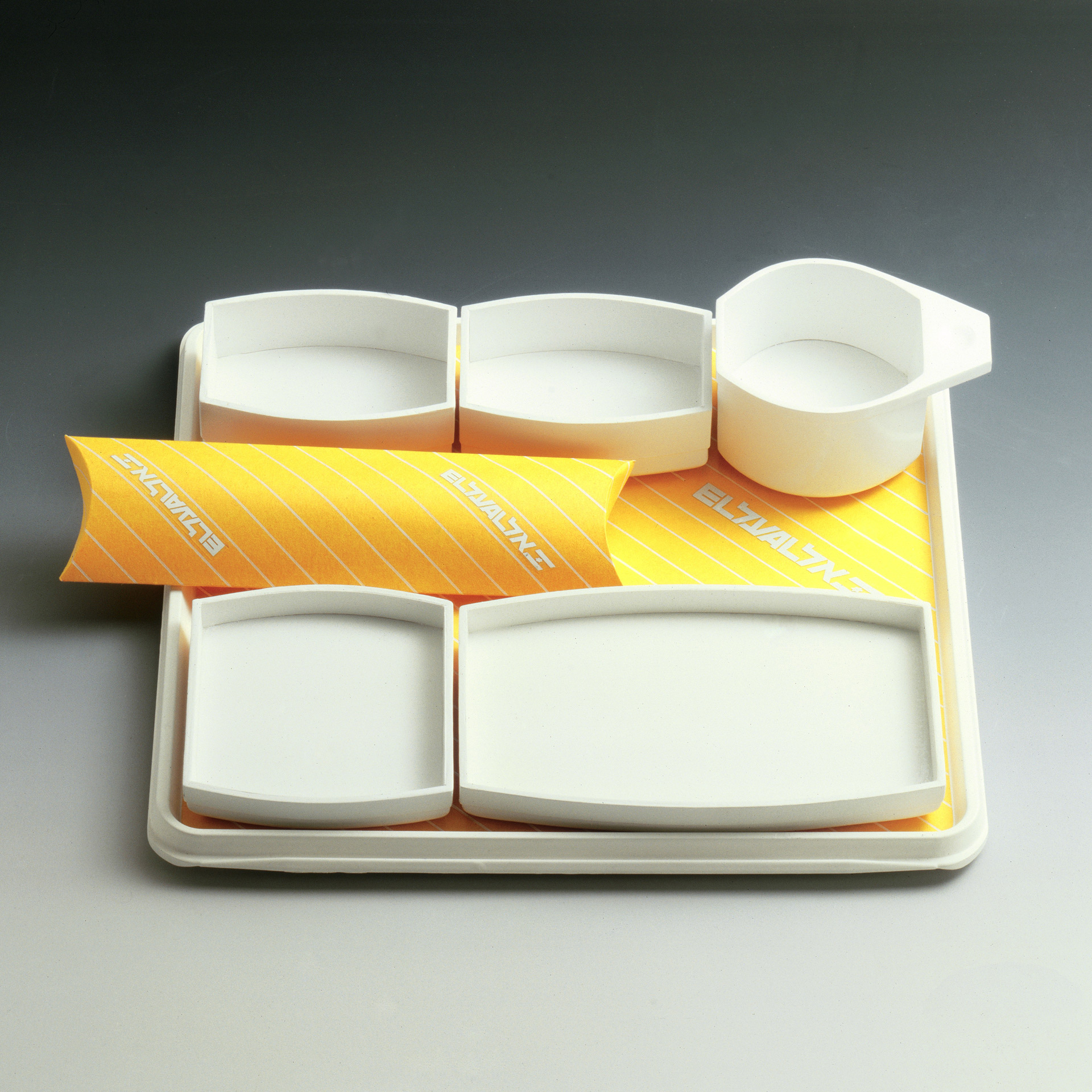
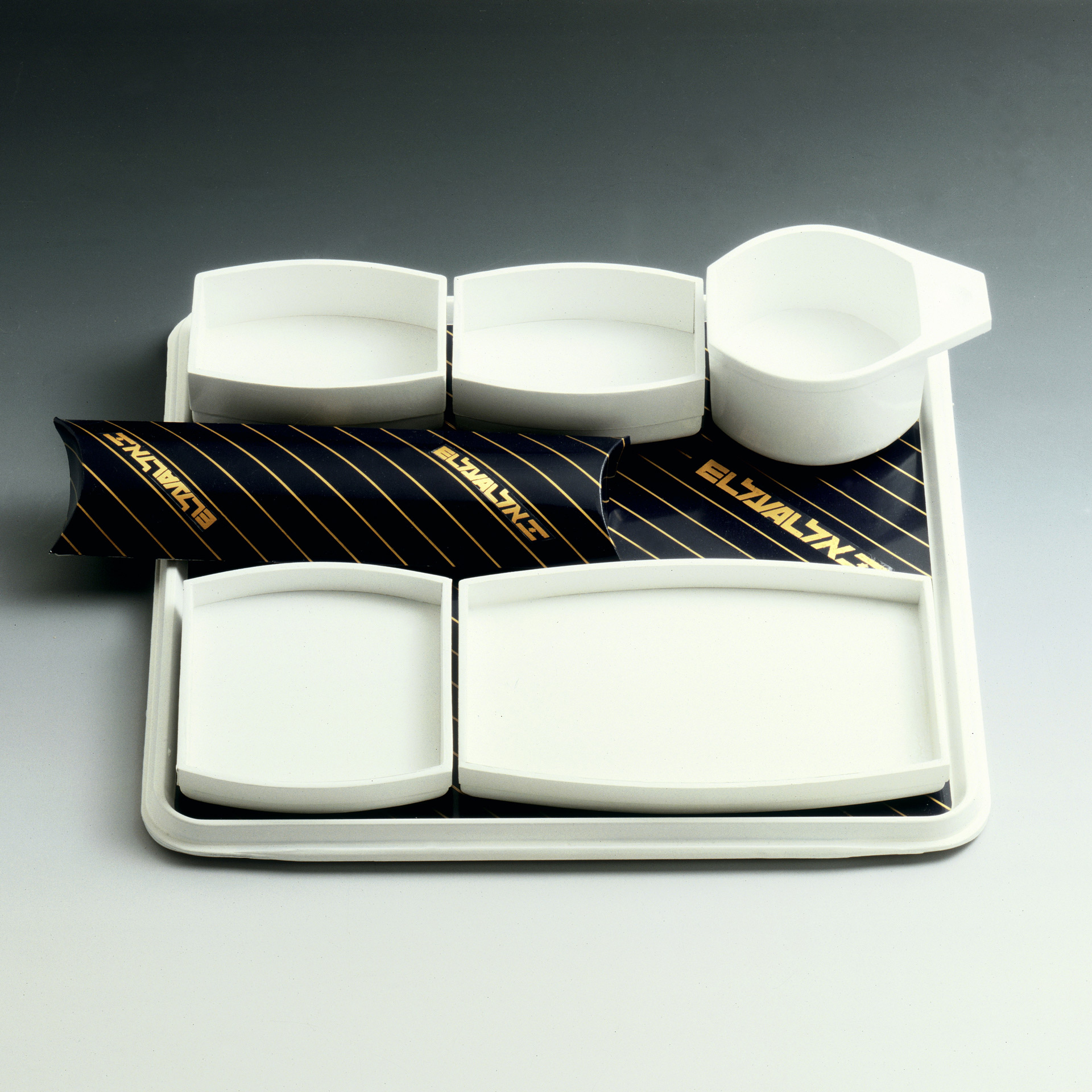
2. Design of passenger service items, catering items, brochures, etc.
3. Design of ground equipment mark ings and accompanying manual
4. Design of final version of unified logo and flag-company signature
5. Design of the company’s stationery with its manual
6. Design of 737 and 767 aircraft livery and interior
When El Al was founded shortly after the establishment of the State of Israel in 1948, very little was thought about the logotype or corporate identity. There was, however, an intuitive statement of pride about the very existence of a Jewish national airline, which immediately found expression in the decoration of the tails of all the aircraft with the Israeli flag, which consists of blue and white stripes and the six-point Star of David. This was – and is – a strong visual statement of “keep the flag flying”, which will remain with El Al, while design policies may come and go.
The Hebrew Alphabet
Despite the fact that the Hebrew alphabet is not a universal medium of communication, it would have been unthinkable to omit it from the national airline’s signature. A solution had to be found to maintain the Hebrew logo at the same level of visual expression as the Latin character logo, and at the same time create in internationally recognizable communication.
A Bridge
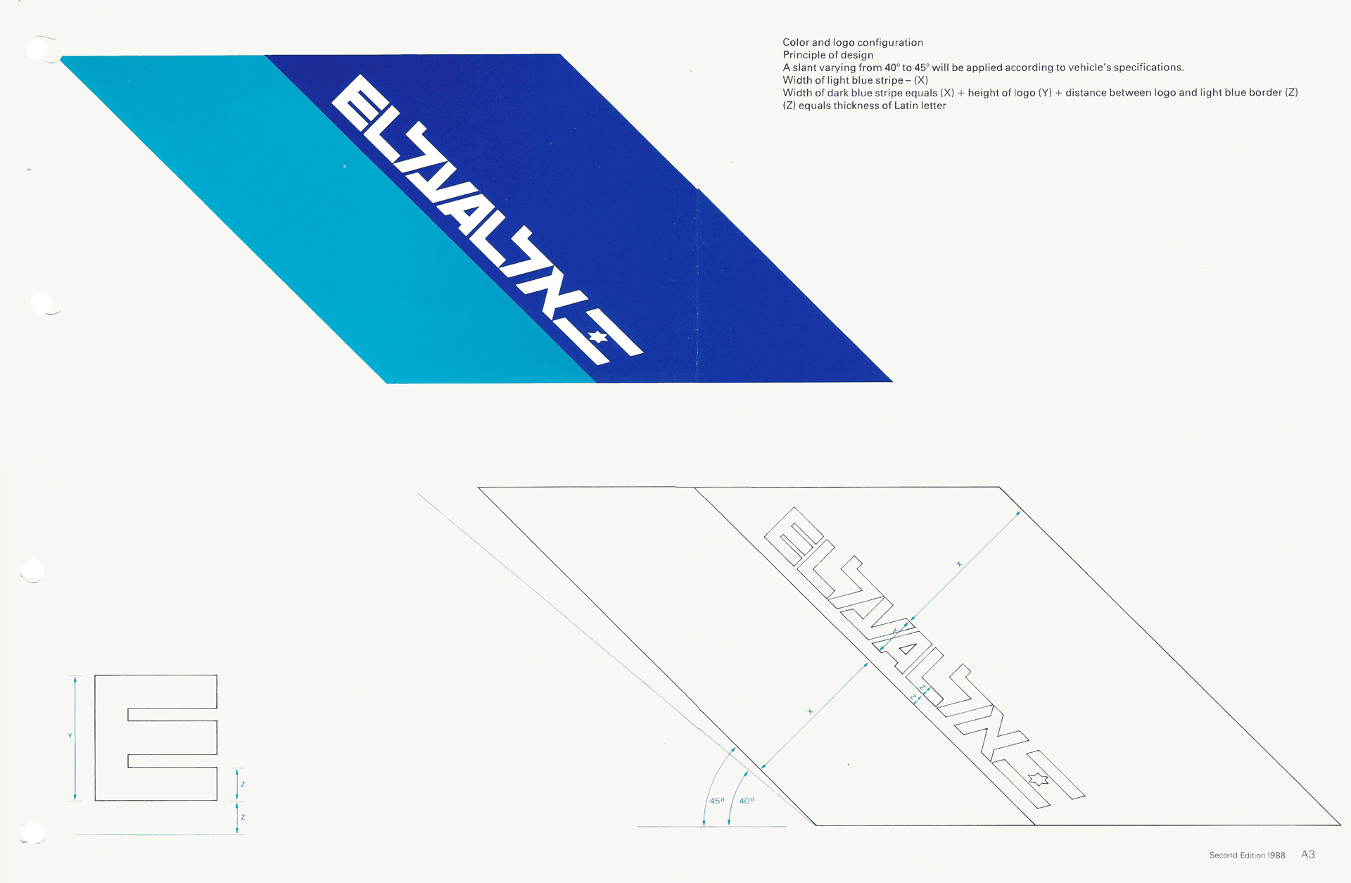
Israel’s geo-political situation has placed the national airline in the position of being the symbol of a bridge between the country and the rest of the world. The integrated Hebrew Latin character logo, with its two way readability – Hebrew from right to left, and the Latin characters from left to right-served to create an image of a bridge between the two cultures and transformed the national to an international visual communication.
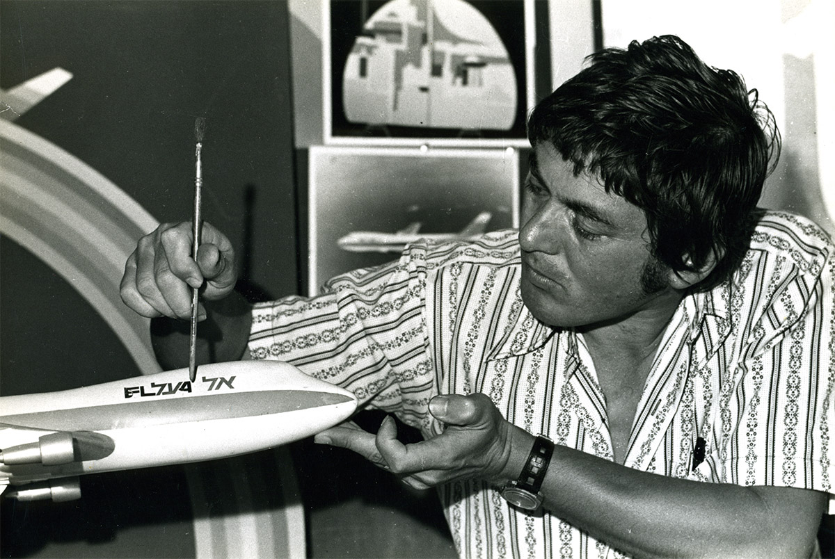
The difficulty we experienced in adapting the two square logos to an elongated area induced us to create a new logo integrating the two alphabets into a single statement. The new integrated logo was immediately accepted by the management for the 747 livery though no thought was given to its further application. We were convinced of the necessity to introduce it as the logo for the entire company and realized its potential as a cornerstone for a new corporate identity program.
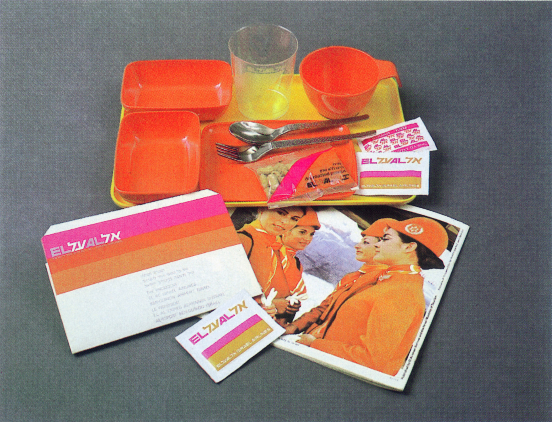
When the head of the catering division invited us to design the items for passenger food service, we exploited the opportunity to repeat the new logo and the orangepink-red color scheme that we had already introduced to the 747 interior. This was followed by the ground equipment division. When creating the manual for this division, we again took the opportunity to incorporate the new logo and to redesign the colors of the ground equipment from olive green and cobalt blue to fresh green, sky blue and white, in keeping with the new livery. A small manual containing minimum instructions and maximum examples was published. This resulted in quick and easy implementation. The El Al ground equipment livery subsequently won an international award in Chicago in 1974.
It was at this point that the company management realized that it had a new corporate identity that had evolved over a period of time, and that there was no turning back. In 1979 we were commissioned to create a logotype and stationery manual, thus finally establishing the new integrated logo and new color schemes as mandatory for all company divisions as of 1 January 1980. A corporate identity expressing Israel’s national pride and history, the region’s sun and colors and the company’s global operations had been established. With the introduction of the Boeing 747 to the El Al fleet, we were commissioned to design the aircraft livery and environmental graphics for the interior.
The Sun
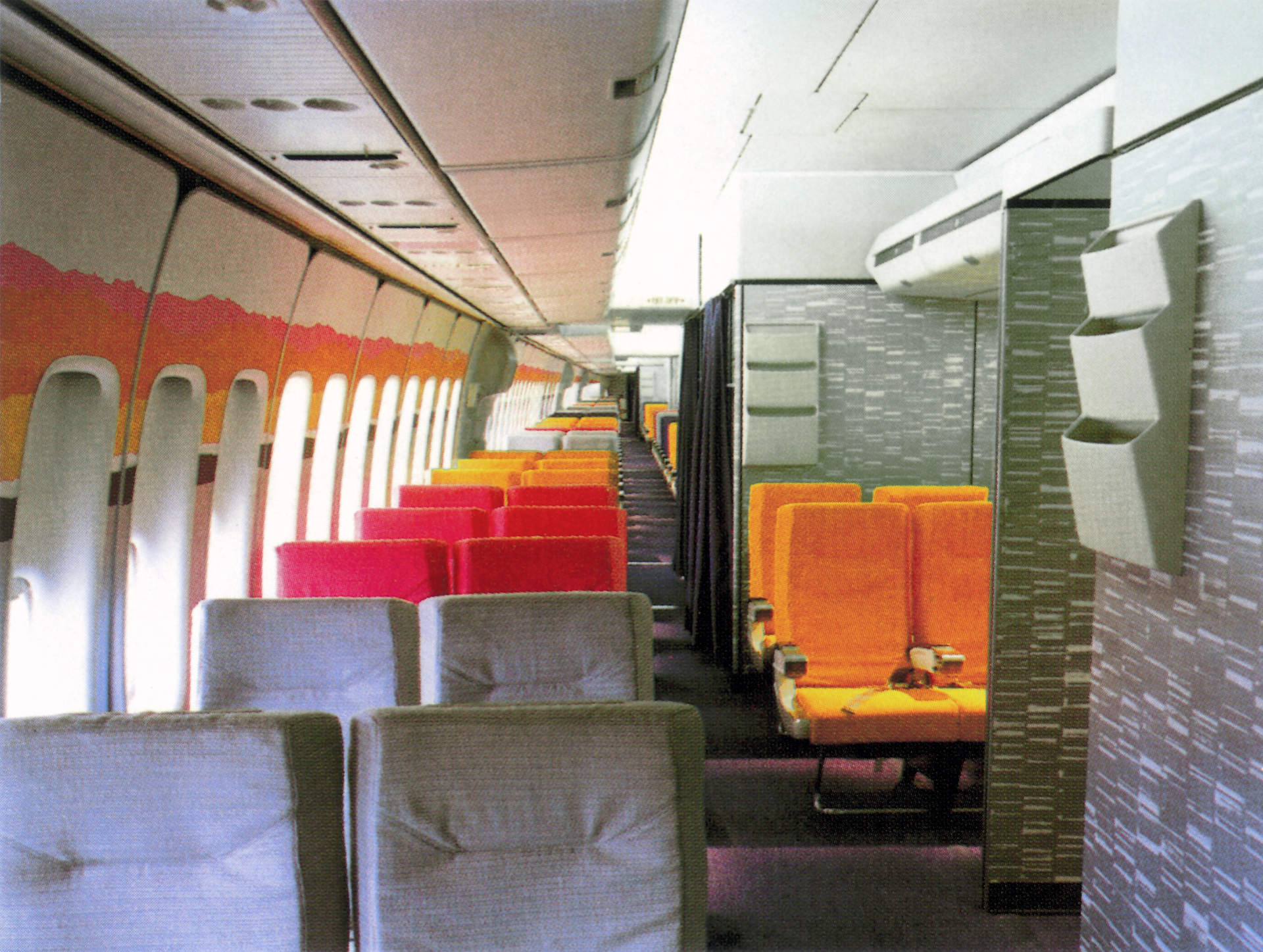
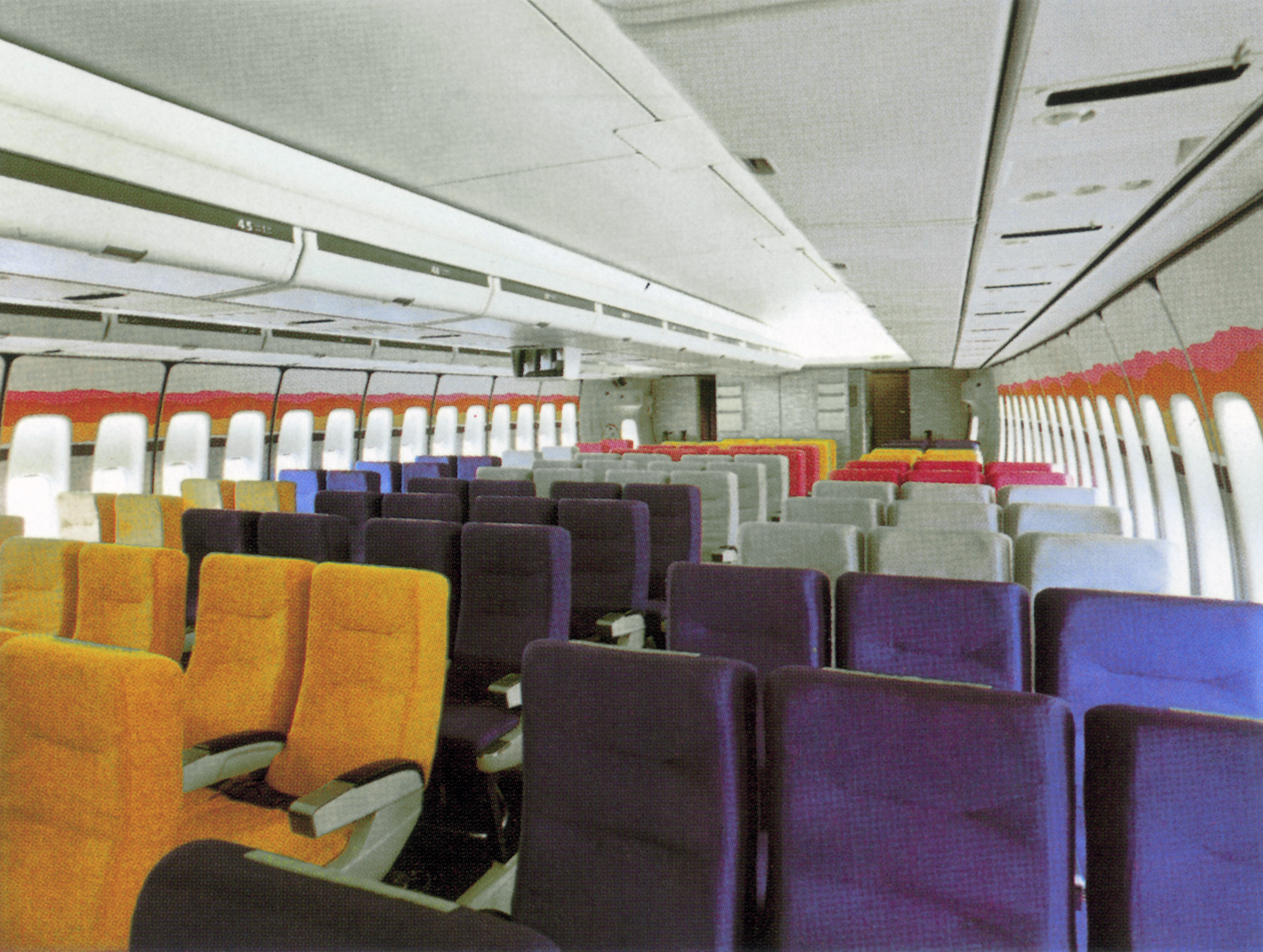
El Al also identified itself with the country’s famous Mediterranean sun. When designing the environmental graphics for the Boeing 747 jumbo aircraft, we based the color scheme on the image of the sun-orange, pink, red, silver and white – in keeping with the company’s wish to welcome passengers to the warm colors of Israel.
And as for the posters, my initial involvement with El Al was in the early sixties, when we were commissioned to design a series of twelve destination posters. This was part of a campaign to introduce the two separate Hebrew and Latin character logos designed by Otto Treuman and George Him.
Wolfgang Schmittel
Corporate Design International
ABC Verlag Zurich, 1984
Evolution of the EL AL logo
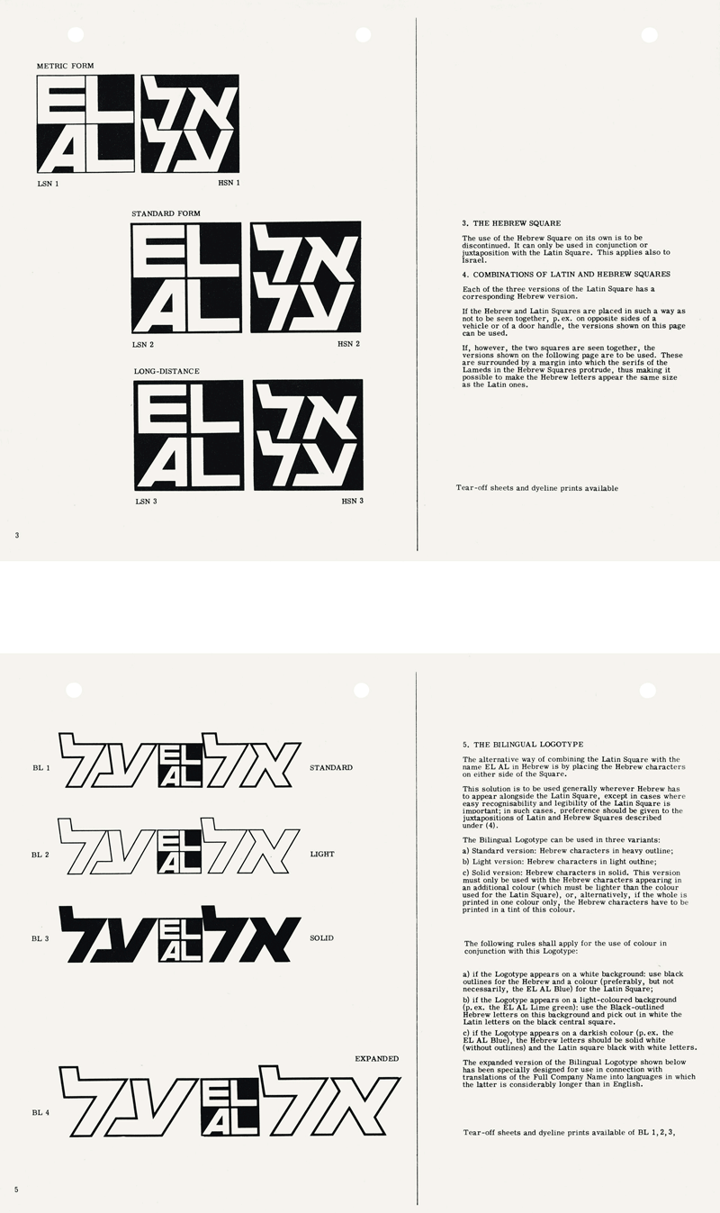
El Al 1963 manual. Logo by George Him and Otto Truiman
1971 – The change in the angle of the Hebrew logo – to parallel the slant of the letter A in English logo – enables a unified, horizontal image fitting the elongated form of the aircrafts

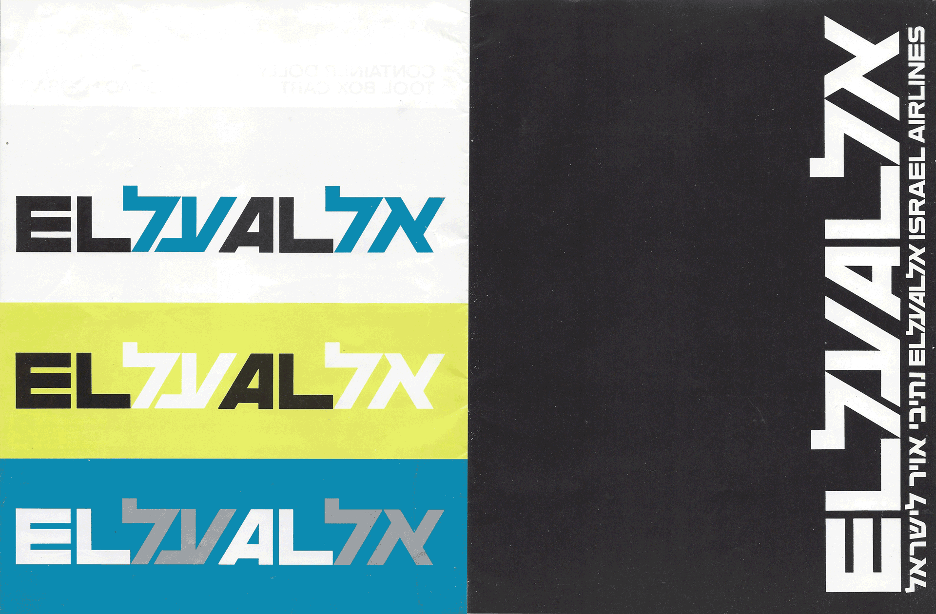
1971 - Ground equipment manual
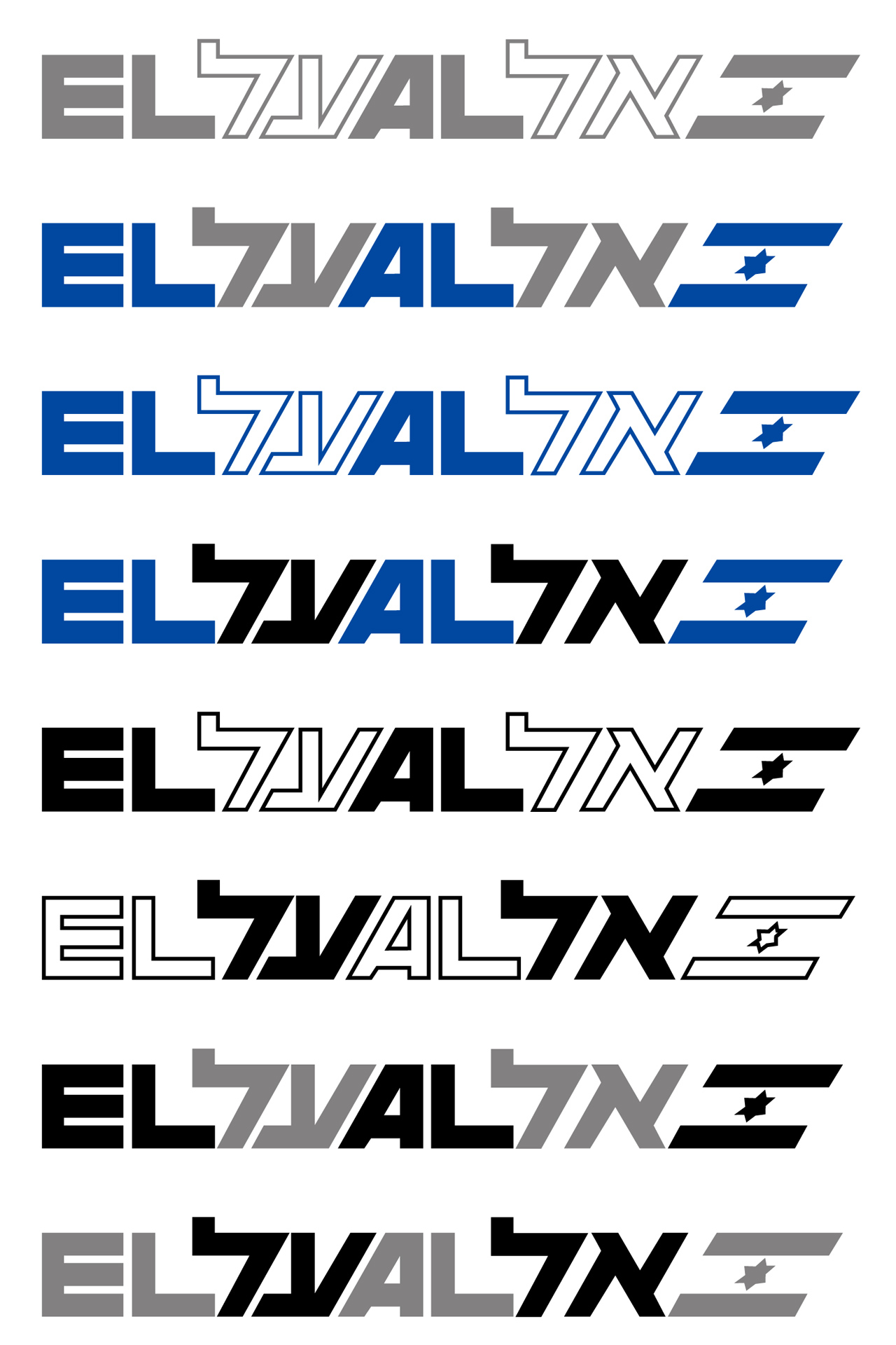
El Al’s stationary manual, 1978
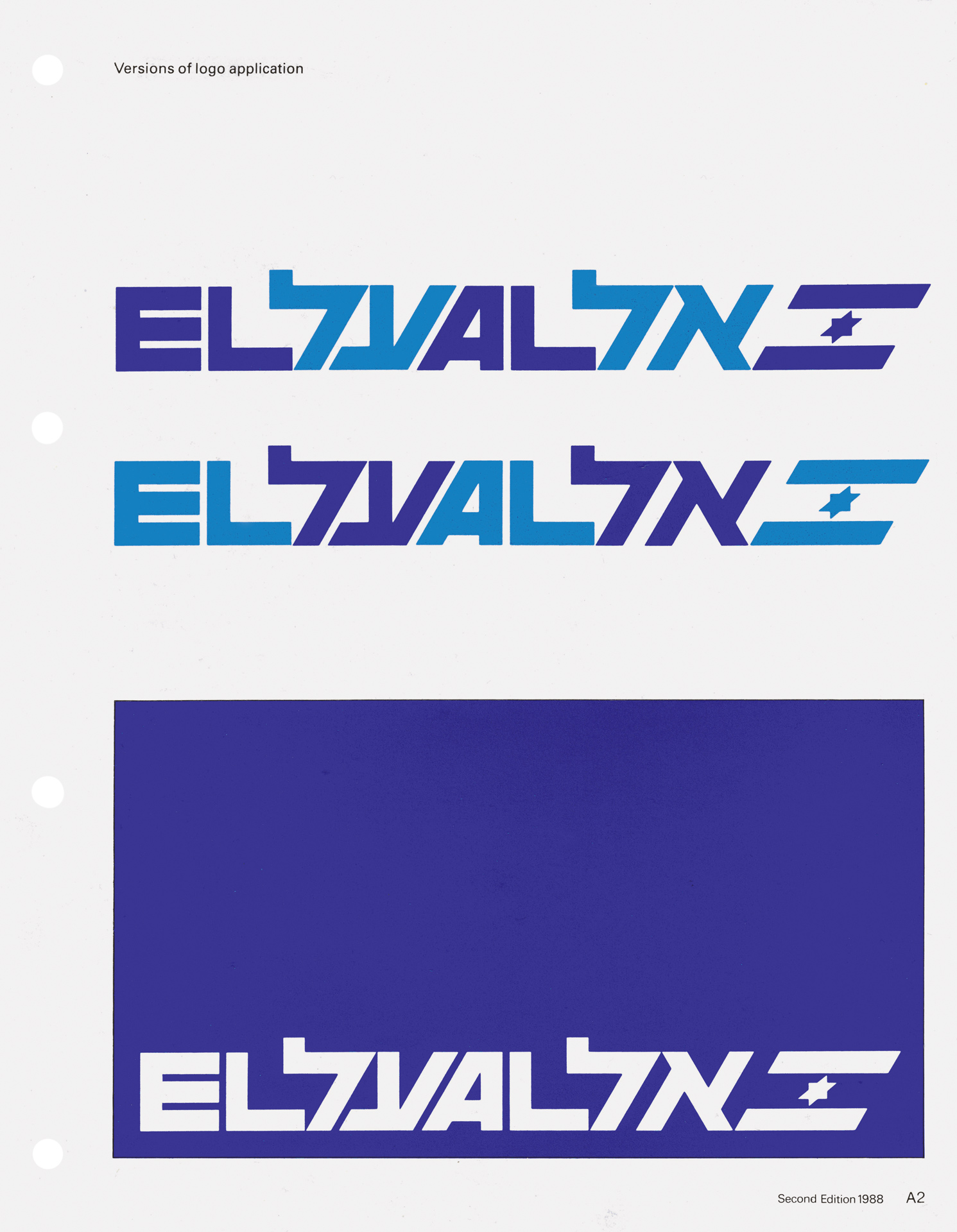
Corporate Identity manual, 1989


Boeing 747 jumbo interior color scheme, based on the image of the sun - orange, pink, red, silver and white - in keeping with the company's wish to welcome passengers to the warm colors of Israel.
Boeing 747 interior
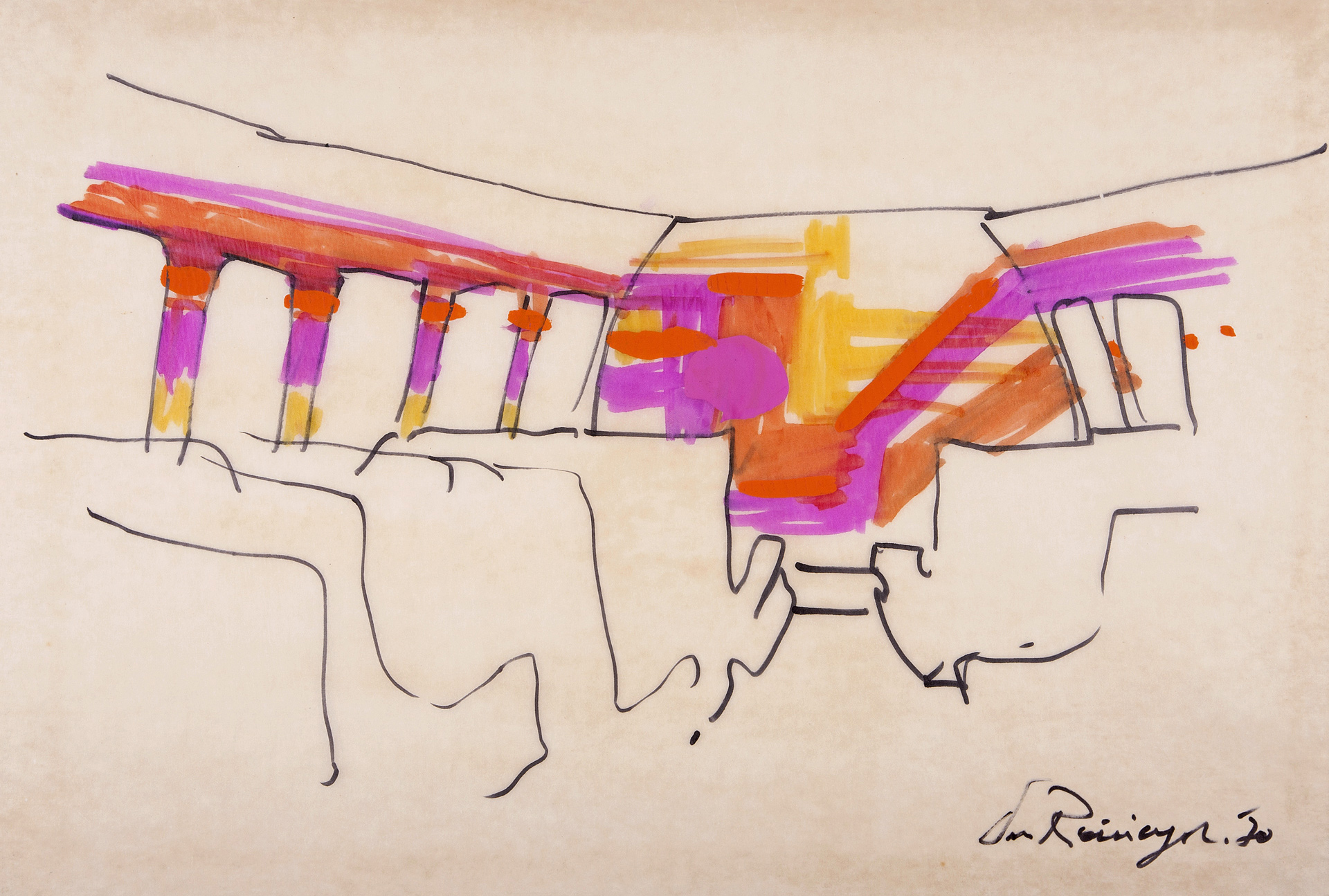
Sketch for interior of El Al Boeing 747, 1969
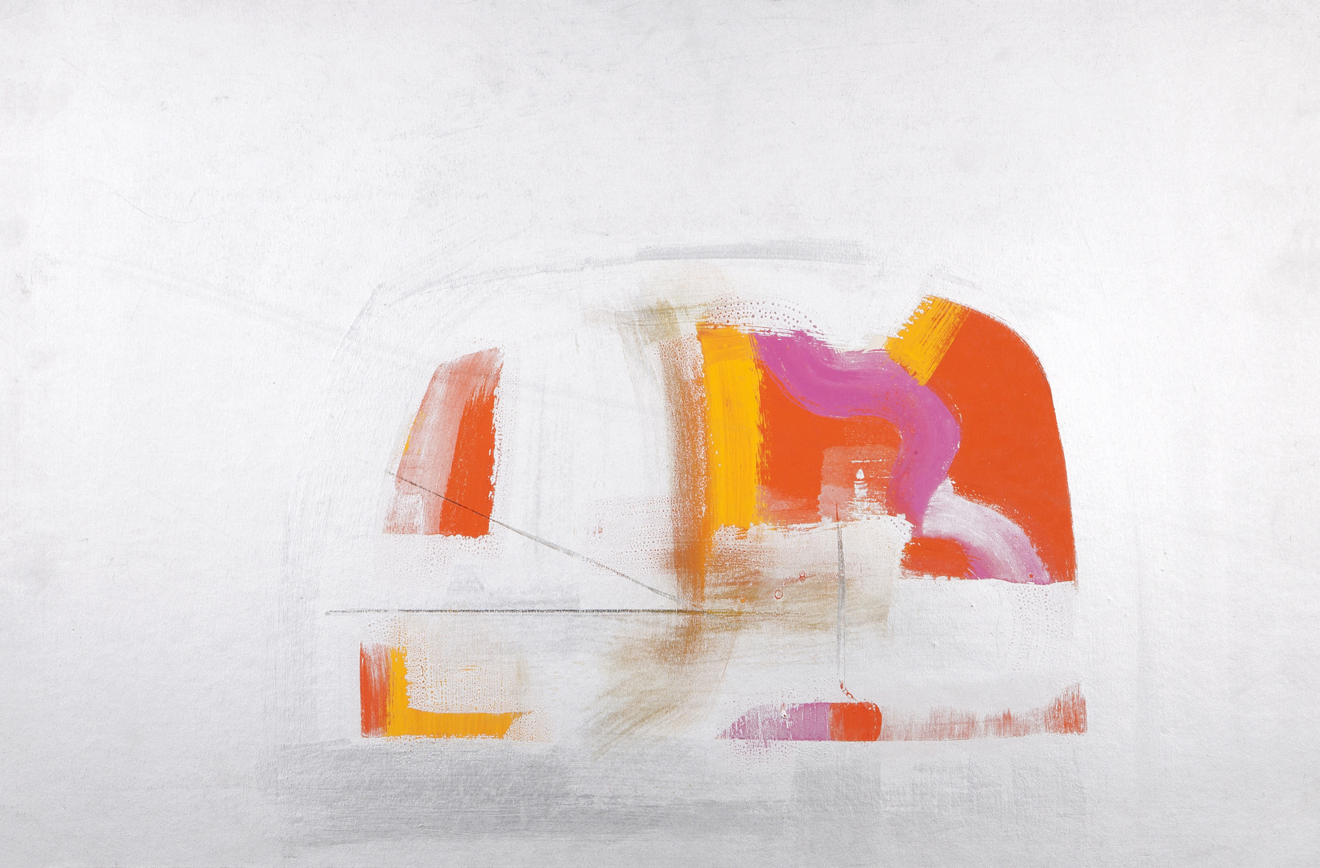
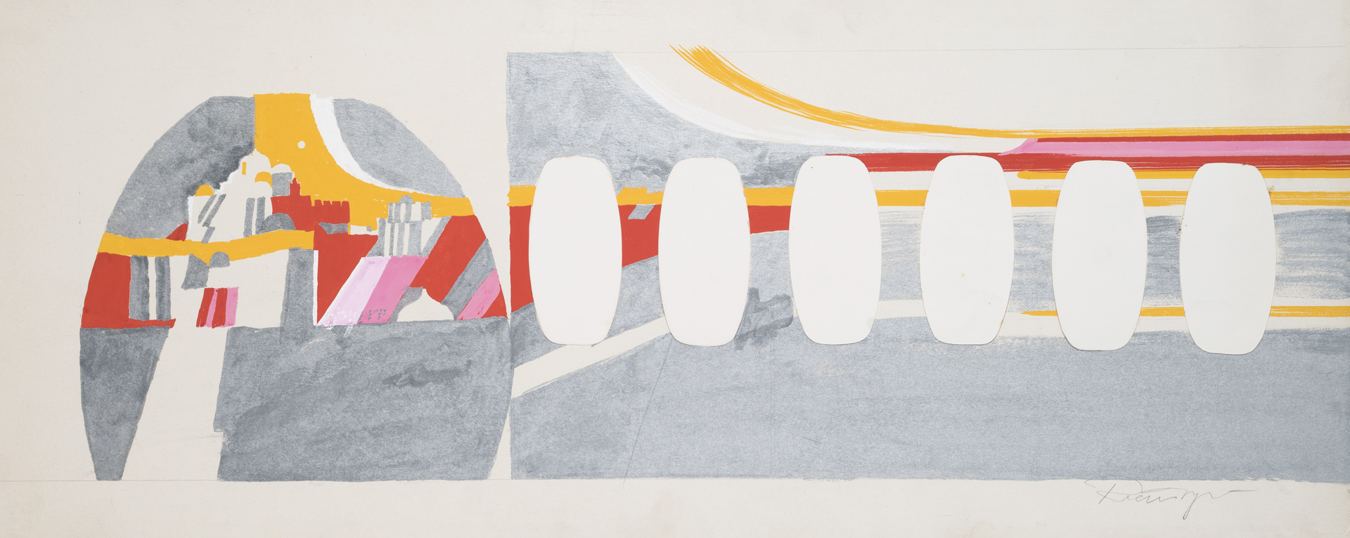
Sketch for interior of El Al Boeing 747, 1969
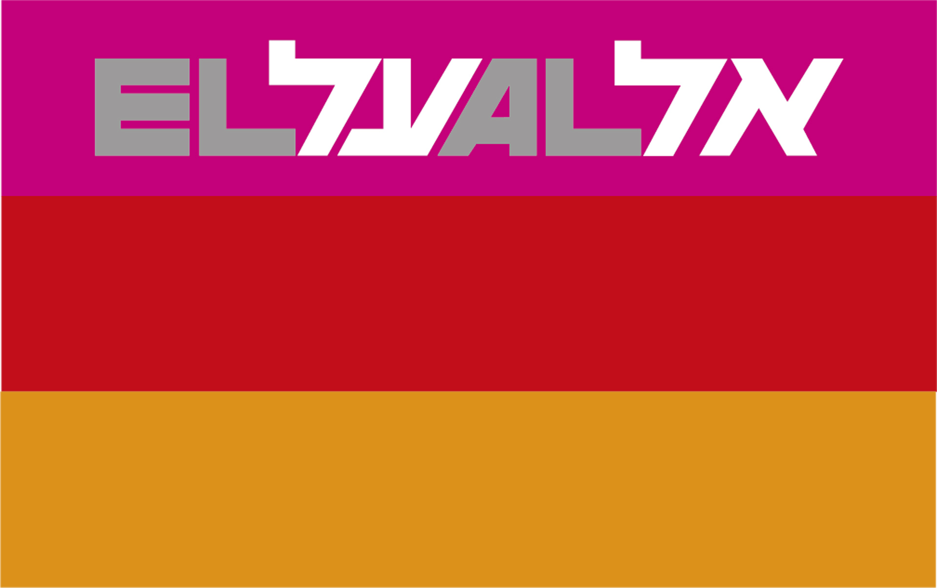
El Al interior color scheme
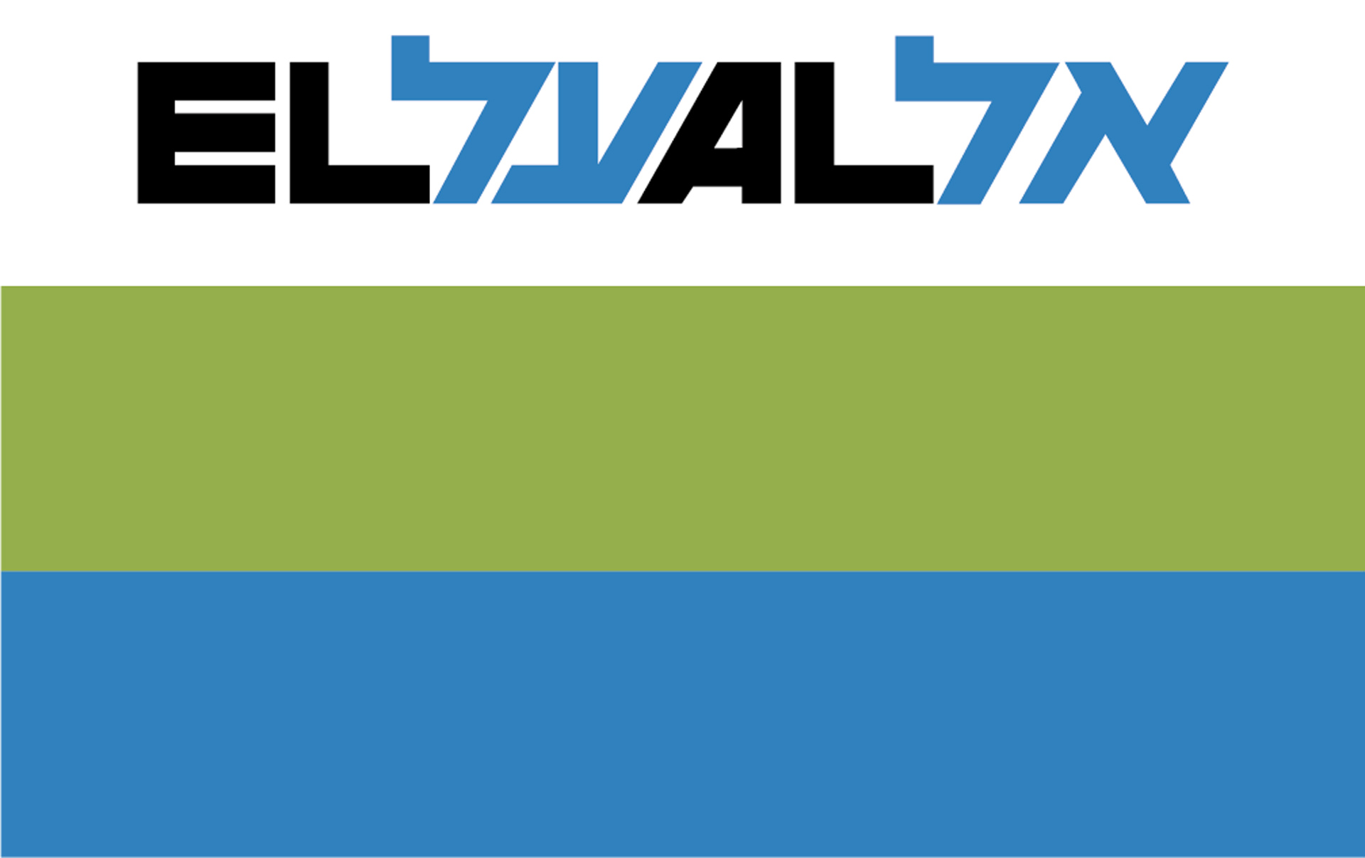
El Al ground livery color scheme
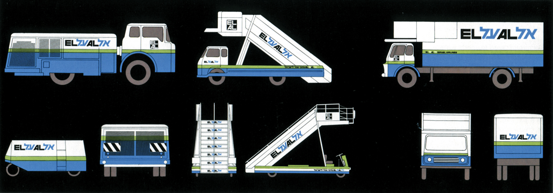
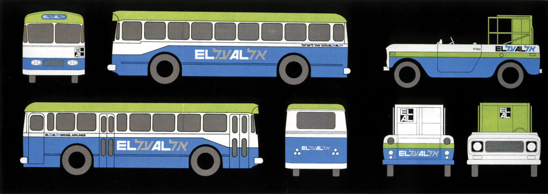
Pages from instruction booklet for painting the company’s vehicles

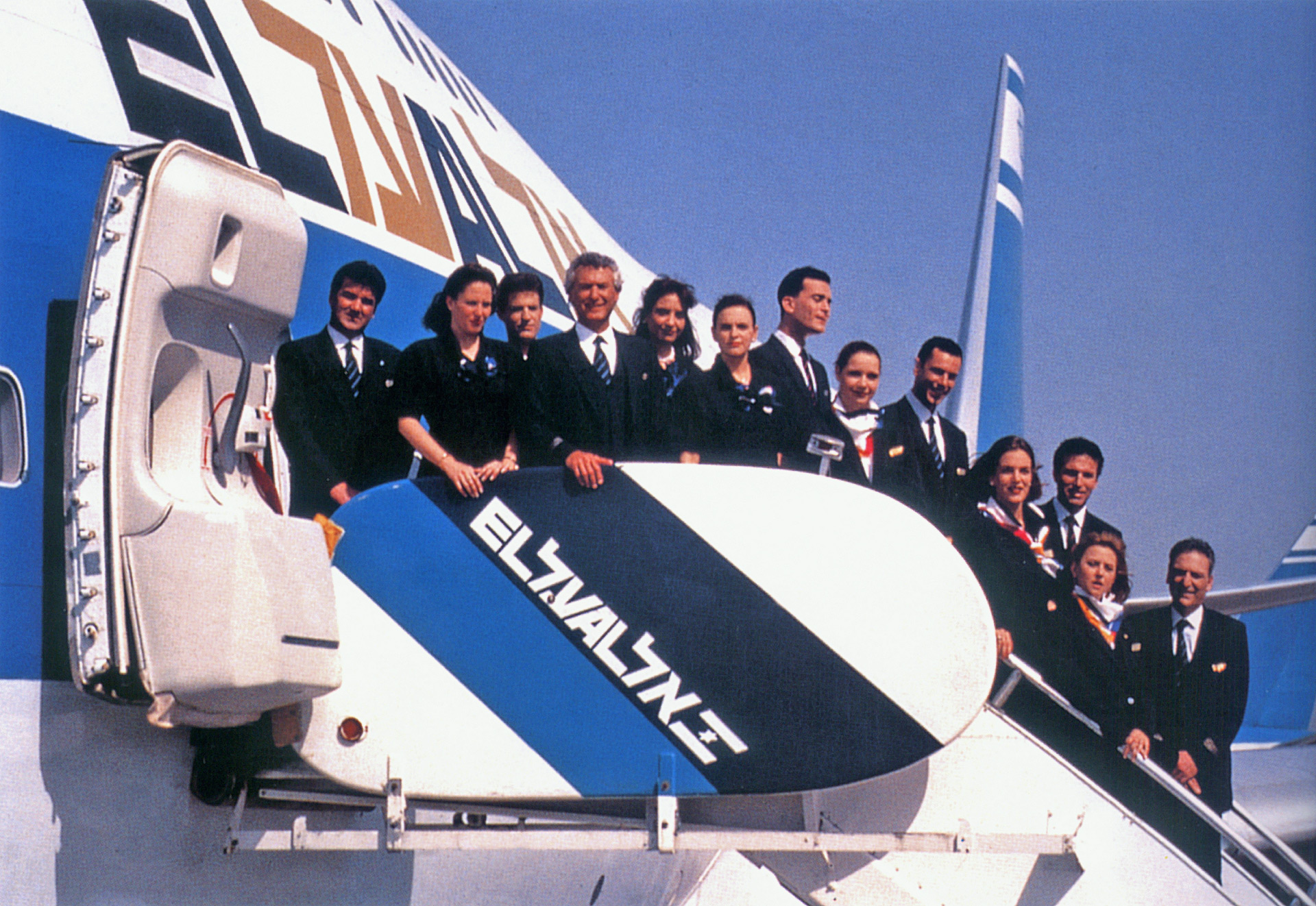
Israel’s flag is added to the logo and the color scheme is changed, early 1980s
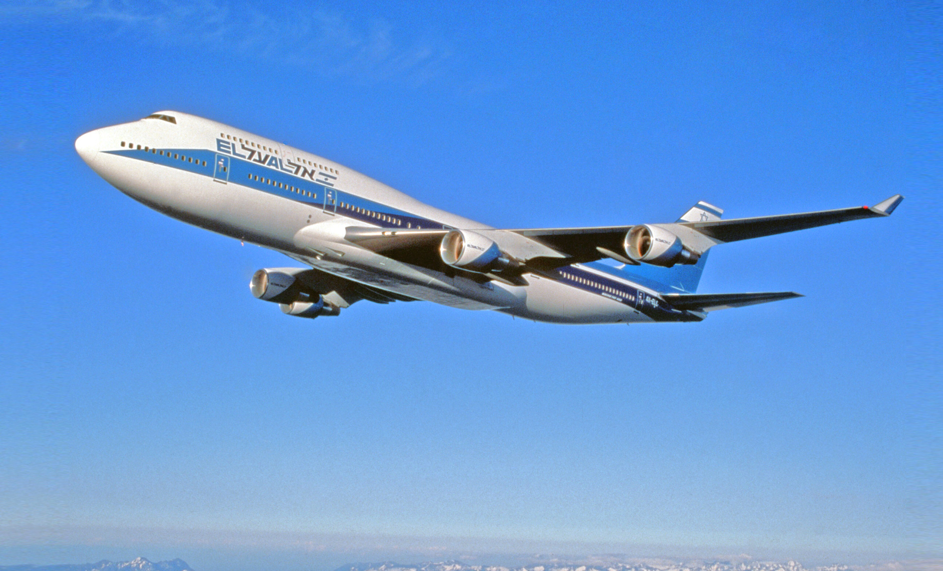
747-800 with uptaded logo and color scheme
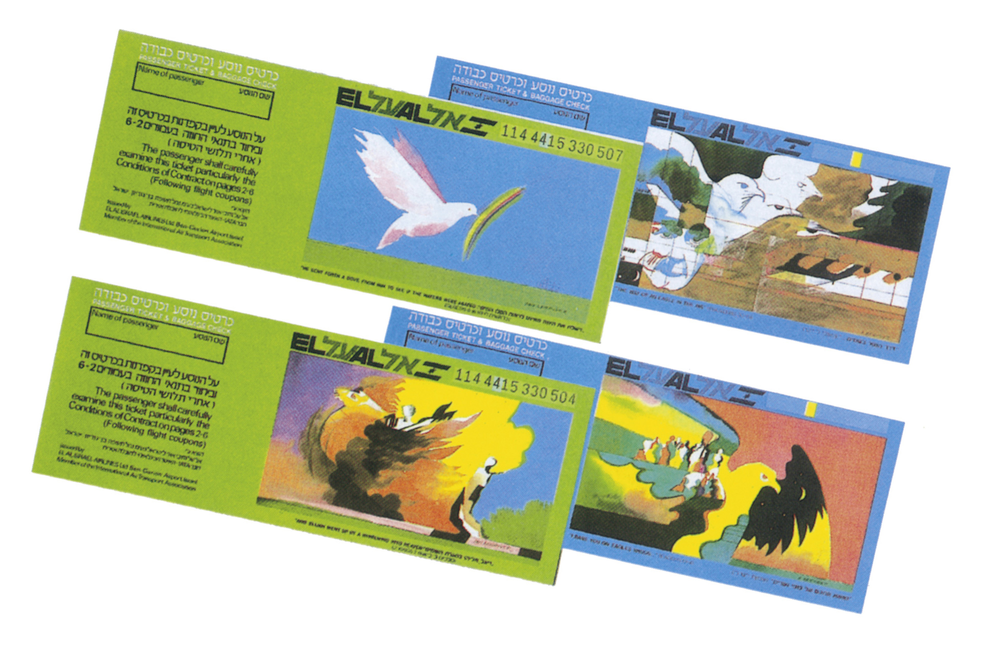

Boeing 737 interior color scheme and carpet
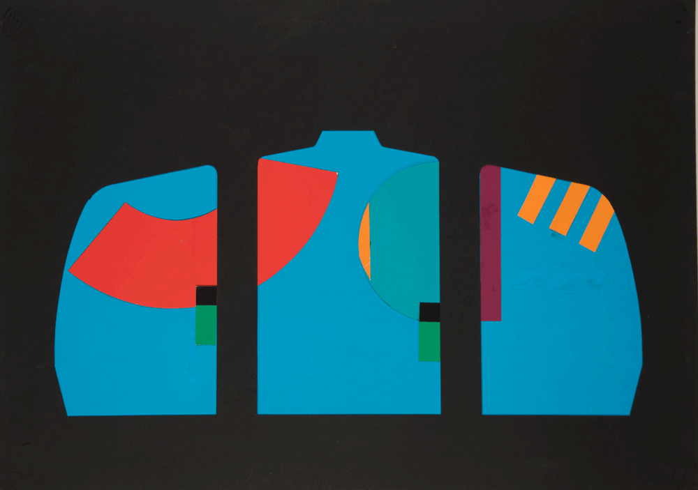
Boeing 767 carpet design
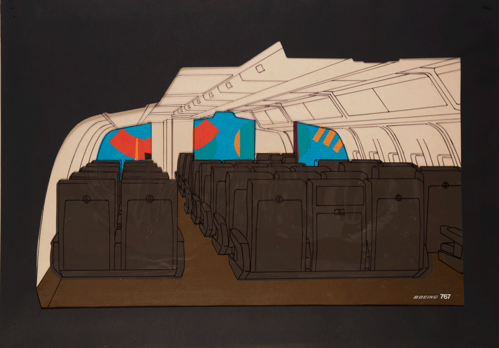
Boeing 767 carpet design. presentation by the Boeing company
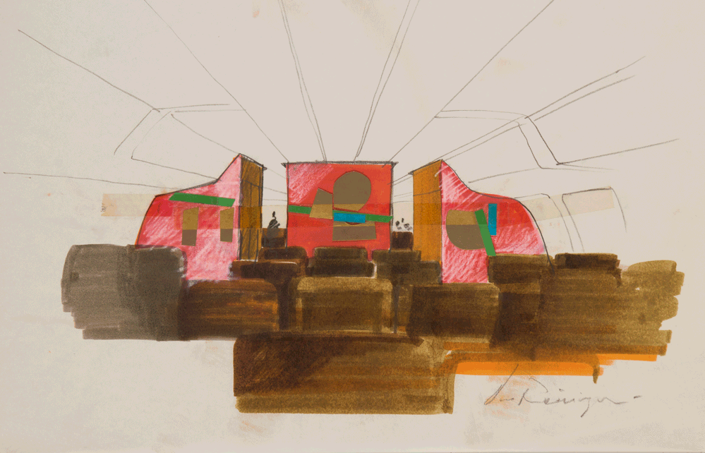
Boeing 767 carpet design
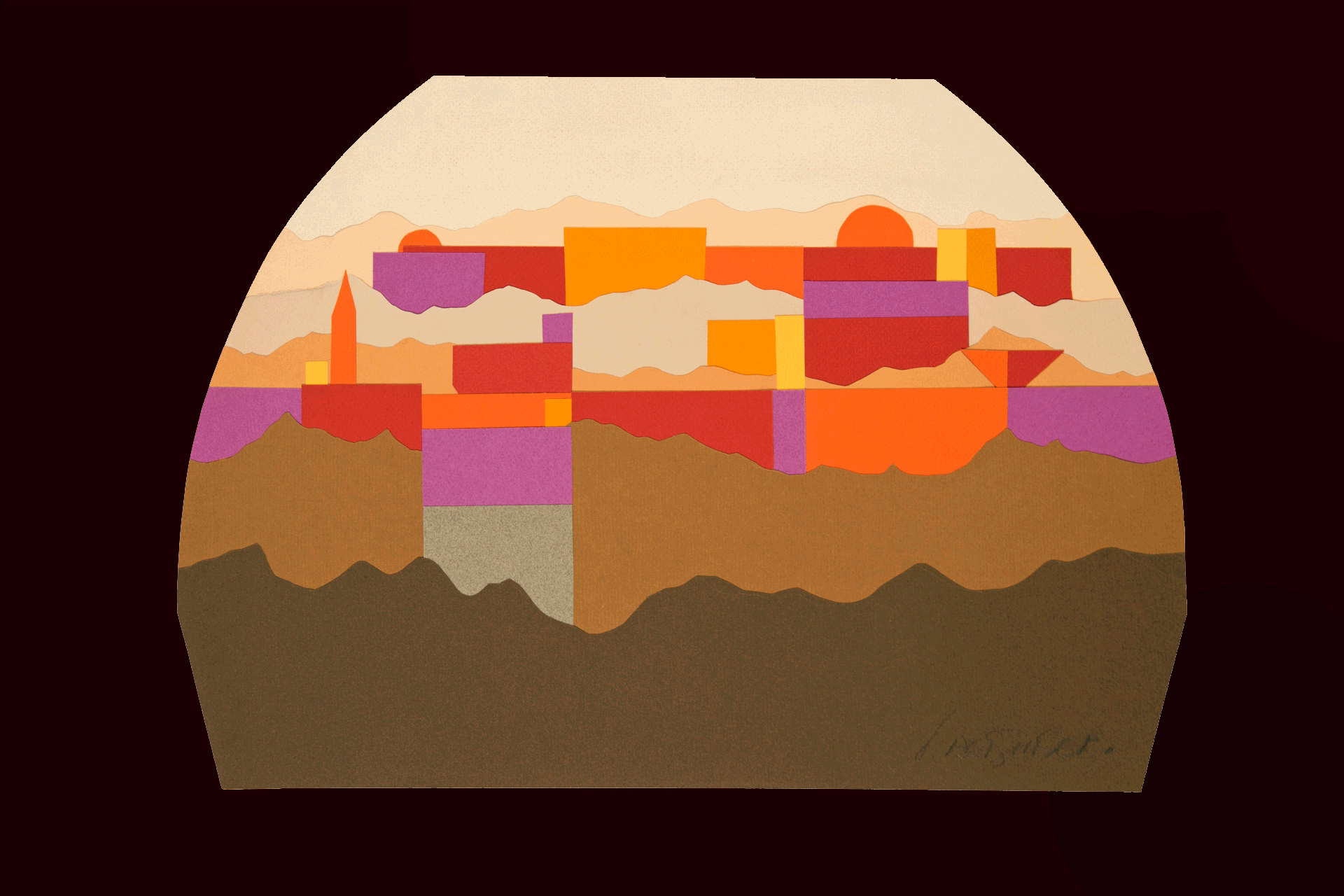
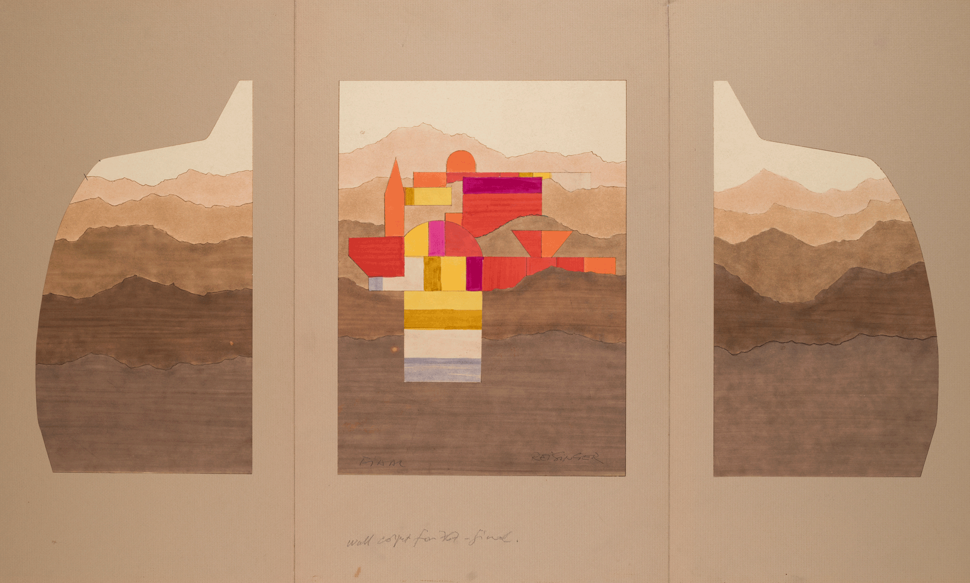
Boeing 767 carpet design
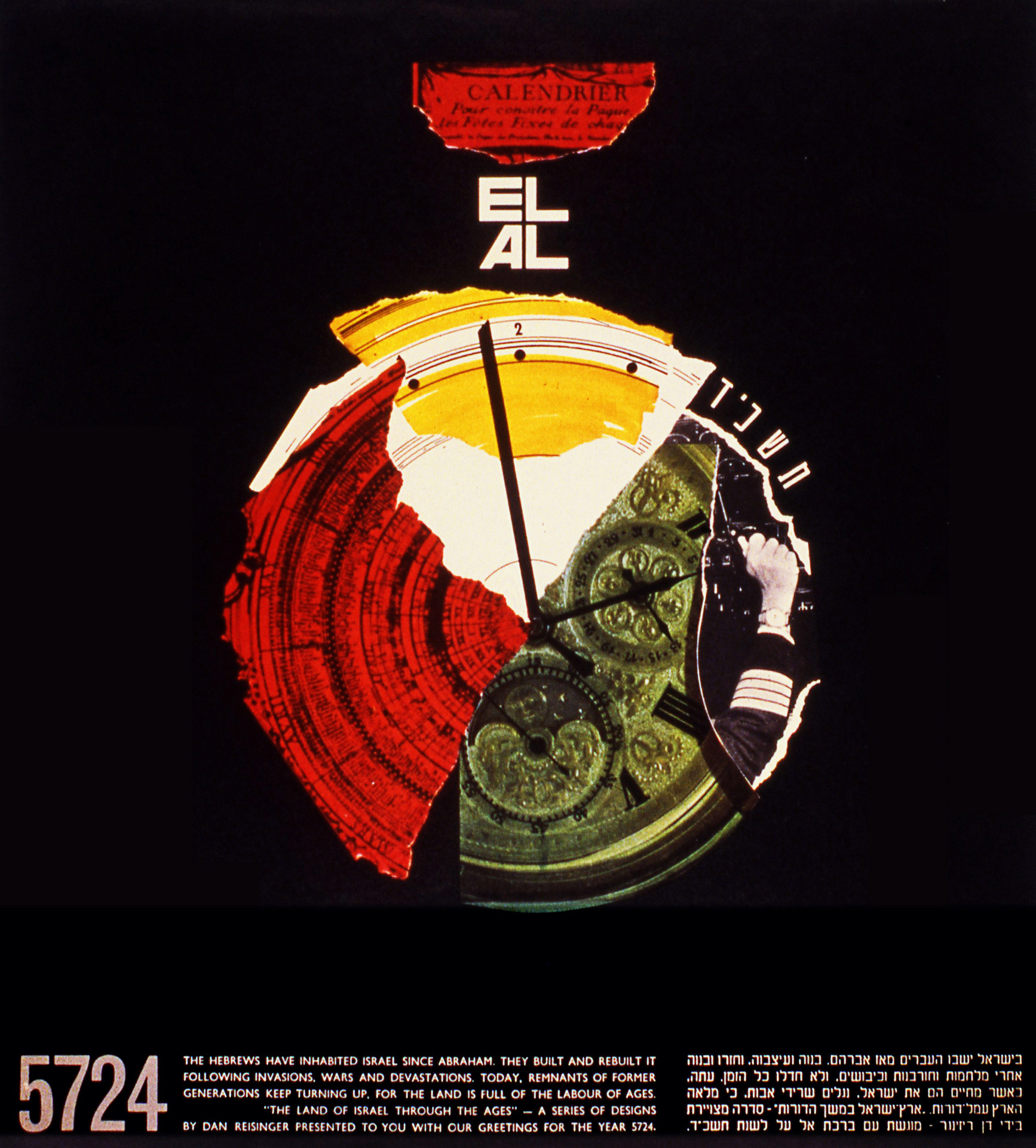
Cover of calendar for El Al, 1963
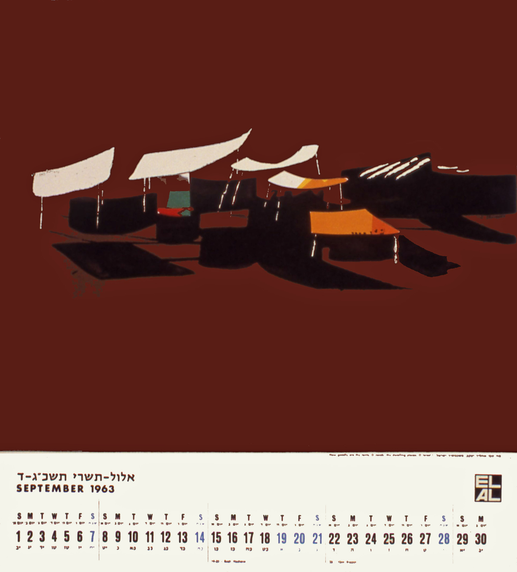
Calendar for El Al, 1963, September
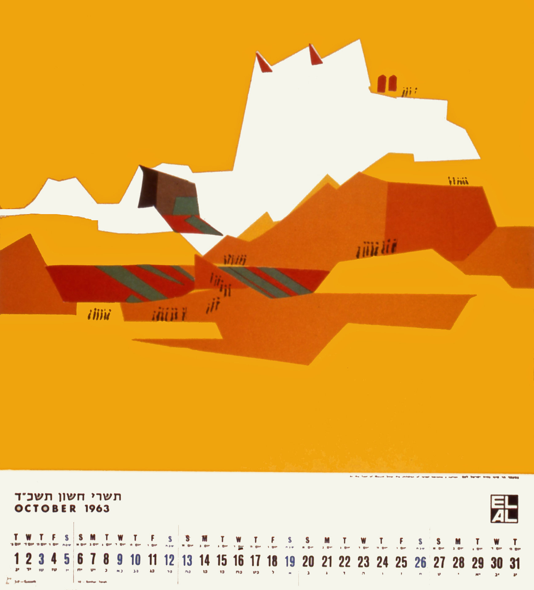
Calendar for El Al, 1963, October
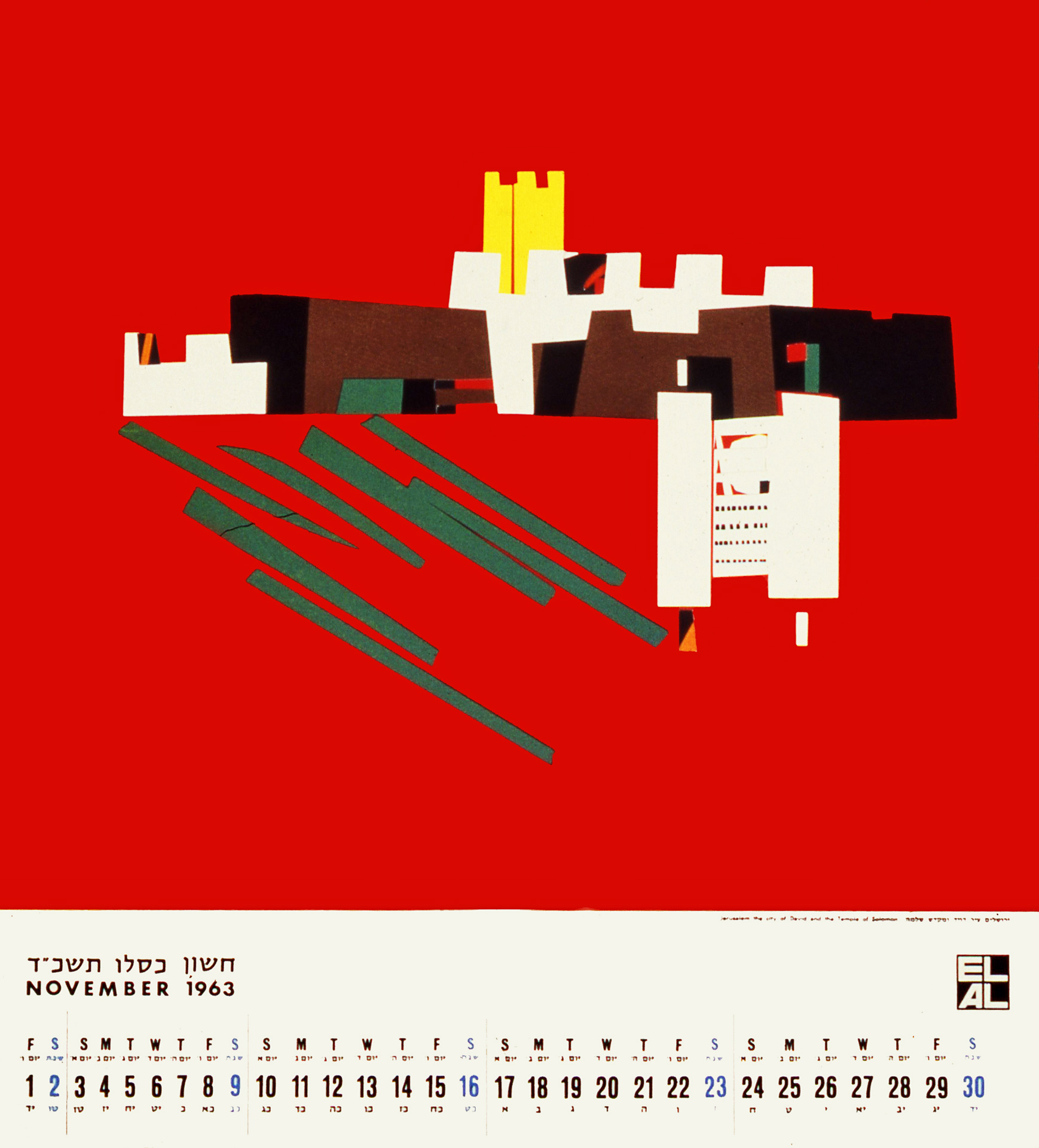
Calendar for El Al, 1963, November
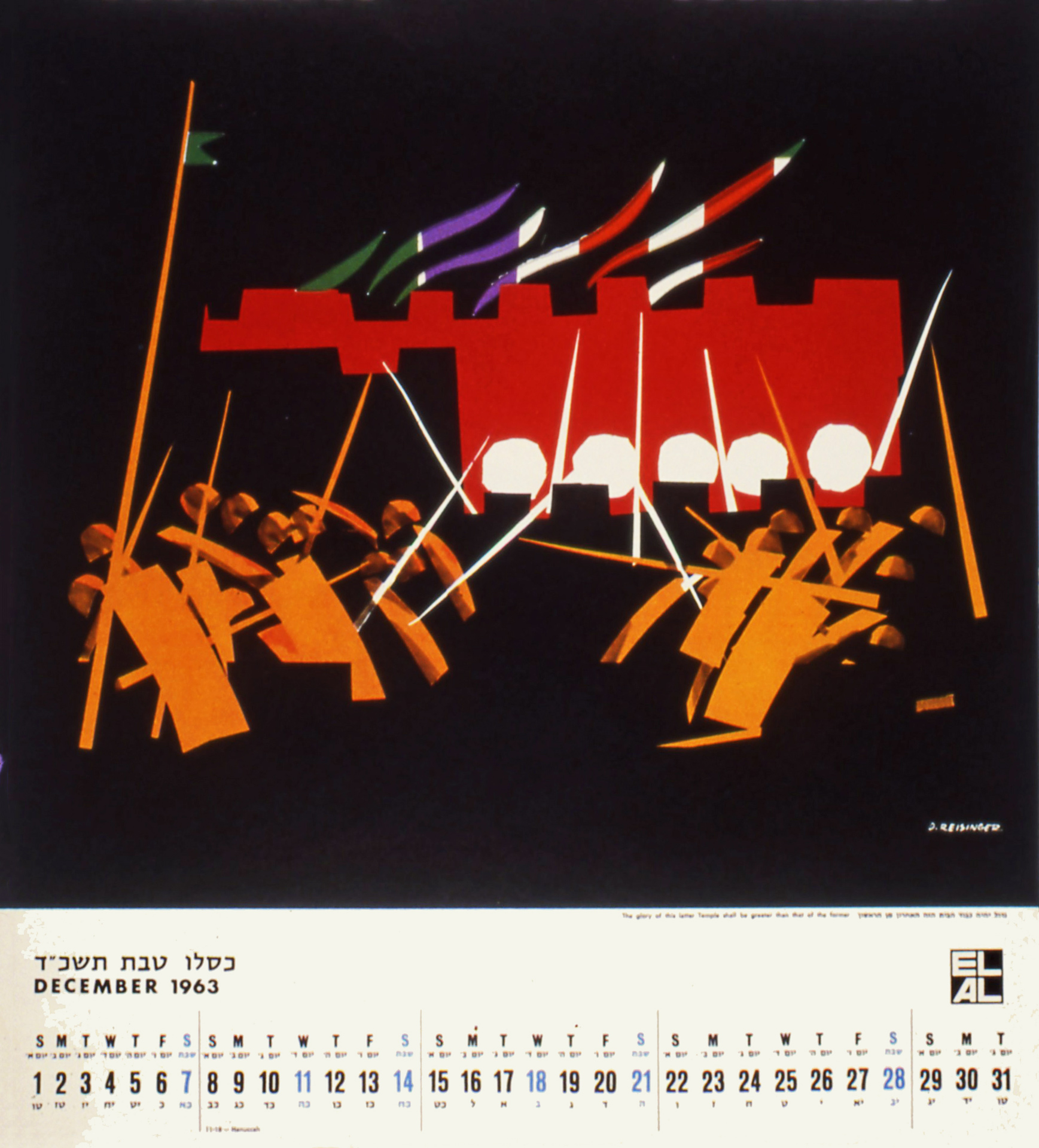
Calendar for El Al, 1963, December
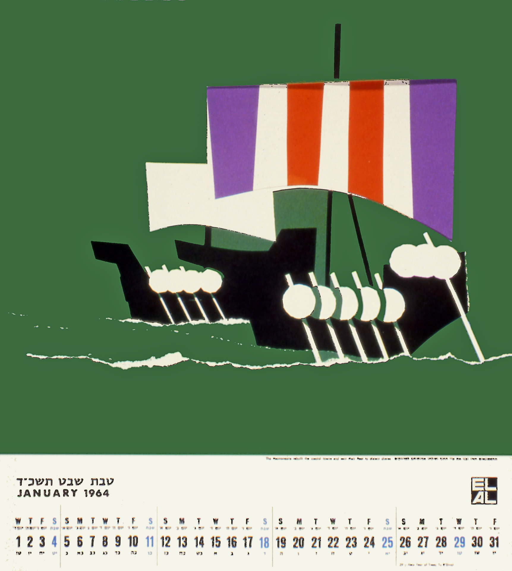
Calendar for El Al, 1963, January
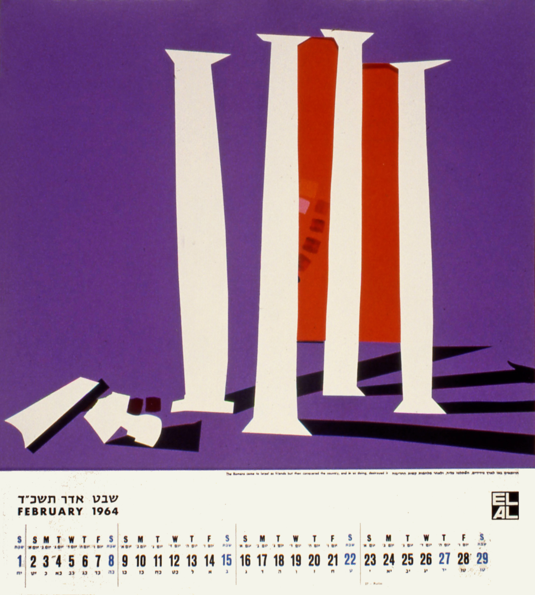
Calendar for El Al, 1963, February
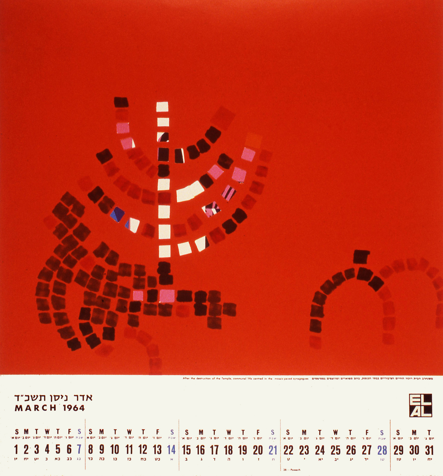
Calendar for El Al, 1963, March
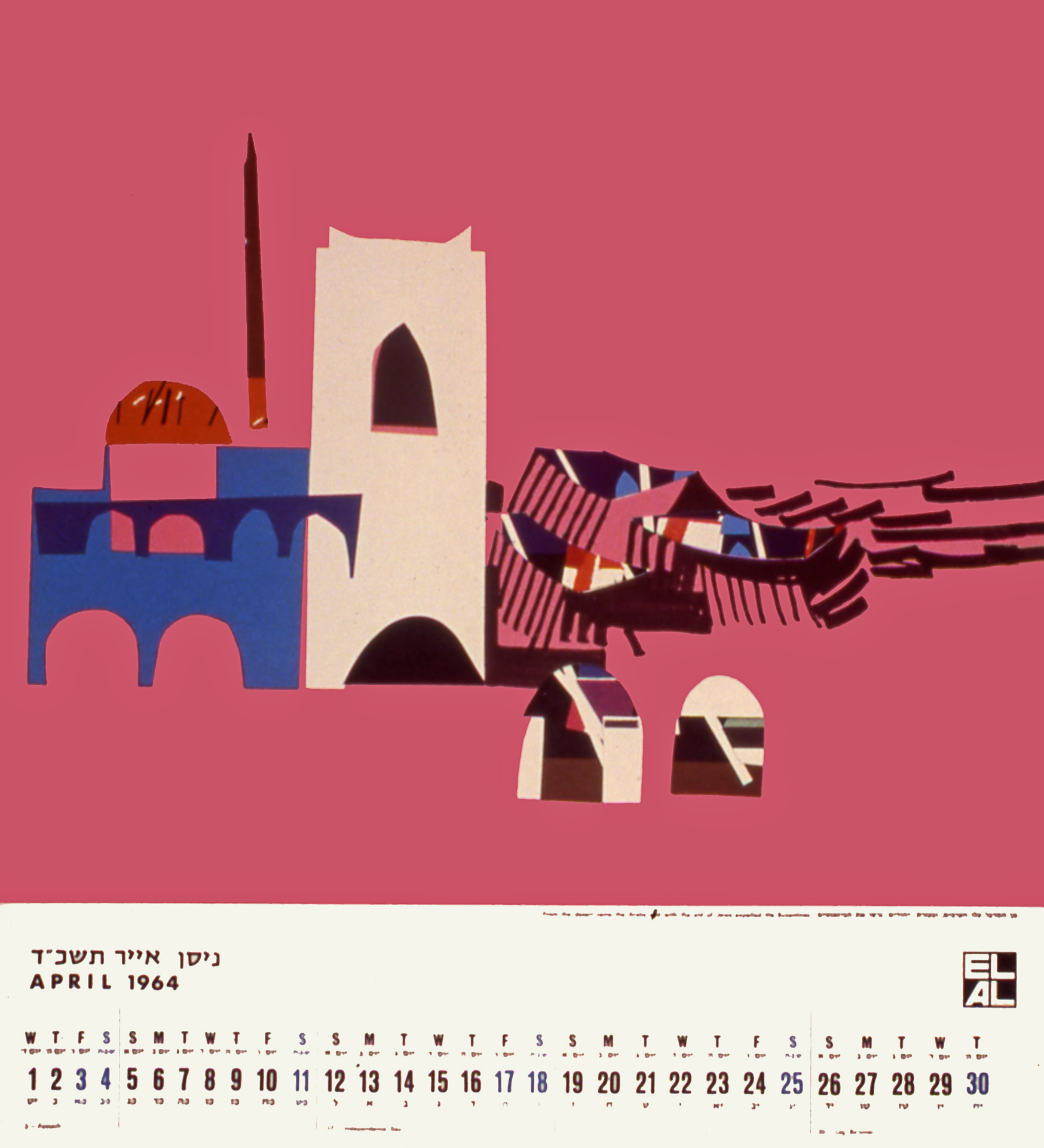
Calendar for El Al, 1963, April
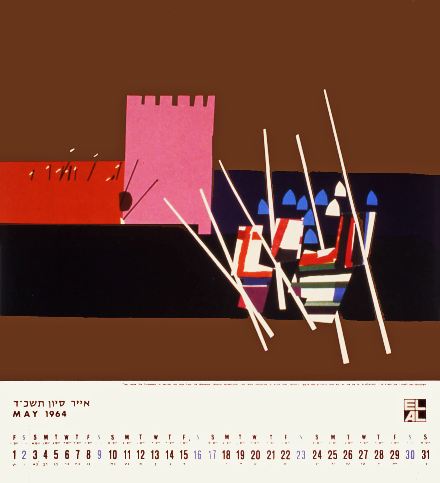
Calendar for El Al, 1963, May
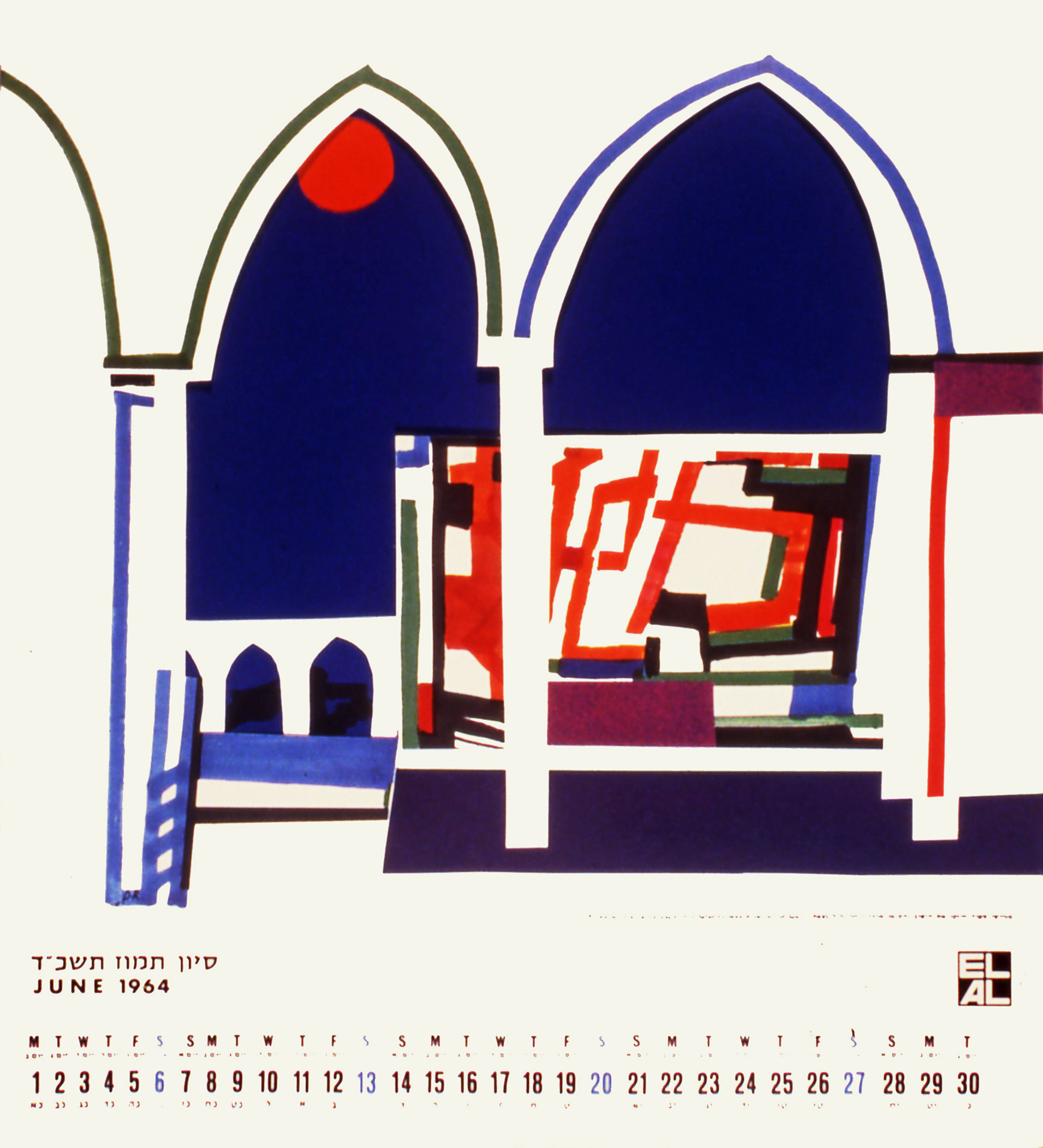
Calendar for El Al, 1963, June
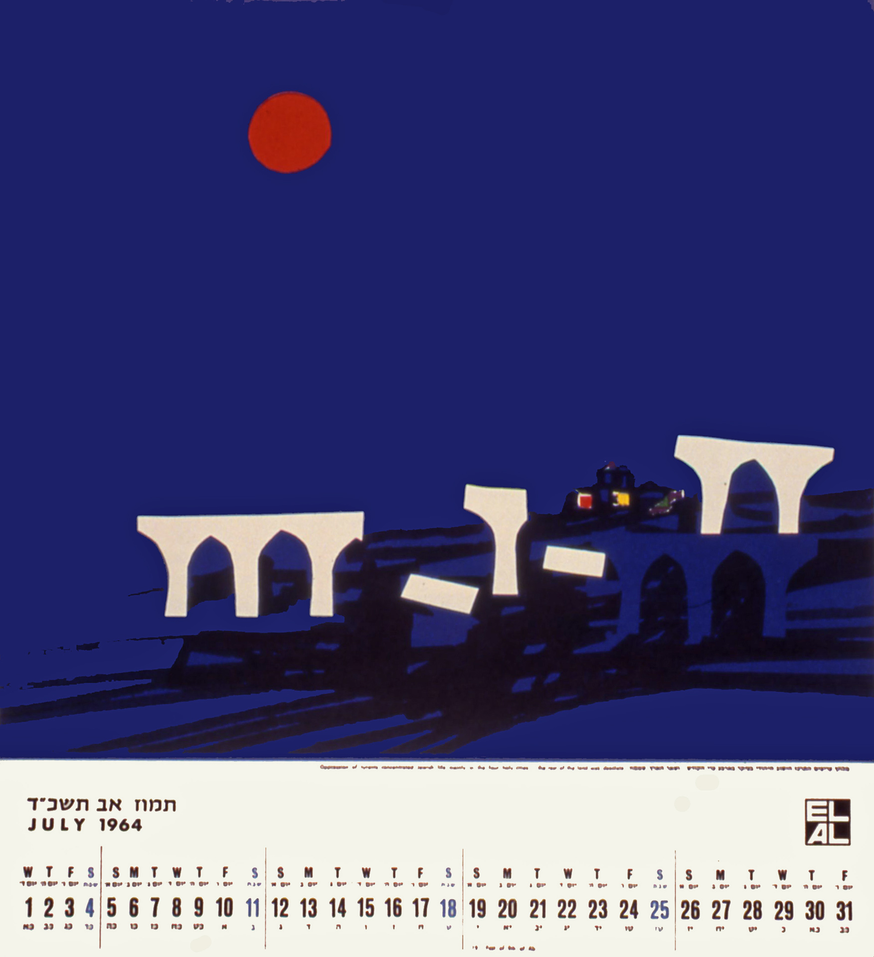
Calendar for El Al, 1963, July
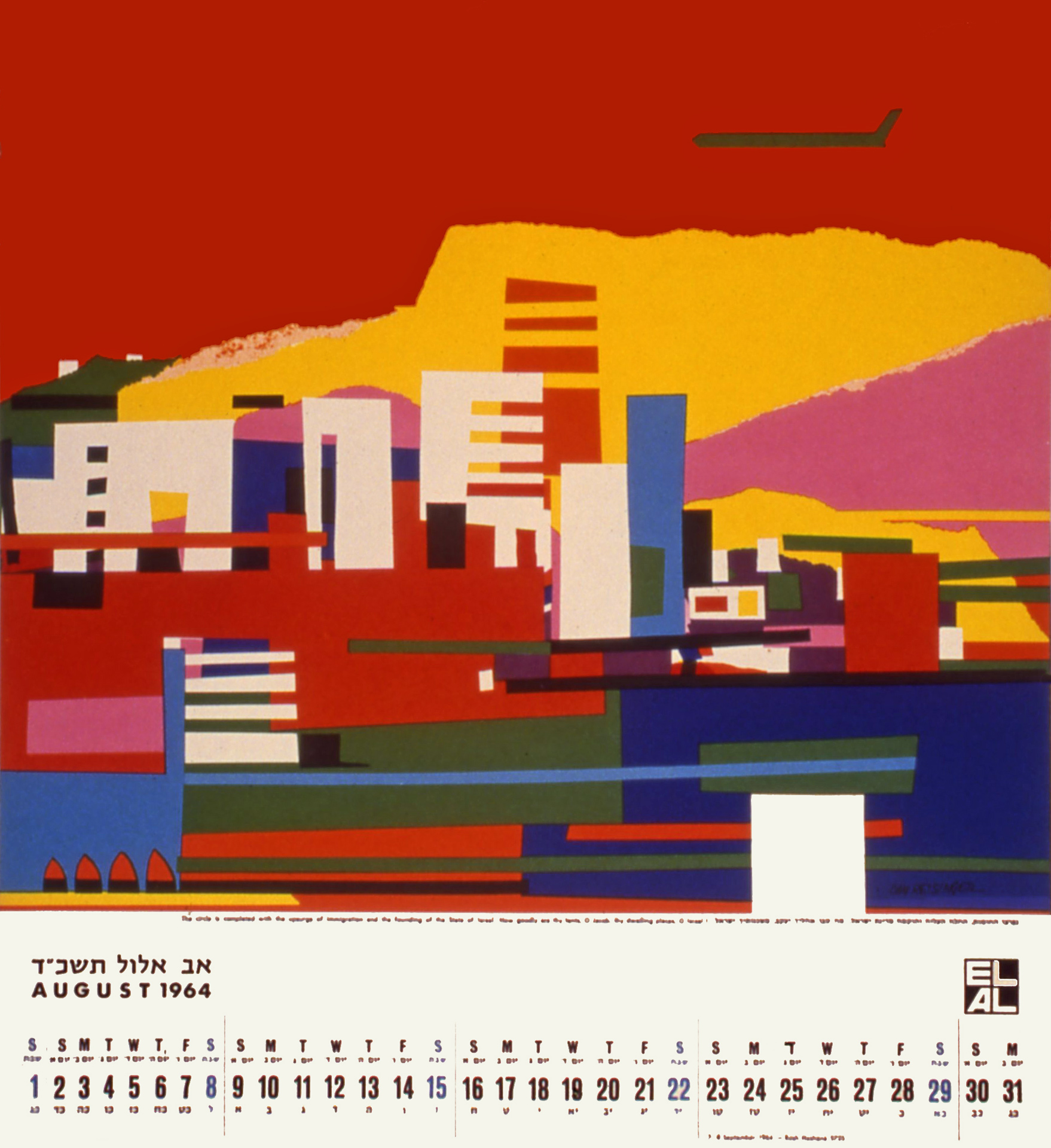
Calendar for El Al, 1963, August

Left to right: perliminary calendar cut-outs, calendar and envelope, poster sketches. Dan Reisinger's exhibition at Israel Museum, Jerusalem, curator: Dan Handel, 2016
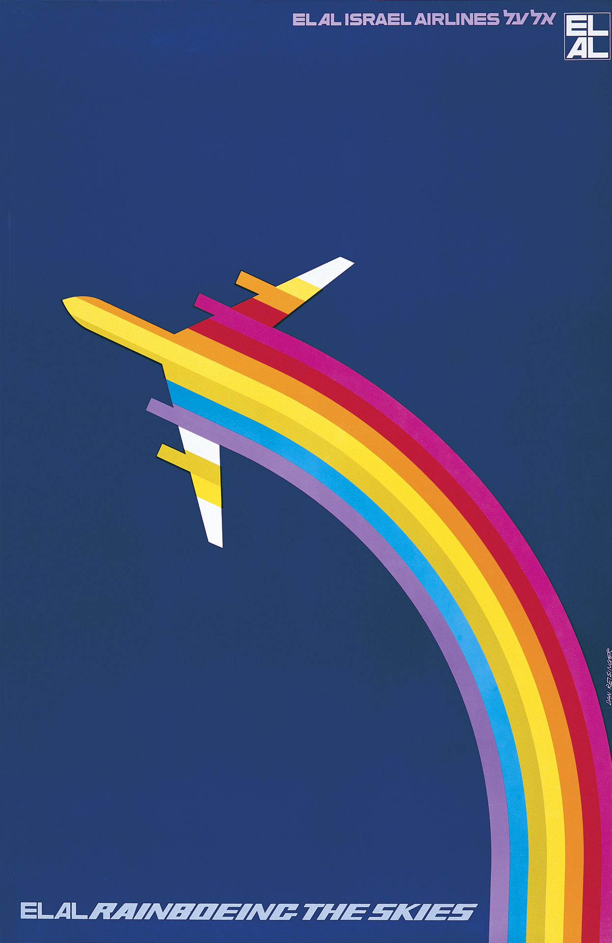
El Al Rainboeing the Skies. Introducing the new Boeing 747 to the El Al fleet, 1971
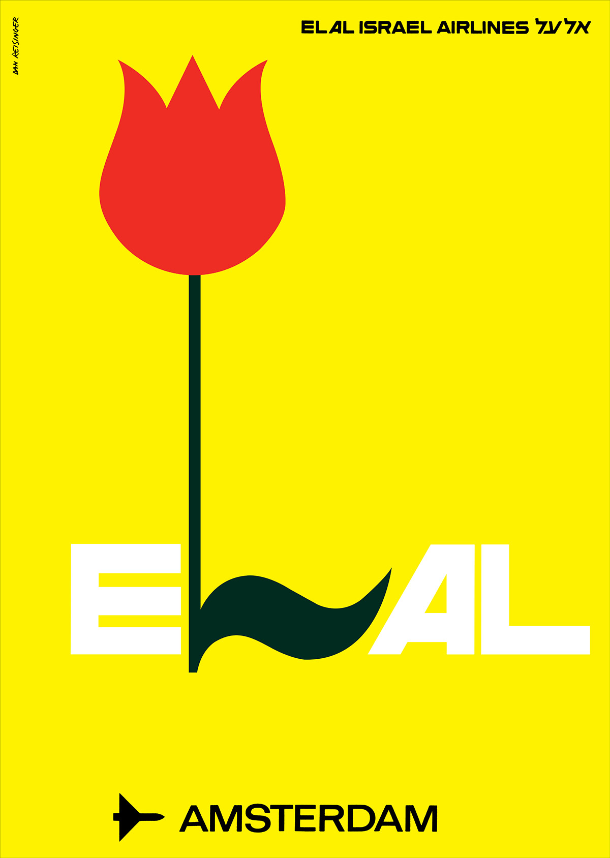
El Al Destinations poster series, 1968–72, Asia
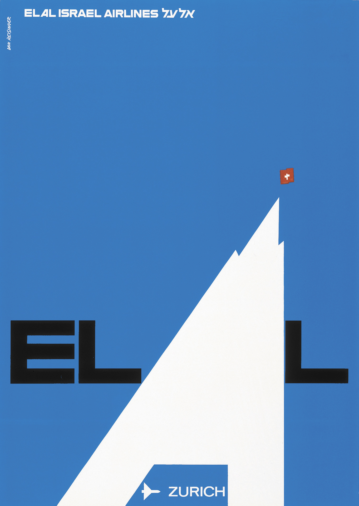
El Al Destinations poster series, 1968–72, Zürich
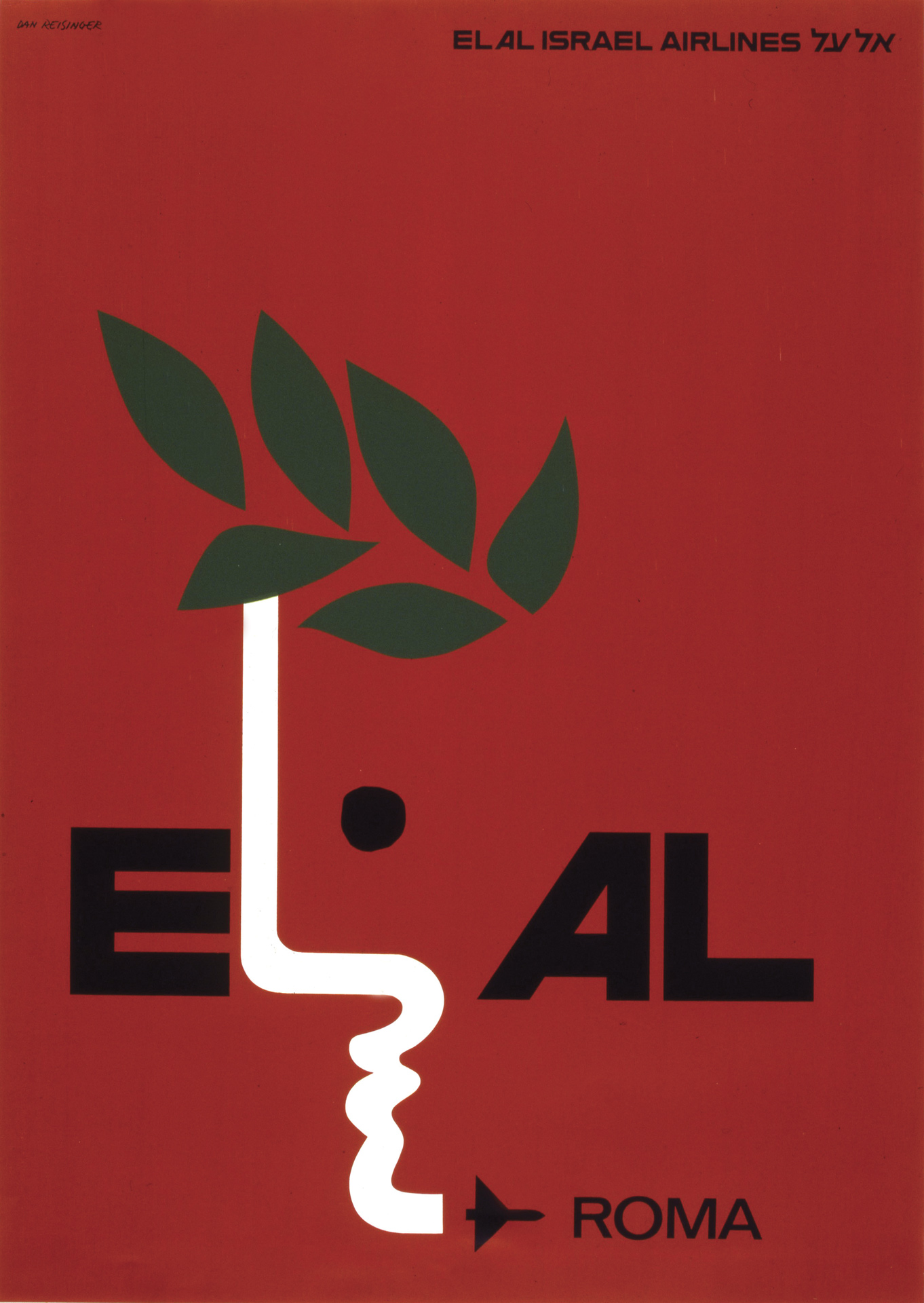
El Al Destinations poster series, 1968–72, Rome
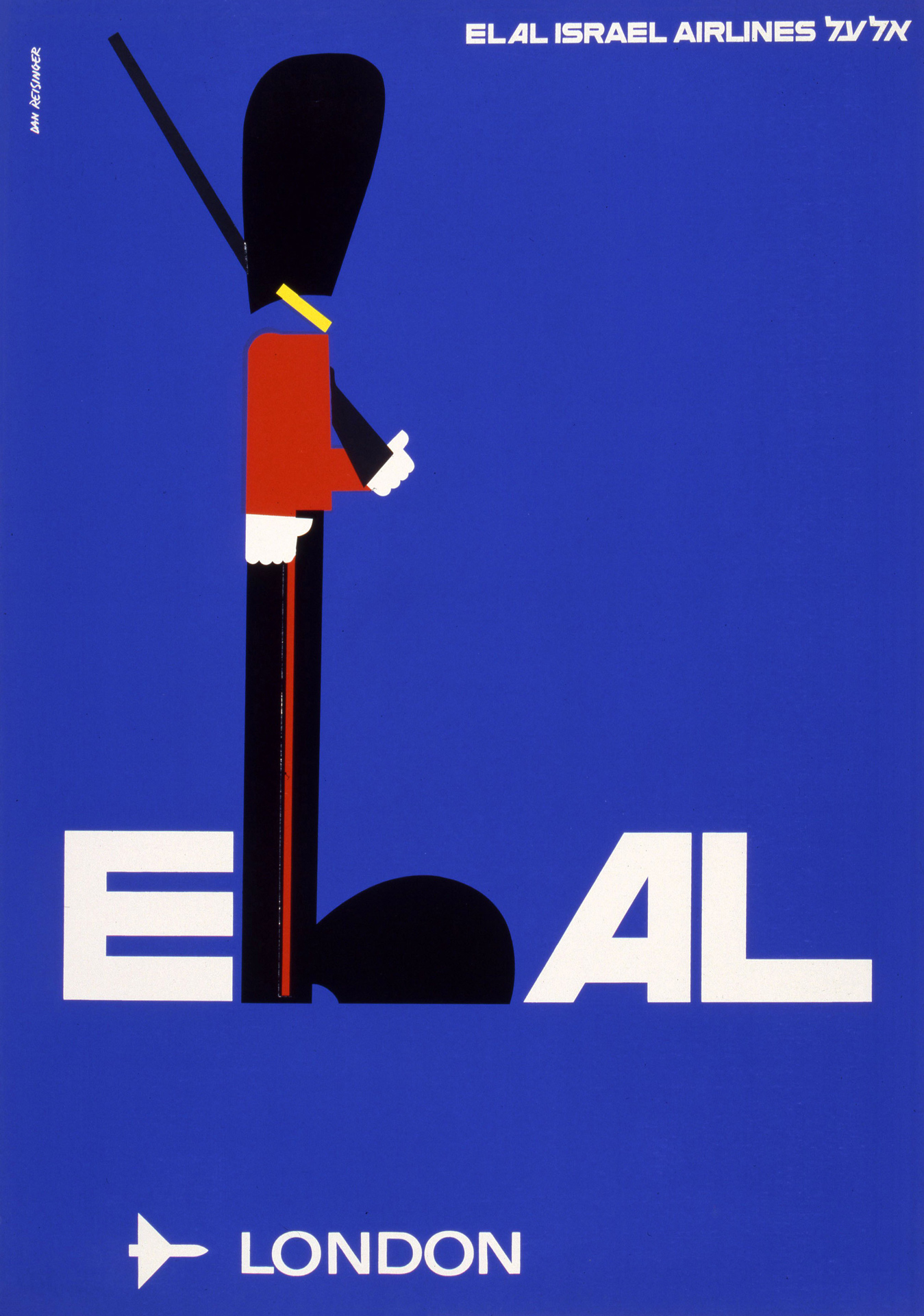
El Al Destinations poster series, 1968–72, London
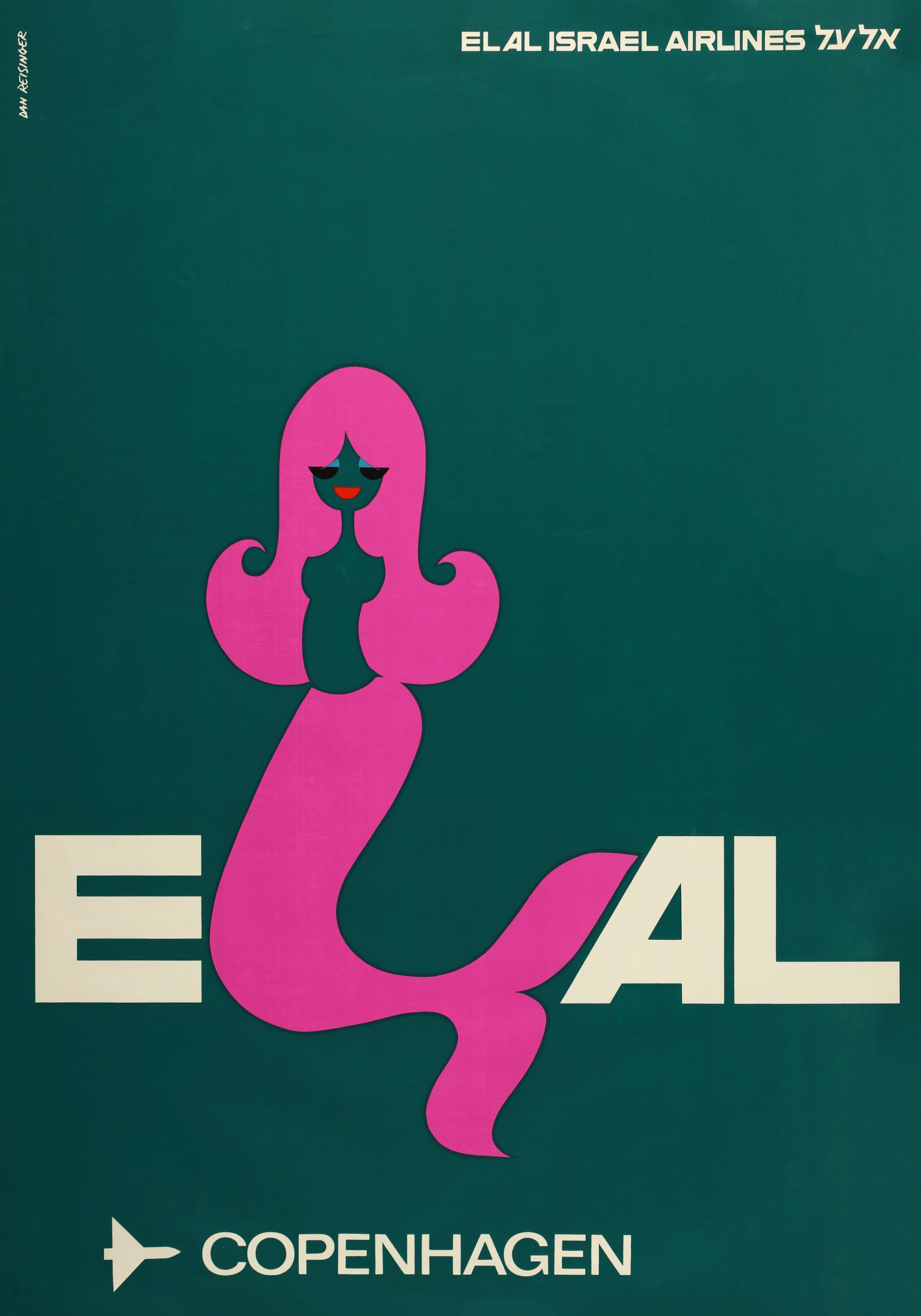
El Al Destinations poster series, 1968–72, Copenhagen
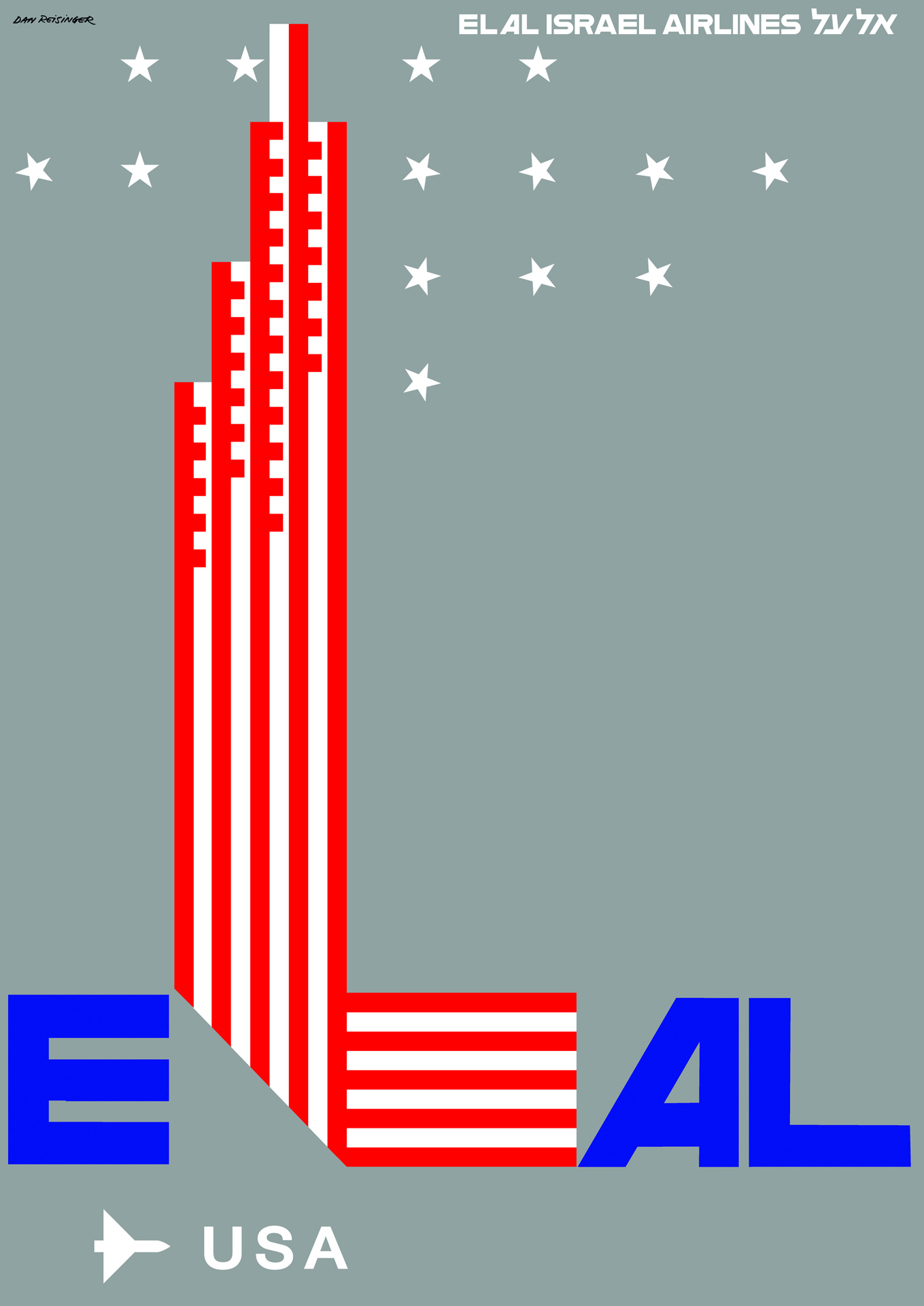
El Al Destinations poster series, 1968–72, USA
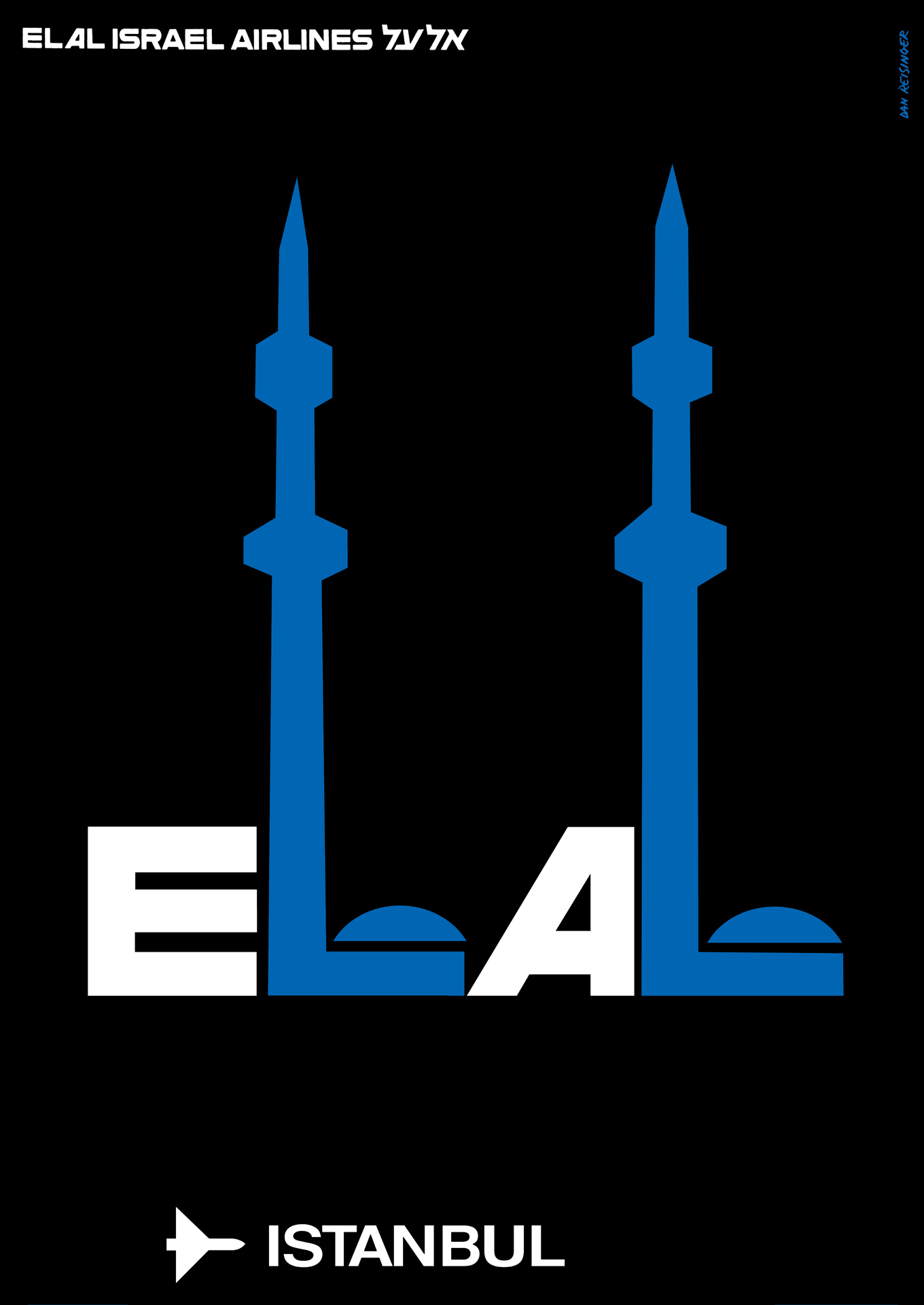
El Al Destinations poster series, 1968–72, Istanbul
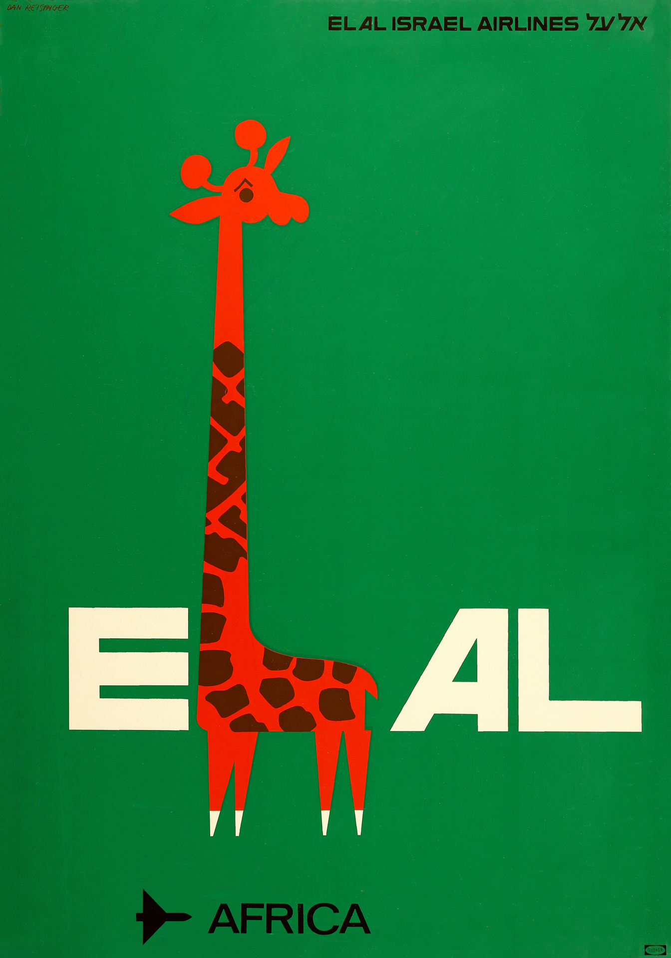
El Al Destinations poster series, 1968–72, Africa
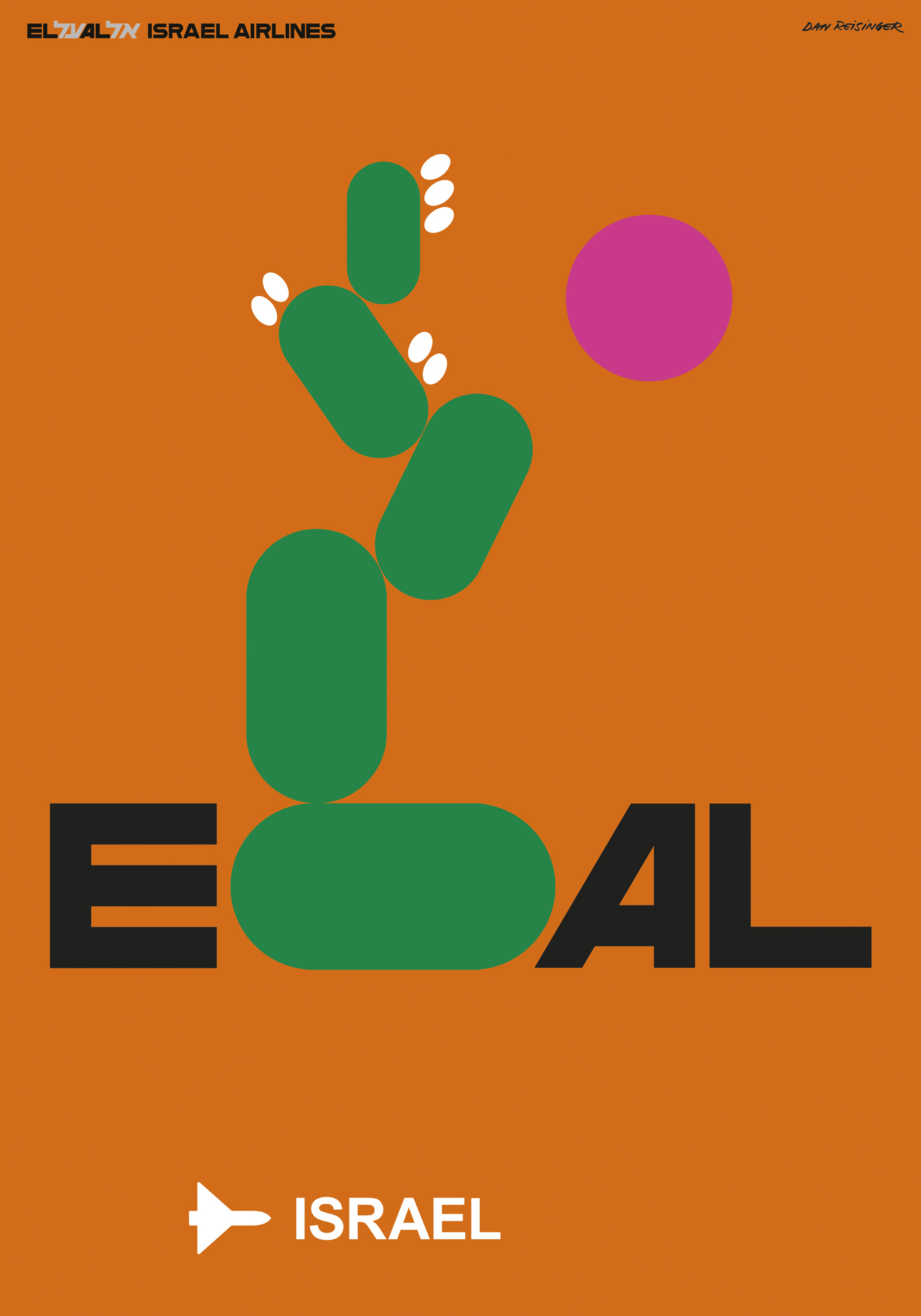
El Al Destinations poster series, 1968–72, Israel
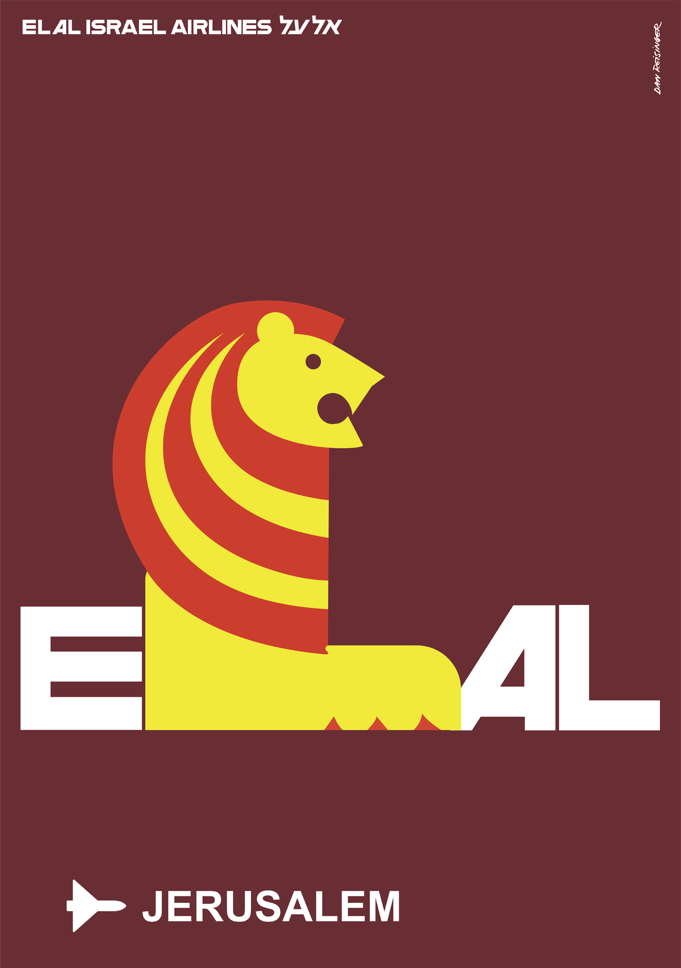
El Al Destinations poster series, 1968–72, Jerusalem
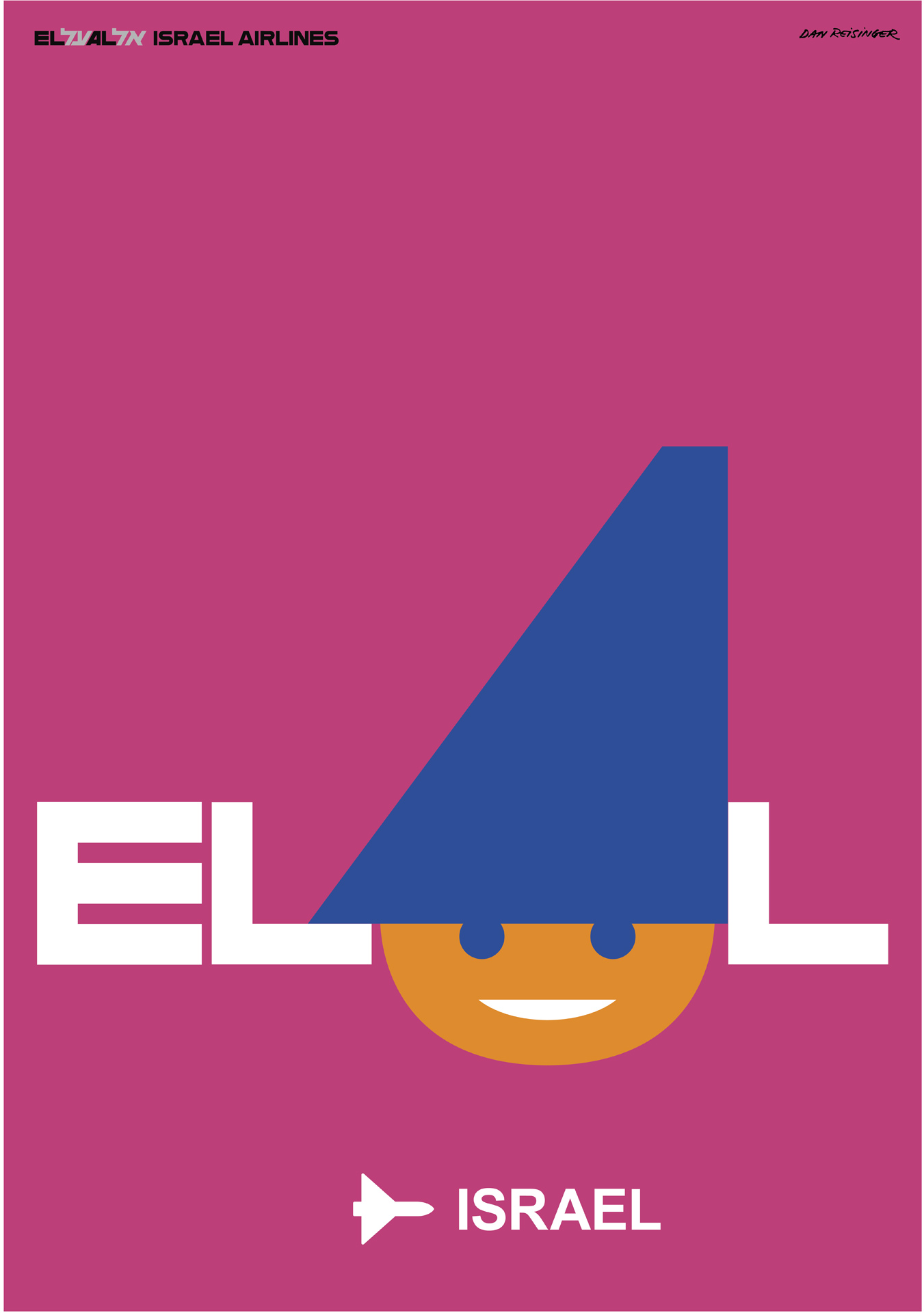
El Al Destinations poster series, 1968–72, Israel
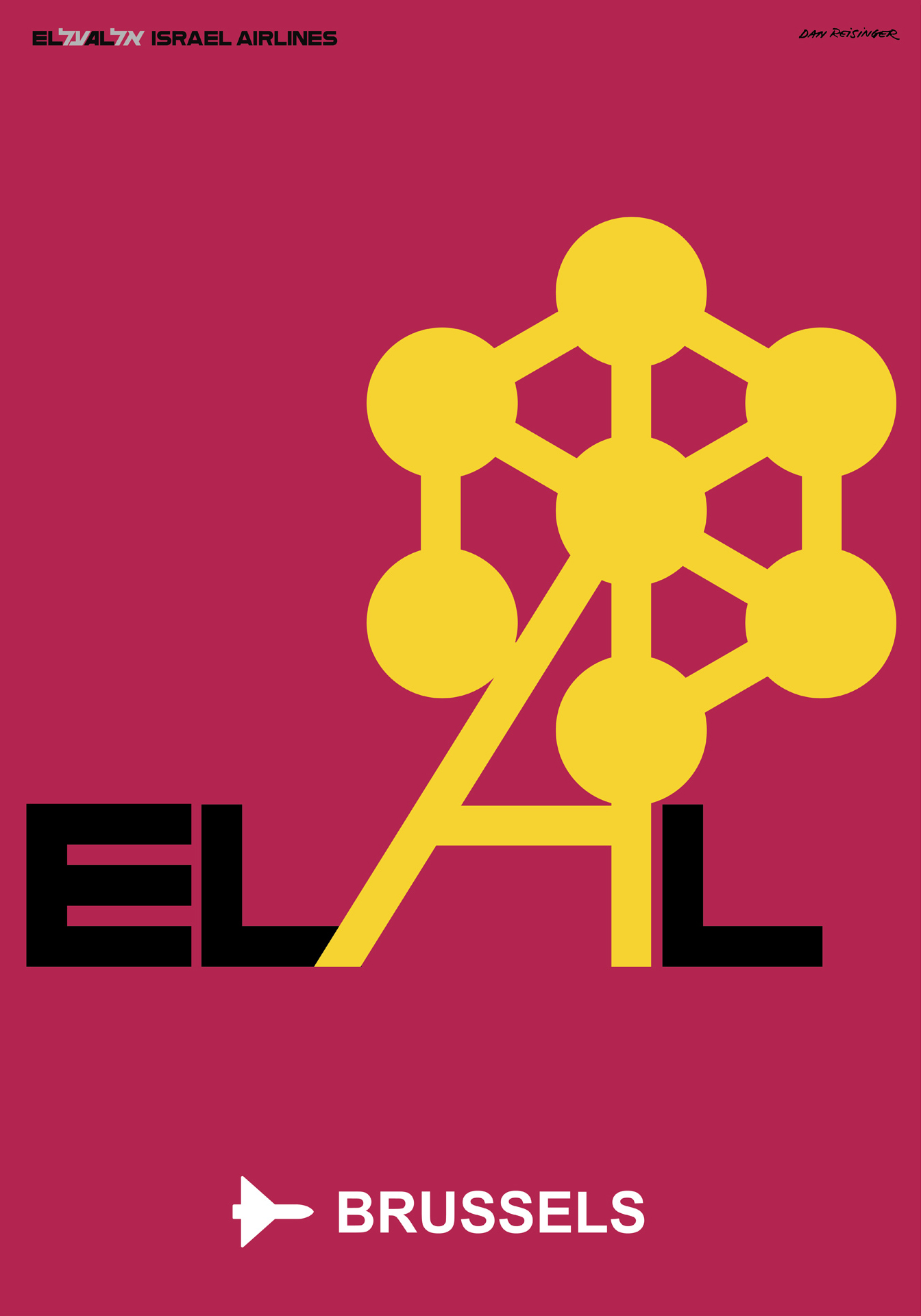
El Al Destinations poster series, 1968–72, Brussels
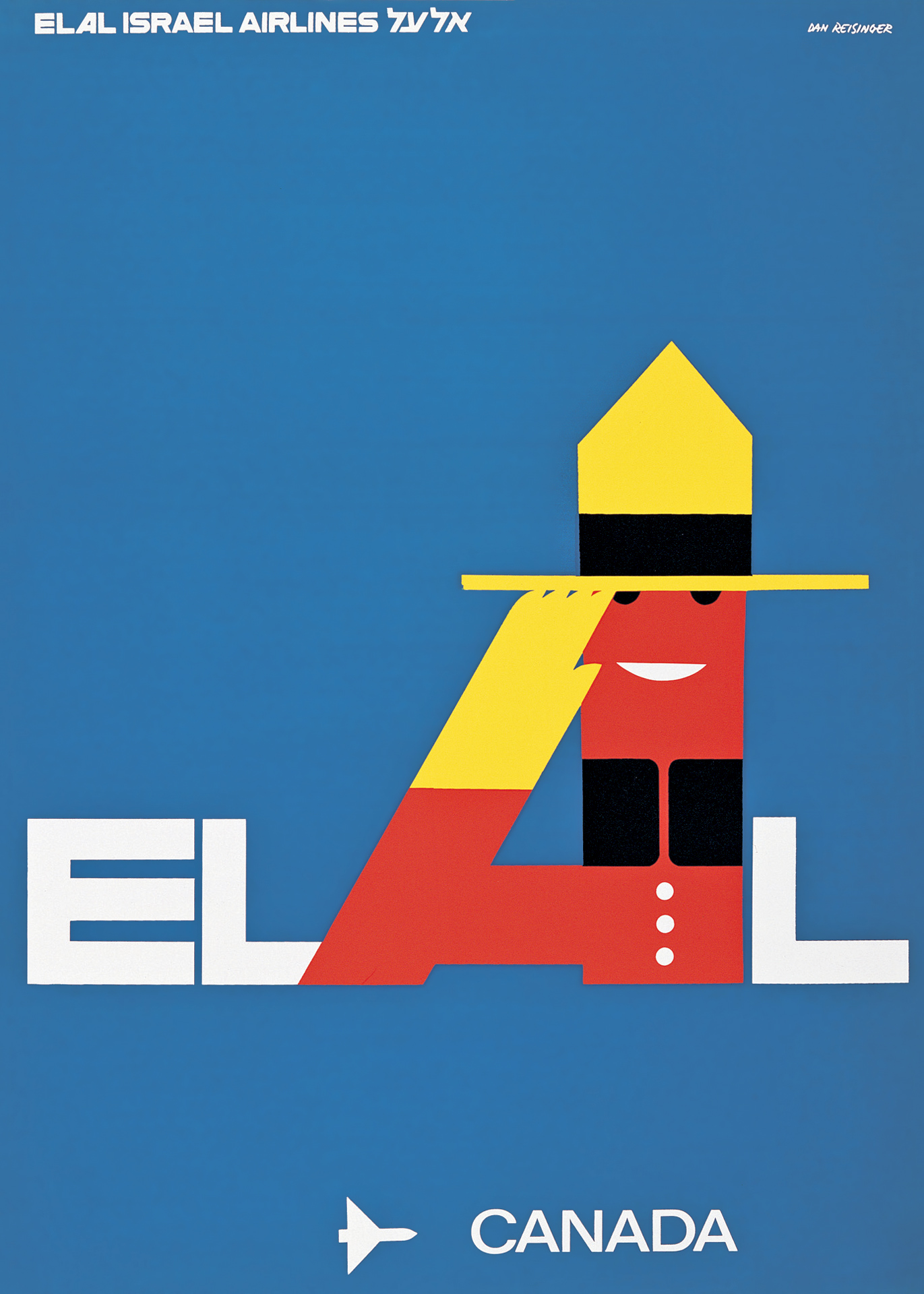
El Al Destinations poster series, 1968–72, Canada
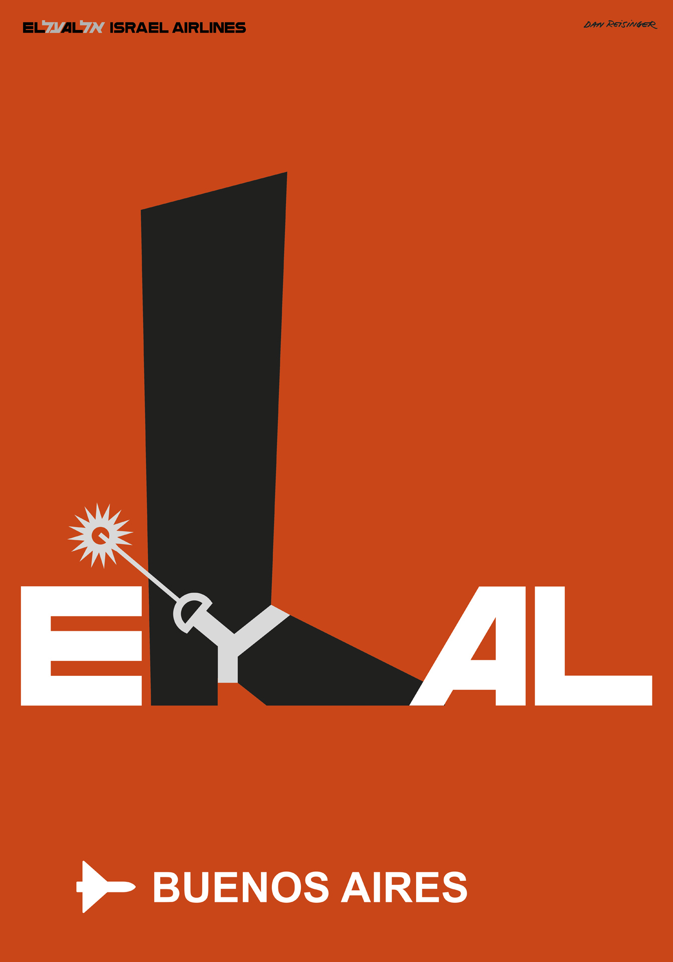
El Al Destinations poster series, 1968–72, Buenos Aires
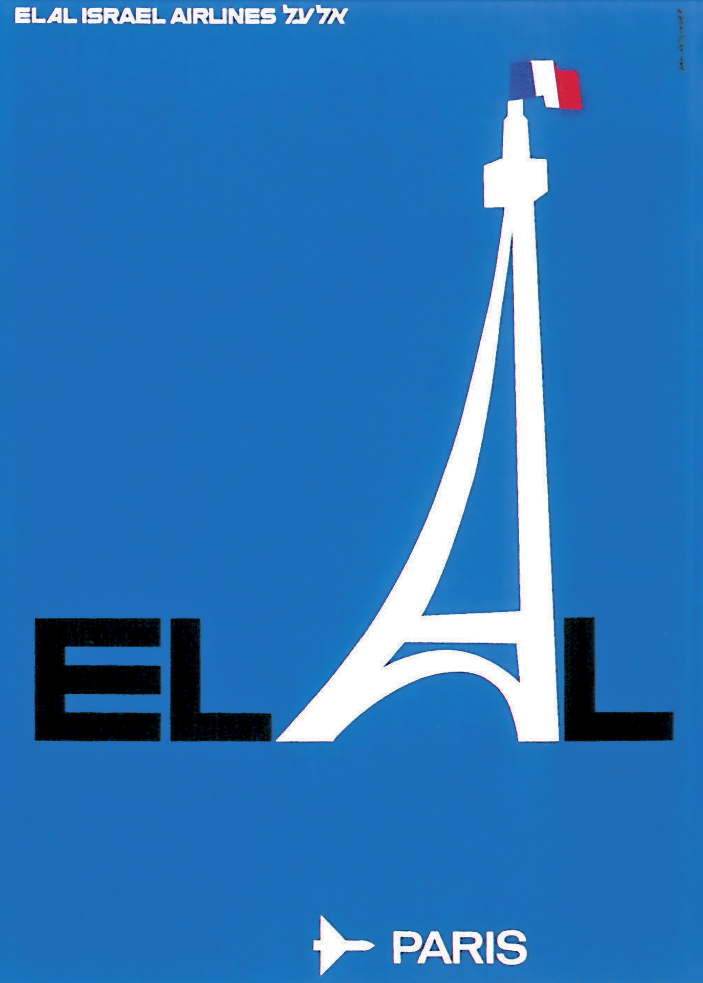
El Al Destinations poster series, 1968–72, Paris
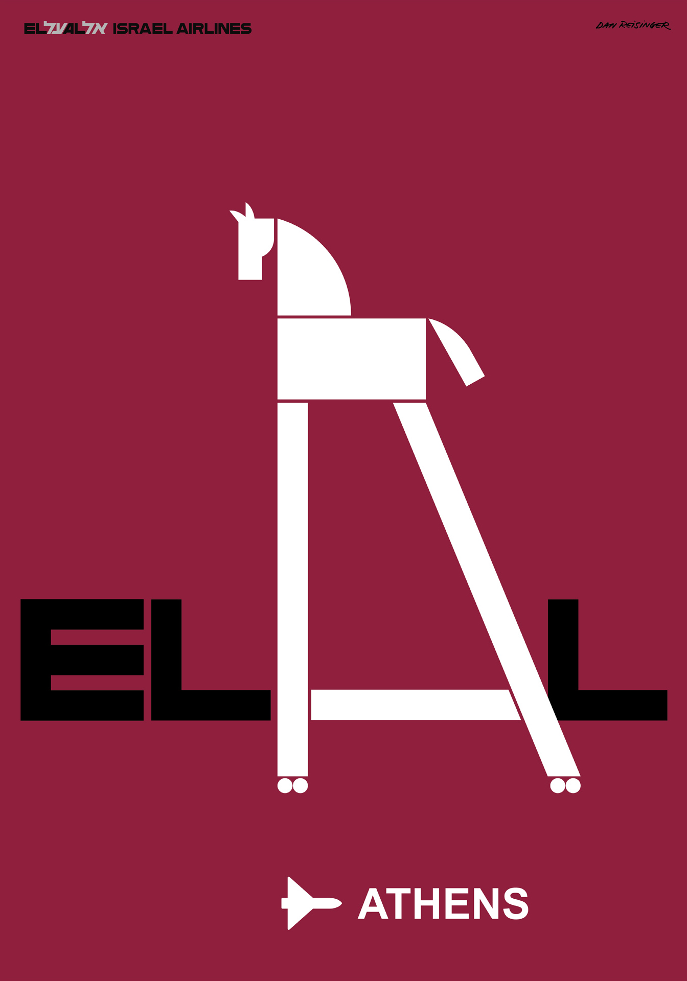
El Al Destinations poster series, 1968–72, Athens
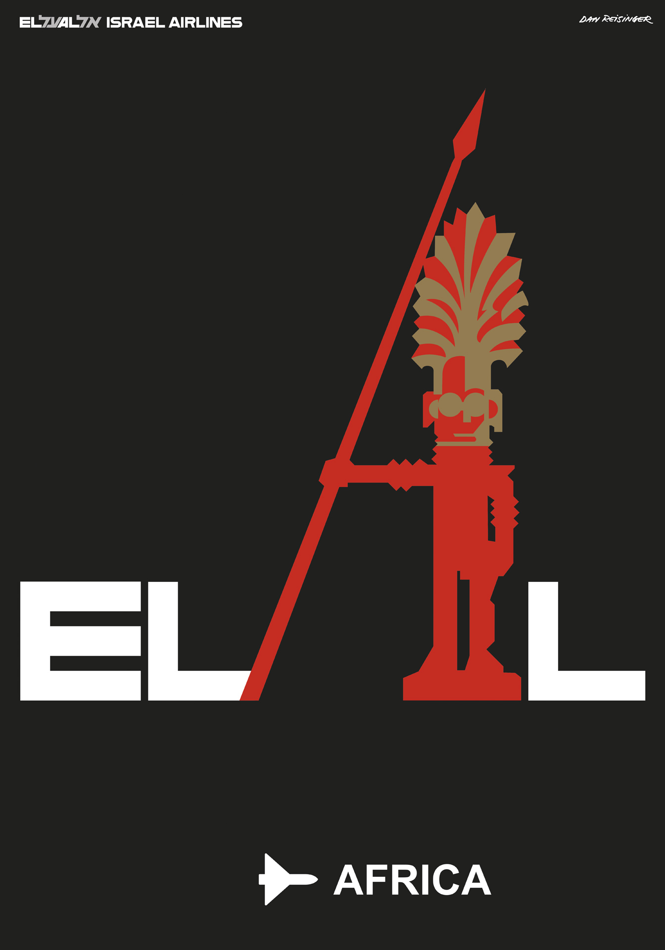
El Al Destinations poster series, 1968–72, Africa