Logos
The most enduring visual heritage of Hebrew/Jewish culture Is the Hebrew letter – the Hebrew writings.
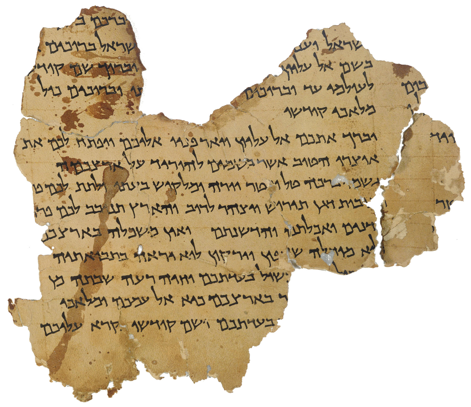
Hand-written Dead Sea Scrolls, dating from 1st century BC
As a child in Europe, I learned the Hebrew ‘Aleph-Bet’ as part of my Jewish education.
The words were incomprehensible but the Hebrew letters registered in my memory as abstract images.
Upon my arriving to Israel, I met those half-forgotten characters again – on shop signs, matchboxes, newspapers, everywhere serving the needs of everyday life.
Of course I have learned to speak and read Hebrew but my interest in the written letter or word has always remained more visual than literal. This attitude motivated me to play and explore new visual possibilities of the Hebrew letters – often combined with Latin lettering – transforming them into symbols, logos or posters to convey the needs of modern graphic communication for industry, marketing and cultural events.
This process enabled me to create an array of new visual images – far different from European symbols based on their heraldic traditions.
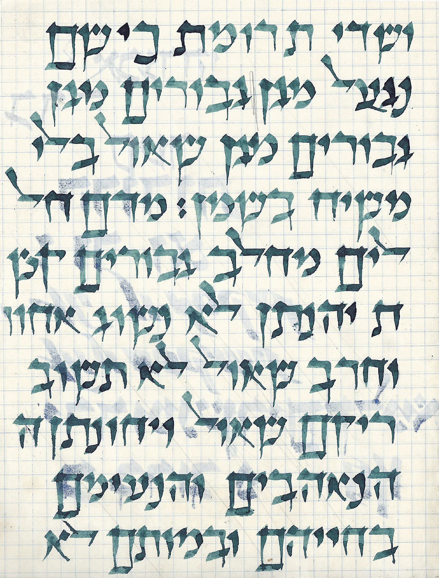
Calligraphic exercise written by Reisinger at Bezalel Art Academy in 1951. This style of writing is known as ‘ktav hamegillot’ (scroll-writing).
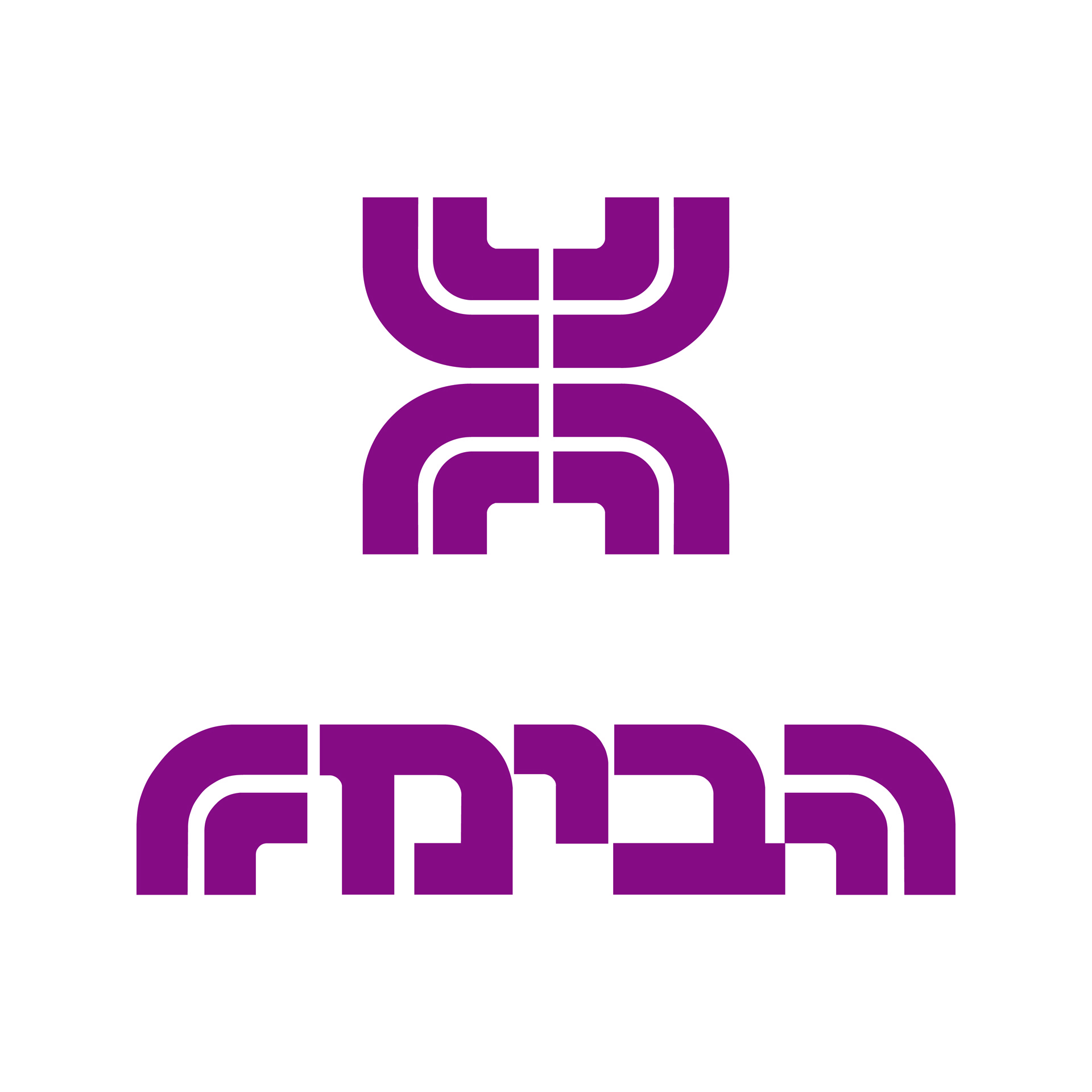
Habima, national theater, 1968

National social security agency, 1968

Jerusalem botanical gardens, 1987

Hayim, friends of the Sambur Center Beilinson Hospital, 1986

Tel Aviv Museum of Art, 1977
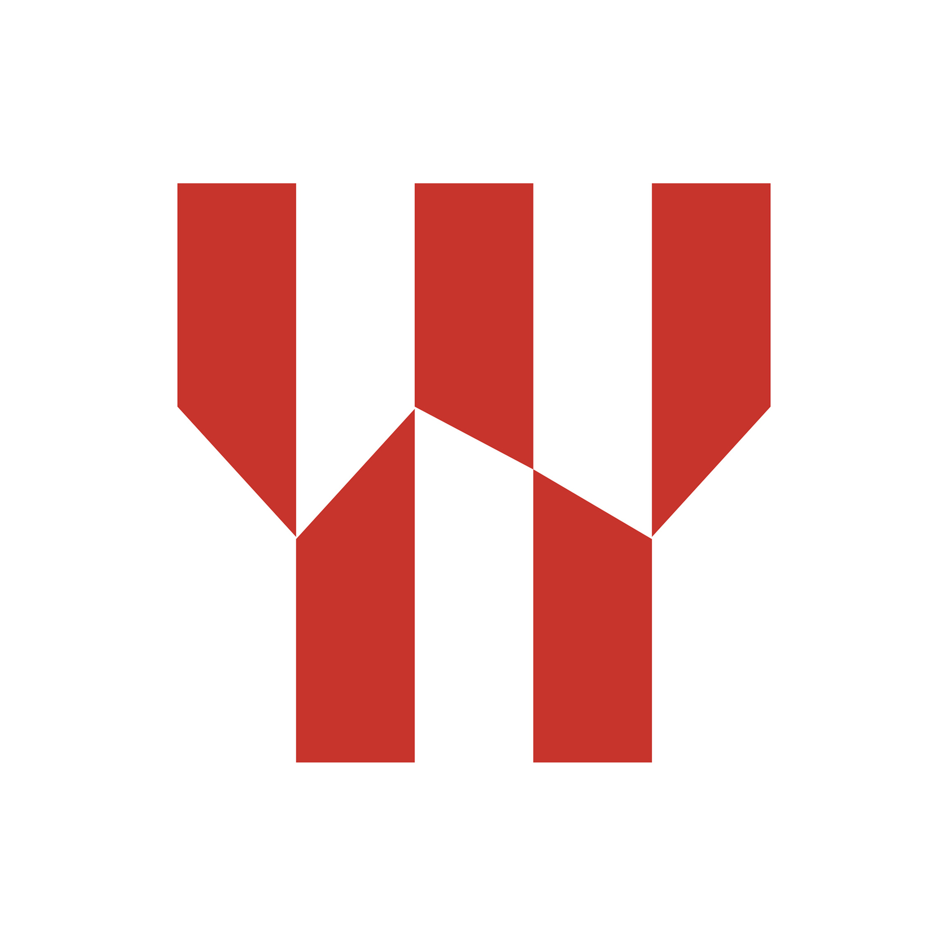
Africa-Israel investments, 1981
Diaspora Museum, 1978
Gav-Yam, construction company, 1997
Pazkar, bituminous products, 1982

Ramet, construction company, 1995
Batsheva Dance Company, 1965
Bat Dor Dance Company, 1966
Kadima-Zoran community centre, 2004
AT, first women’s colour magazine, 1966
Israeli Air Force Magazine, 1978

Sharem Hotel, Sinai, 1969
Teshet, tourist & aviation services, 1968

Michael Rozenfeld, engineering & building consultant, 1975
Bilingual Logotypes
With the growing export-oriented industry, the designer frequently has to address the visual message to two different cultures, using two different alphabets: Hebrew for the local market, Latin for global markets.
The necessity to combine two types of scripts, aesthetically and meaningfully, presents a challenge to any graphic designer. My background, as an immigrant to a new counrty, has helped me to overcome these objective difficulties and, at the same time, express my subjective need to minimize cultural barriers and create a visual harmony between conflicting elements.

EL AL Israel airlines, 1978

Maxima air seperation center, 1977

Tambour paint and chemical industries, 1991

Continental hotel, 1974

Avib construction company 1980

Maman, international cargo services, 1974

Teva pharmaceuticals, 1986
It was a challenge for me to achieve a harmonious, unified image out of two (sometimes three) different letter-forms, to experiment with the creation of alphabets, based on common shapes in Hebrew and Latin letter-forms. The flexibility of Hebrew type (type & cursive) allowed for some satisfactory results in the creation of bi-lingual logotypes and symbols.
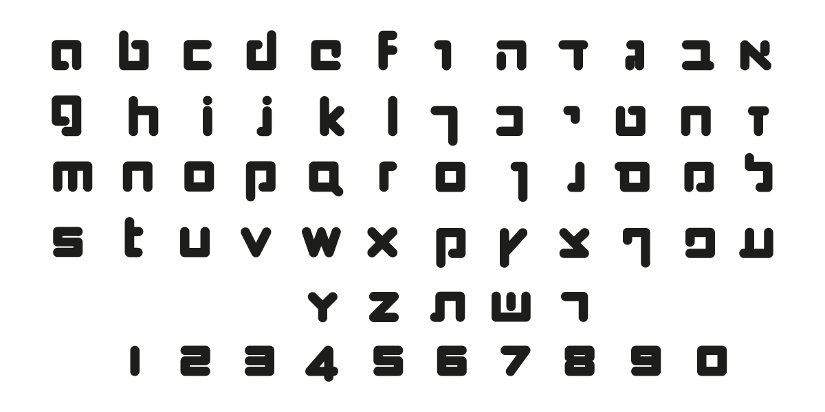
Niba, fashion house, 1977
Khan, theater, Jerusalem, 1970
Delek, fuel company, 1977
Lily, tissue paper products, 1973
Globus Group, film & television studios, 1991

Shenkar, college of engineering, design and art, 1982
Carmelit, Haifa subway, 1990

Atelje 212, theater, Belgrade, 1989
Scanli, video & pre-press services, 1995
Arkia Airlines, 1979

Dor Energy, gas and fuel company, 1989

Daphna Tours, 1966

Gamda Toys

Canit, shopping mall, 1985
The Open Museum, Tefen industrial park, 1985
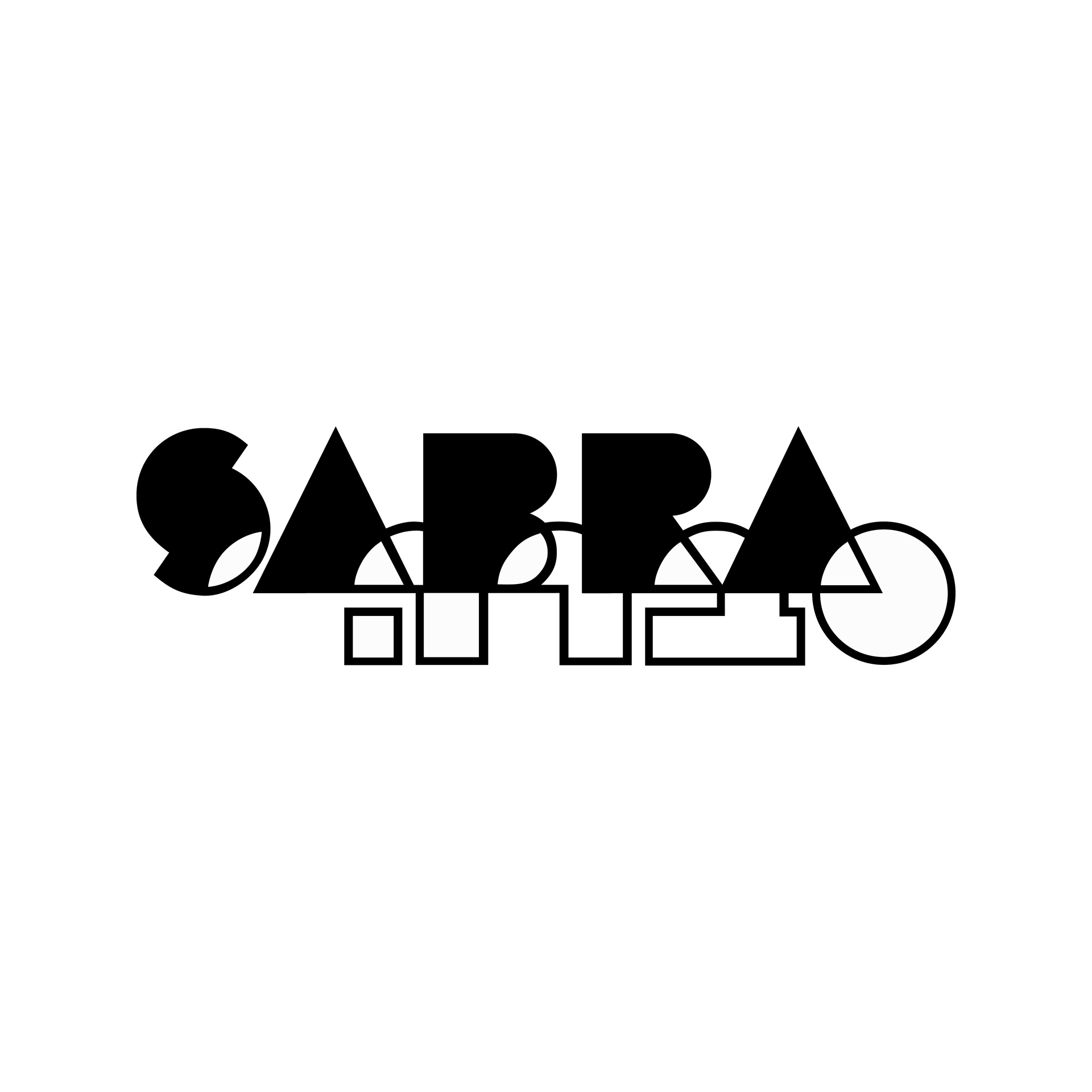
Sabra, coffee shop at Dan Hotels, Tel Aviv ,1983
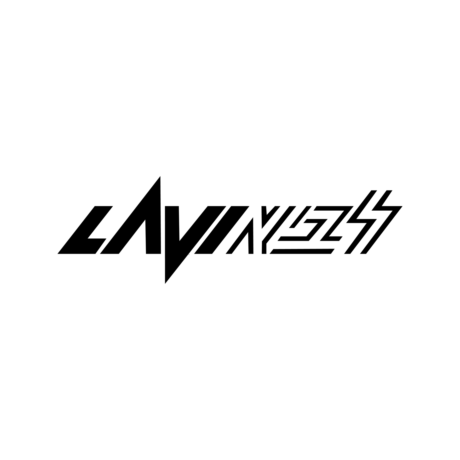
Lavi, Israeli aircraft, 1983

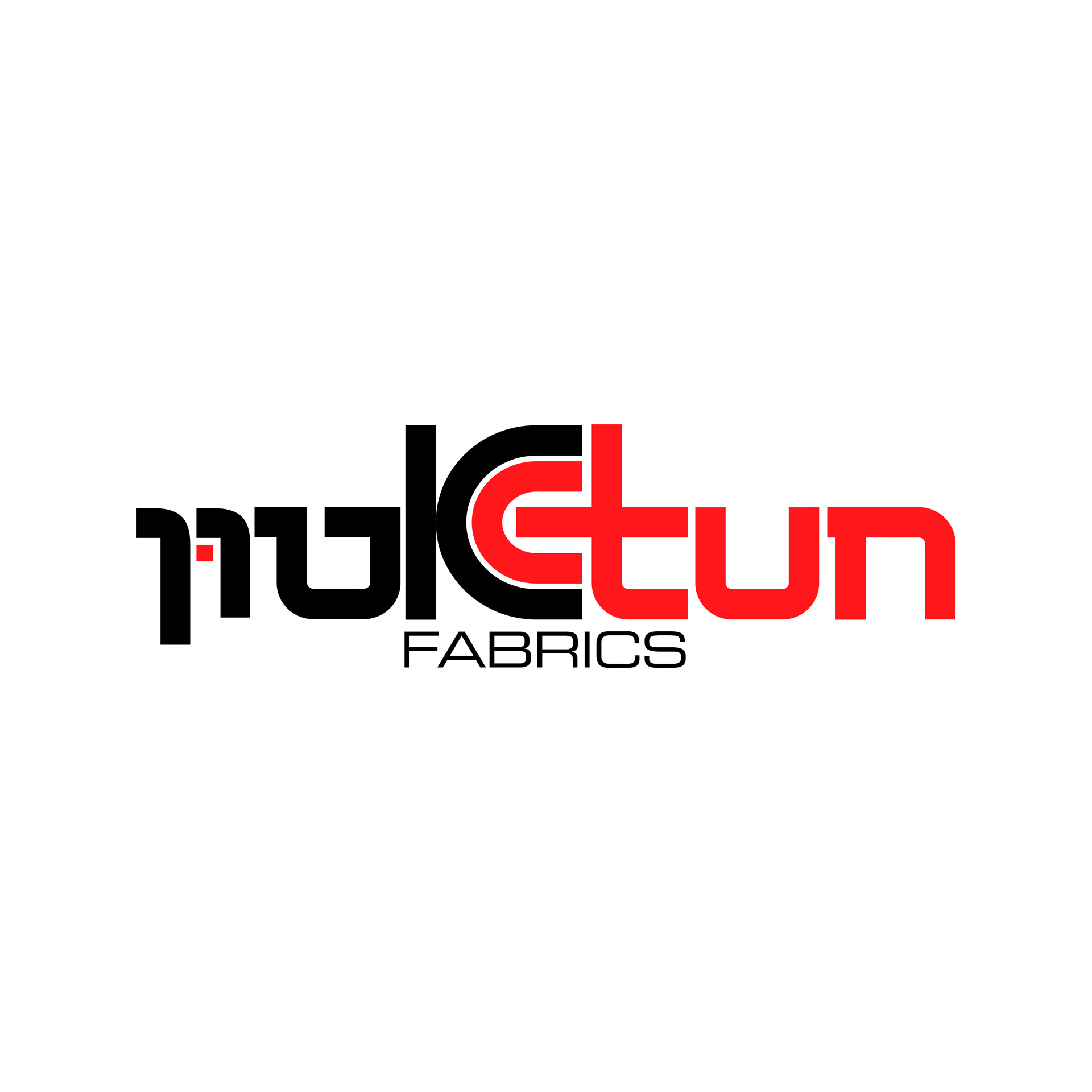
Etun, fabrics, 1970
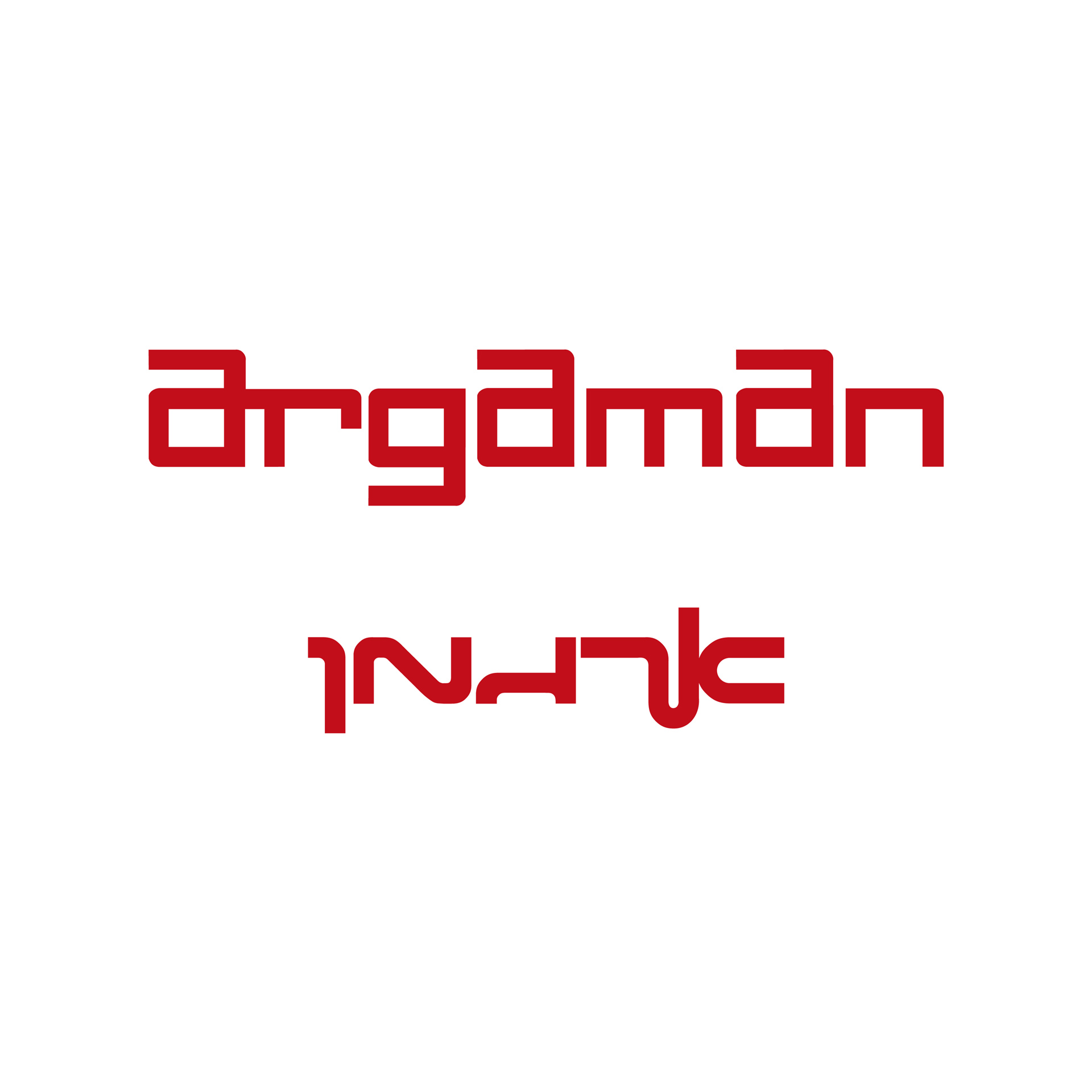
Argaman, textiles, 1969
Argathen, 1969
Arel Energy, 1983
Velveta Cream, 1968
Negev Jojoba, cosmetic products, 1978
Letters create images. Images create letters.
My approach to the letter is not strictly typographic, I perceive letters more as images – shapes to be explored for new possibilities. In my work, I enjoy the play of transforming the letter into an image or image into letter, Either Hebrew or Latin.
I.M.P., Israel Music Publications, 1982

David & Lisa, hair stylists & cosmetics, 1977

Hogla, paper hygine, 1965
A. Medan paper, 1993

H&C, housing & construction company, 1998
Electra, 1986

Israel Ministry of Tourism, 1993
Israel Week at Carson Pirie Scott, Chicago, 1971
Amos Master-Cut, hair stylist, 1987
Old Acre Development Co. 1994
Ofakim, innovative technologies, 1993
Creative Output, computer software programs, 1982
Iscar Blades, 1968

Thompson Medical, New York, 1977

Rematam, duty free shop, 1972
Deicas art gallery, 1982
Logo is the corner-stone of an identity. It should express the essence of the company or organization it is created for.
As a symbol or logo will be seen many times it may have an element of a riddle or puzzle which teases or invites the viewer to look at it again and again – to understand its message. This process makes the viewer a partner in establishing the effectiveness of the logo and will make the image more memorable.
Iscar, hardmetal cutting tools, 1976

Hemda Center for Science Education, 1990

Israel Pharmaceutical Association, 1988
Kupat Holim Clalit, General Health Services

Rabin medical center, 1996
Hadassa medical center,
Migada

Gamida for life
Equal Rights, association for the disabled, 1993
Gila Almagor's charity fund

Near East International Fair, 1961

Association for the fight against cancer, 1962
Hirschman, auto mechanic ,1961
Yellow Pages, 1968

The Green Ribbon, quality mark for fruits and vegetables, 1964

24 Hours, Yediot Aharonot newspaper supplement, 1978
Seven Days, Yediot Aharonot newspaper supplement, 1978
Seven Nights, Yediot Aharonot newspaper supplement, 1978
Hishtil, plant nurseries, 1993

EMI, Israeli Union of Performing Artists, 1988

Negev tourism and development co. 1986

Israel air force museum
Batsheva Dance Company, 1988
University Theater, 1968
Ten Fingers, folk art gallery, 1974
Daniel Tower Hotel, 1972

Dan Panorama Center, hotel, apartments and shopping center, 1985

The Tel Aviv Stock Exchange, 1982
Israel Diamond Exchange, 1979
Ferstenberg Grunstein, diamond polishing, 1975
The Tel Aviv Stock Exchange, 40th anniversary, 1993
Weizmann Institute of Science, 50th Anniversary, 1980
Bank Leumi, 75th anniversary, 1997
Israel-America House, 1969

Israel Hotel Association, 1972
Yavneh Municipality, 1987
Wolf Foundation, promotion of science & art for the benefit of mankind, 1982
Israel Presidential Award for Voluntarism, 2008
The Israel Prize, 1986
Lendava, Slovenian Holocaust museum
Phoenix, films about Holocaust survivors, 2007
Signing ceremony of peace treaty between the State of Israel & the Hashemite Kingdom of Jordan, 1994